
 Methodology
For method, I started with a series of reclassifications of 9 images that indicated which areas could be used, and should not be used, for agricultural production. The 9 reclassifications went as follows (1=suitable areas, 0=unsuitable areas):
1 - RECLASS
Windsev
0 = 0-1
1 = 1-3
0 = 3-6
1 = 6-999
Result: Lesswindsev.rst
2 - RECLASS
Exploit
0 = 0-3
1 = 3-999
Result: Lessexploit.rst
3 - RECLASS
Afpetann
0 = 0-184
1 = 184-1844
0 = 1844-9999
Result: Evaprates.rst
4 - RECLASS
Chemical
0 = 0-1
1 = 1-3
0 = 3-6
1 = 6-999
Result: Lowchemdet.rst
5 - RECLASS
Grazing
0 = 0-3
1 = 3-999
Result: Notovergraz.rst
6 - RECLASS
Physical
0 = 0-1
1 = 1-3
0 = 3-6
1 = 6-999
Result: Lessphysdet.rst
7 - RECLASS
Rate
0 = 0-1
1 = 1-3
0 = 3-5
1 = 5-999
Result: Lessdegr.rst
8 - RECLASS
Severity
0 = 0-1
1 = 1-3
0 = 3-6
1 = 6-999
Result: Goodsoil.rst
9 - RECLASS
Watersev
0 = 0-1
1 = 1-3
0 = 3-6
1 = 6-999
Result: LessH20sev.rst
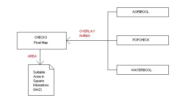
The next step was to create a single image of suitability. To do this I used a logical "AND" operation through a series of OVERLAY multiply operations which gave me a final image of regions where conditions are favourable for agricultural use (Agribool.rst). I incorporated all 9 reclassifications into this final picture.

I then decided to reclass the layer Popdens, representing estimated population density, to give me an image of where population density above <25 is located. The reclassification went as follows:
RECLASS
Popdens
0 = 0-3
1 = 3-999
Result: Popcheck.rst
I then overlaid and multiplied Agribool.rst and Popcheck.rst to see which areas would be favourable to agricultural use and had enough people living in these regions to work the land (Check1.rst). Area was also calculated for this region: 1=482493.8594439km2 0=6997104.5186048km2

I then did a reclassification of Watersev, representing the severity of water erosion, to highlight all waterbodies in order to do a "Distance from Waterbodies" operation. This reclassification went as follows:
RECLASS
Watersev
1 = 0-1
0 = 1-5
1 = 5-6
0 = 6-999
Result: Waterbodies.rst
By using DISTANCE, I calculated a distance surface (a spatially continuous representation of distance) from all waterbodies in the reclassified layer Waterbodies.rst. It created for me Waterbodydist.rst.

This was then reclassified to give me the image Waterbool.rst:
RECLASS
Waterbodydist
0 = 0.80 (map units)
1 = 0.80-4.79
0 = 4.79-999
Result: Waterbool.rst
Here I chose
anything from 0.80-4.79 to be suitable for agriculture because of close
availability of a water source. Anything past 4.79 map units I deemed
as unsuitable. I then overlaid and multiplied Waterbool.rst and Agribool.rst
to show me all areas favourable to agricultural use and within close distance
of a water supply (for irrigation needs). This gave me the layer
Check2.rst, where all areas suitable = 601406.5008470km2 and all areas
not suitable
= 6878422.1503309km2.


I then decided to create a final Boolean image that included all areas suitable for agricultural production (good land, etc.), sufficient population density and close distance to a water source, which gave me Check3.rst. The area calculated for this image dropped significantly to 288053.8794164km2, where 0=7191012.8013056km2. We can see how these three main constraints really limit the amount of land that is highly suitable for agricultural production in Africa. It becomes clear that compromises must be made in order to achieve a greater area of land under cultivation. This is also evident from the fact that the layer for soils affected by agricultural practices has an area for 1 equaling 974341.0794752km2, and an area for 0=6505345.1056551km2.


 -Prior Area Calculations for Check1 and Check2
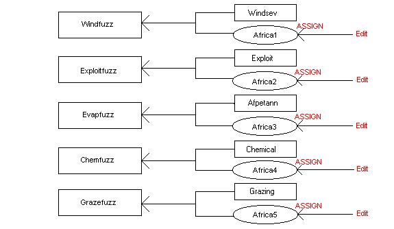
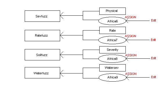
After coming up with a final Boolean coverage, I decided that I should evaluate my multiple criteria and weigh each factor. This would give me a map of fuzzy tolerances, as opposed to a "yes and no" map. Instead of having areas equal to 1 as suitable, and areas equal to 0 as unsuitable, I would now have a map with degrees of suitability. To start off, I reclassed the same 9 images as before, only this time they were standardized (assigned) to a continuous scale of suitability from 0 (the least suitable) to 255 (the most suitable). This is how it was done:
1 - ASSIGN
Windsev
255 = 6
200 = 1
125 = 2
75 = 3
Result: Windfuzz.rst
2 - ASSIGN
Exploit
255 = 3
75 = 1
Result: Exploitfuzz.rst
3 - ASSIGN
Afpetann
255 = 184
200 = 553
125 = 922
75 = 1291
Result: Evapfuzz.rst
4 - ASSIGN
Chemical
255 = 6
200 = 1
125 = 2
75 = 3
Result: Chemfuzz.rst
5 - ASSIGN
Grazing
255 =3
75 = 1
Result: Grazefuzz.rst
6 - ASSIGN
Physical
255 = 6
200 = 1
125 = 2
75 = 3
Result: Sevfuzz.rst
7 - ASSIGN
Rate
255 = 5
200 = 1
125 = 2
75 = 3
Result: Ratefuzz.rst
8 - ASSIGN
Severity
255 = 6
200 = 1
125 = 2
75 = 3
Result: Soilfuzz.rst
9 - ASSIGN
Watersev
255 = 6
200 = 1
125 = 2
75 = 3
Result: Waterfuzz.rst
For the layers "Grazing" and "Exploit" there was not enough suitable criteria to be able to add in values for 200 and 125. Therefore, the two possible suitable criteria were given to the highest and lowest values on the scale (255 and 75). Attribute Values Files were also created in each step in order to be able to assign the proper values to the final 9 fuzzy maps. They were labelled africa1.avl, africa2.avl, and so on.
Once the assigning of the 9 previous raster layers were complete, I then decided to use the J-shaped curve function under the module FUZZY to assign Popdens and Waterbodydist to the same continuous byte range scale (0-255). I decided to use this function to create these two fuzzy maps because as population density increases, so does suitability. Suitability also decreases the further away a population is from a water source. Therefore the function went as follows:
FUZZY (J-shaped curve)
Popdens
input image: popdens
Monotonically Increasing
control point a: <25 (assigned as category
3 in legend)
control point b: >500 (assigned as category 8
in legend)
output image: Popfuzz.rst
FUZZY (J-shaped curve)
Waterbodydist
input image: waterbodydist
Monotonically Decreasing
control point c: 4.79
control point d: 12.78
output image: Waterdistfuzz.rst

Once this was complete, I had my 11 fuzzy tolerance maps. Now I needed to create a new pairwise comparison file (called Africa.pcf) to be able to weigh all factor files. I did this under the module WEIGHT and I assigned weights for each fuzzy layer giving each one a relative importance to all other layers. These weights were:
1/9 = extremely
less important
1/7 = very
strongly less important
1/5 = strongly
less important
1/3 = moderately
less important
1 = equal
to
3 = moderately
more important
5 = strongly
more important
7 = very
strongly more important
9 = extremely
more important
See table:

The appropriate calculations were derived from the weights assigned to each layer:
The eigenvector of weights is :
chemfuzz : 0.0940
evapfuzz : 0.0457
exploitfuzz : 0.0342
grazefuzz : 0.0336
popfuzz : 0.1205
ratefuzz : 0.0872
sevfuzz : 0.0881
soilfuzz : 0.1065
waterdistfuzz : 0.1302
waterfuzz : 0.0616
windfuzz : 0.1984
Assigning weights to layers in comparison with other layers was a difficult task. Each layer is crucial to the goal of my project, however, there were some layers that just happened to be a little, or a lot more or less important than others, so in this way, the MCE WEIGHT function was helpful for the final outcome of this project. Lastly, in order to be able to view my weighted linear combination map, I created a Raster Group File (AfricaWLC.rgf) complete with all 11 factor images. This let me explore the resulting aggregate suitability image with the feature properties tool in order to be able to better understand the origin of the final values. The last step of my project is displayed here:

The final image created using Weighted Linear Combination:

The darker
green areas are considered the most suitable (in approximately the 220-255
range), and the yellow, orange and red colours are the least suitable (in
the 100-155 range). The lighter green areas represent areas of medium
suitability (having a range usually between 155 and 220), and the purple
areas represent waterbodies (unsuitable).
