
- People
- Administration & Staff
- Research faculty
- Gabriela Aceves-Sepúlveda
- Alissa N. Antle
- Sheelagh Carpendale
- Parmit Chilana
- Jon Corbett
- Steve DiPaola
- Halil Erhan
- Brian Fisher
- Diane Gromala
- Marek Hatala
- Kate Hennessy
- Alireza Karduni
- Sylvain Moreno
- Carman Neustaedter
- Will Odom
- Philippe Pasquier
- Niranjan Rajah
- Bernhard Riecke
- Gillian Russell
- Thecla Schiphorst
- Chris Shaw
- Wolfgang Stuerzlinger
- Ron Wakkary
- Ö. Nilay Yalçin
- Teaching faculty
- Emeritus
- Adjunct Faculty
- Alumni
- Work at SIAT
- Opportunities
- Research
- Programs
- News & Events
- Spaces & Equipment
- Media
- Showcase
- Contact
- Staff & faculty resources
Optmizing the Online Ordering Process on the Bonus Bakery Website
By: Sarah Daniels, Isabelle Louie, Naod Asaye, Rishabh Johri
Course: IAT 432 Design Evaluation
Project description: As a plant-based bakery in Vancouver founded in 2019, Bonus Bakery quickly established a strong reputation within the local plant-based community. During the pandemic in-store traffic and sales plummeted forcing Bonus Bakery to pivot to an online strategy.
To address common issues noted by our client and to improve the robustness of the online ordering process, our team decided to evaluate Bonus Bakery’s current website as a part of our final project for IAT 432: Design Evaluation. We specifically focused on the customer experience of ordering online for home delivery and in-store pickup. Our team used three different evaluation methods: a heuristic evaluation, a customer feedback questionnaire, and a series of think-aloud usability studies. Based on the data collected during these tests, our team developed a list of recommendations and created a high-fidelity prototype of a new design that would better address customer's needs.
Explore the report and prototype:
1. Introduction
1.1 Background
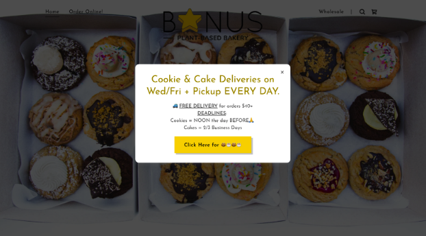
Our partnership with Bonus Bakery emerged from our passion for supporting local businesses in our community. As a plant-based bakery in Vancouver, Bonus Bakery was founded in 2019 and quickly established a strong reputation within the local plant-based community. During the pandemic, in-store traffic and sales plummeted, forcing Bonus Bakery to pivot to an online strategy. Although our client initially used Instagram to communicate information and drive sales, he eventually created a website to keep up with the increasing volume of orders (figure 1).
1.2 Target Audience
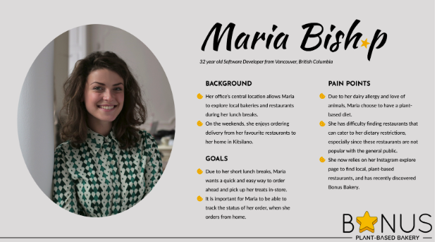
According to Bonus Bakery’s social media analytics and personal knowledge from our client, 75 percent of their audience were between the ages of 25 and 44 years old, around 87 percent of the audience were women, and many customers had dietary restrictions such as gluten allergies or plant-based diets (P. Tanguy, personal communication, October 23, 2022).
Based on these demographics, our team developed a user persona to guide our participant recruitment process during user testing, as shown in figure 2 and Appendix 4.3.
1.3 Evaluation Goals
In our first meeting, our client explained common issues that customers were facing, all of which related to the website's online ordering process. Our client expressed his interest in improving the robustness of this process to turn the website into the primary channel for placing orders. Currently, orders can also be placed through direct messages on Instagram, text messages, email, directly in-store, and recurring wholesale orders. In light of these pain points and goals, our team decided to evaluate the design and structure of Bonus Bakery’s current website, focusing on the customer experience of ordering online for home delivery and in-store pickup.
1.4 Overview of Study Methods
In order to optimize the online ordering experience, our team needed to identify any usability issues and further explore customers’ pain points. We planned to conduct extensive research with current and prospective customers to pinpoint aspects of the website that could be improved.
Our team used three different methods to evaluate the website: a heuristic evaluation, a customer feedback questionnaire, and a series of think-aloud usability studies. These study methods allowed our team to identify general usability issues and better understand customers’ thoughts when placing an order. Based on the data collected during these tests, our team developed a list of recommendations and created a high-fidelity prototype of a new design that would better address customers’ needs.
2. Heuristic Evaluation
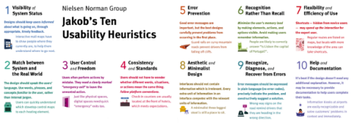
First, each team member conducted an independent heuristic evaluation of Bonus Bakery’s website, focusing on the online ordering process of a single product for both delivery and in-store pickup. The heuristic evaluation technique was developed by Jakob Nielsen in 1994. To this day, with minor changes over time, design experts use Nielsen’s 10 interaction design principles (figure 3) to evaluate an interface (Nielsen Norman Group, 2020). Guided by these principles, this technique allowed our team to identify any existing usability problems and their severity before getting customers involved in the evaluation process.
2.1 Methodology
For each issue, our team noted down which design principle was violated, the severity of the issue, and our recommended solutions. Issues with a severity rating of 3 or 4 were more critical as they hindered the user’s ability to complete tasks and were therefore a higher priority. Issues with a severity rating of 1 or 2 were less important and were typically cosmetic or minor usability problems. These ratings later guided our redesign process as they allowed our team to address critical issues first, given the time constraints of our project. Once each team member had completed their individual evaluation, we compiled our findings into one document and convened to discuss the most severe issues that needed to be addressed (see Appendix 1.1).
2.2 Results
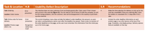
Upon reviewing our consolidated findings, 26% of the broken principles were given a severity rating of level one (cosmetic issue), 42% were severity level two (minor usability issue), 21% were severity level three (major usability issue), and 11% were severity level four (critical issue). Figure 4 shows an excerpt of our team’s findings and recommendations.
The most severe issues were caused by a lack of error prevention (e.g., users can place an order after the deadline), the need for users to recall information from memory (e.g., order deadline information only appears in a dismissable pop-up), and a lack of flexibility and efficiency when using the website (e.g., users must type their flavour selection into a text box).
2.3 Limitations
One limitation of the heuristic evaluation technique is that it does not involve end users. As a result, it is possible that our team may have missed certain problems or found issues that do not typically affect customers. Therefore, we decided to supplement our findings with a customer feedback questionnaire.
3. Customer Feedback Questionnaire
Using SurveyMonkey, our team created a customer feedback questionnaire to gather qualitative feedback from Bonus Bakery’s existing customers on the online ordering process and compare these with issues noted in our team’s heuristic evaluation (see Appendix 1.2). In addition, our team aimed to better understand the reasoning behind users’ actions as they navigated through Bonus Bakery’s website. Using a questionnaire allowed our team to reach a large sample and gather data on users’ perceptions of different aspects of the ordering process. In conjunction with the heuristic evaluation, this helped highlight common issues to guide our redesign process.
3.1 Participants
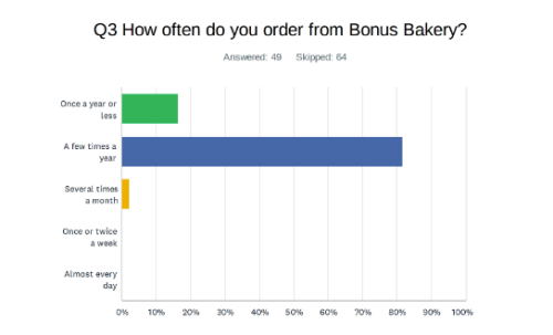
Participants for the questionnaire were recruited through sharing the questionnaire link on Bonus Bakery’s Instagram and Facebook pages. Our team was primarily interested in gathering feedback from Bonus Bakery’s existing customers, so the questionnaire included a screening question to ensure only participants who had purchased or attempted to purchase goods from Bonus Bakery could complete the survey. The survey reached a total of 113 users, out of which 49 were existing customers who fully completed the questionnaire. As shown in figure 5, 82% of participants reported ordering from Bonus Bakery a few times a year, 16% reported ordering once a year or less, and 2% reported ordering several times a month.
3.2 Data Collection
Responses were anonymously collected through SurveyMonkey. Qualitative data in the form of scalar Likert scale ratings, rank order scales, and open-ended comments were recorded. At the end of the questionnaire, participants were given a $5 discount code for their next Bonus Bakery order as compensation for their time. Participants also had the option to provide their contact information in a separate form if they were interested in participating in our usability studies.
3.3 Results
A few common issues emerged upon analyzing customers’ responses, with a majority of responses relating to the flavour selection process and the presentation of delivery and deadline information.
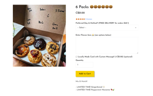
Out of 49 participants, 60% of suggestions related to improving the input method of selecting flavours and the visualization of different product options. For instance, one participant stated, “Selecting flavours for the cookies can be slightly tedious as you need to type in each flavour you want. A drop-down menu for the number of each flavour you want would be helpful”. Another participant said, “I can’t always remember what each cookie looks like. I usually go to your Instagram page to find what it looks like and has in it when choosing a flavour”.
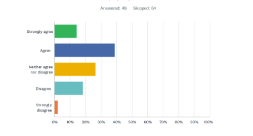
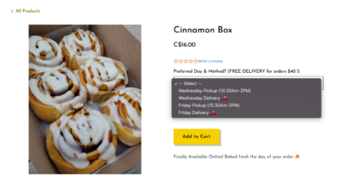
50% of respondents were neutral towards or did not like the pop-up presentation of the delivery and deadline information, as shown in figure 6. One participant stated the following:
“I only know the deadlines because I’ve ordered before but when looking on the site, I couldn’t find it stated anywhere except when it first popped up on the home screen. People may forget after reading or click without reading and not be able to find cut off times when they go to place their order.”
Another participant experienced this, saying, “After I close the pop-up, I can't seem to find this info anywhere. And I don't remember the order deadline days from reading the popup, as at that time I probably wasn't sure whether I'd be ordering or not”.
3.4 Limitations
Although the customer feedback questionnaire involved end users, there were still a few limitations. For instance, only approximately 50% of the open-ended responses were in-depth. Many responses provided little insight into the customers’ thought processes, with comments such as “It is clear” and “I agree”. Another potential limitation and reliability concern of the questionnaire was that participants could interpret certain answer options differently. With questions like asking customers to rank aspects of the ordering process from most to least clear, the magnitude between answer options is not known. To address these limitations, our team conducted four usability studies to gain in-depth insight into customers’ behaviours and interactions with the existing website.
4. Usability Study: Existing Website
A think-aloud usability study method was used to observe participants’ interactions with Bonus Bakery’s existing website. By engaging with real customers, our team hoped to gain further insight into their behaviours, preferences, and common issues they faced, in addition to those identified in our heuristic evaluation and customer feedback survey. Furthermore, by employing a think-aloud technique where users were asked to describe their thoughts while completing tasks, this helped us identify issues that may have hindered their ability to complete tasks successfully and/or efficiently.
4.1 Participants
Participants for the usability study on the existing website included two current customers who were recruited through the customer feedback survey and two prospective customers who were recruited through the “Plant-Based Vancouver” Facebook group.
The two current customers (C1 and C2) had ordered from Bonus Bakery before. C1 was between 35 and 44 years old and was familiar with the website’s mobile interface. C2 was between 18 and 24 years old and primarily placed orders on the website’s desktop interface. The two prospective customers (P1 and P2) had never ordered from Bonus Bakery before, were between 25 and 34 years old, and typically ordered food online using a mobile device.
Although our target audience was users between 25 and 44 years old, one difficulty we faced during the recruitment process was a lack of participant availability on the study dates. As a result, some participants recruited belonged to the 18-24 age demographic.
4.2 Environment
The studies were conducted remotely over Zoom, and participants were asked to join on a desktop device to ensure screen-sharing capabilities. For each session, one team member led the study using a pre-written script (see Appendix 4.1), while a second team member took notes and was responsible for recording the room. The study set-up is shown in figure 7.
4.3 Study Method
The study consisted of four phases: pre-study, task, post-study, and debrief.
In the pre-study phase, the participant was introduced to the study’s goals and think-aloud format, informed that their video and audio would be recorded and would only be viewed by the design and teaching team, and asked to complete a consent form and pre-study questionnaire (see Appendix 2.1). The participant was also notified that they could stop at any time.
At the start of the task phase, the participant was once again reminded to think aloud, and the team’s notetaker began the Zoom recording. Participants were then given three tasks, one at a time. Each task required participants to identify a product that fulfilled the given situation and go through the order process until they reached the customer information screen. The tasks were:
Imagine you are attending a potluck, and you would like to bring some cookies to share. Your budget is $15 and you would like to pick up the cookies in store as soon as possible. What product do you select, and what day will you receive it?
Imagine you are attending a birthday party for a close friend on Friday night and would like to order-in a cake as a surprise. Your friend has a gluten-free diet, and there will be 8 people in attendance. You would also like to include a “Happy Birthday” message on the cake. What cake do you order, and what is the cost before delivery fees?
Imagine you are hosting a dinner for your family, which includes members who are allergic to chocolate and nuts. The dinner will take place on Sunday, so pick a delivery date that will ensure your cookies are fairly fresh when consumed. What 6-pack cookie combination do you order, and what is the delivery date?
Each task was read aloud to the participant and also sent in the Zoom chat. As the participant completed each task, the team’s notetaker made note of any interesting comments, opinions, actions, and issues that the participant encountered (see Appendix 3.1.1). Once the last task was complete, the recording was stopped and saved.
In the post-study phase, the participant completed a post-study questionnaire (see Appendix 2.2) that gathered their thoughts on the five usability principles emphasized by Jakob Nielsen: learnability, efficiency, memorability, errors, and satisfaction (Nielsen Norman Group, 2012). Learnability refers to the ease at which users accomplished tasks the first time they encountered the design, so this aspect was only included in the questionnaire for the prospective customers.
After the completion of the study, participants were sent a $10 Bonus Bakery voucher via email as compensation for their time.
4.4 Data Collection
Participants’ comments and actions were recorded by the team’s notetaker in a Google Docs document (see Appendix 3.1.1). The Zoom meeting was also video and audio recorded to capture participants’ facial expressions, gestures, and comments. Example recordings can be found in Appendix 3.2.
4.5 Results
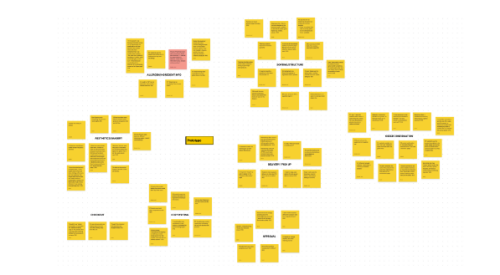
Our team conducted affinity diagramming to organize the qualitative data collected during the study (see Appendix 4.4, figure 8).
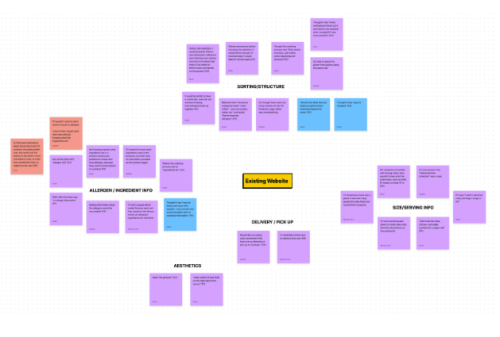
Four significant issues were noted by participants: unclear information, improper filtering/sorting, allergen identification, and product representation.
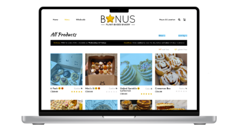
The first concern was that the deadline and delivery information was not consistently available (figure 9). P2 noted, “I wish that somewhere before choosing the selection, it would tell the amount of business days it would take for it to be ready.” Although this information was presented in the initial pop-up on the homepage, P2 had difficulty recalling this information when it came to selecting the delivery day they wanted.
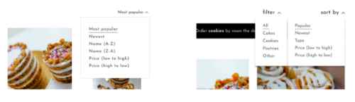
The second problem that participants ran into was the inability to use the sorting options on the All Products page effectively to find and select the correct products. Without the ability to filter products, C2 noted that the page could become a bit overwhelming. When asked what they would change about the ordering process, P2 said, “It just needs some organizing and structure”, and recommended adding categories (e.g., cookies, cakes) on the All Products page. C1 also expressed an interest in adding a filter by product type option, as they initially tried to use the sort tab to view only cake products.
The third and most critical concern was the lack of allergen and ingredient information, as shown in figure 10. Participants emphasized the importance of knowing ingredient information, with P1 saying “I don’t think I would order from here without knowing what the ingredients are” and P2 noting that they would either call the bakery to confirm the ingredients or end up not ordering.
The fourth issue involved overall visual and graphical inconsistencies. For instance, when looking at the Naked Sprinkle Collection cake, many participants were unsure of the serving size. As a prospective customer who had never visited the website, P1 said “I actually don’t know how many it feeds”. On the other hand, as a current customer, C1 remembered previously seeing information about how many people Bonus Bakery’s cakes feed, but could not find it on the product page. While C1 was correct in remembering that other pages like the Bonus Cake Collection provided this information, this is not consistently shared across all product pages.
4.6 Limitations
One limitation of the study was the inability to have participants fully complete the order process (construct and external validity). To protect user privacy, participants were asked to stop their task once they reached the customer information page. Since the study would be recorded, we did not want participants to share their personal information or payment details over Zoom. Additionally, we did not want participants to spend their own money to complete the study. As a result, we relied on the findings from the heuristic evaluation and customer feedback survey to pinpoint areas of improvement for the checkout process.
5. Website Redesign: Prototype
Based on the data collected from our team’s heuristic evaluation, the customer feedback survey, and the usability studies on the existing website, our team created an interactive Figma prototype with our recommended changes (see Appendix 2.3.1). Key changes included the addition of static cards on the homepage with delivery and deadline information (figure 11), product filters, revamped product pages with more photos and information about key ingredients and serving sizes, and the relocation of the delivery/pickup selection to the checkout page.
5.1 Pilot Study
Using this first draft of the prototype, a pilot study was conducted with a peer to gather initial feedback on the design, identify any bugs in the prototype, proofread the content, and ensure the tasks could be completed in a timely manner (see Appendix 3.1.2). This allowed us to address any improvements to the prototype before testing with real users so as to not waste their time.
5.2 Refined Prototype
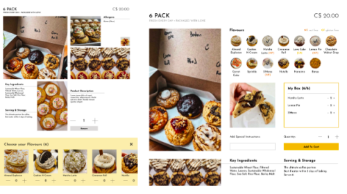
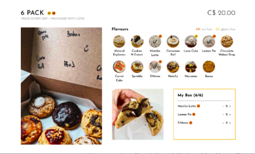
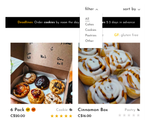
Based on the feedback from the pilot study, our team created a refined prototype (see Appendix 2.3.2). Key changes included reducing the amount of content on the homepage by moving the hours and location information to a separate tab, adding a banner at the top of the product pages with the delivery and deadline information to make it more accessible, improved product filters (figure 12), and a simplified flavour selection process (figure 13).
6. Usability Study: Prototype
Using this refined prototype, our team conducted eight think-aloud usability studies with current and prospective customers, with a process similar to the first round of studies conducted on the existing Bonus Bakery website.
6.1 Participants
Participants included four current customers who were recruited through the customer feedback survey and through a call-out on Bonus Bakery’s Instagram story, as well as four prospective customers who were recruited through the “Plant-Based Vancouver” Facebook group.
The four current customers (C3, C4, C5, and C6) had ordered from Bonus Bakery before. C3 and C5 were between 35 and 44 years old, C4 and C6 were between 25 and 34 years old, and all four participants were more accustomed to placing orders on the website’s mobile interface.
The four prospective customers (P3, P4, P5, and P6) had never ordered from Bonus Bakery before. P3 and P5 were between 18 and 24 years old, P4 and P6 were between 25 and 34 years old, and all four participants typically ordered food online using a mobile device.
One limitation of the participant recruitment process was that all eight participants were more familiar with ordering food on a mobile device, and none of the respondents who frequently used a desktop interface belonged to our target audience or were available on our study dates. Nonetheless, we needed to conduct the studies on a desktop device to ensure that all features of the prototype would work and the participant would be able to share their screen.
6.2 Methodology
The environment, study method, and data collection methods for the usability studies conducted on the prototype were the same as the usability studies conducted on the existing website, described in Section 4.2 to 4.4. The only key changes were the study tasks, which were modified to align with the functional capabilities of our prototype. The tasks were:
Recently, you’ve discovered Bonus Bakery on Instagram and would like to try their cookies. As a huge fan of sweet and salty treats, you’d like to try something with pretzels in it. Since you don’t have time to go to the store this week, you would like the cookies delivered to your home as soon as possible. What item do you order, and what is the delivery date?
Your best friend’s birthday is coming up, and you would like to surprise them with a personal mini cake from Bonus Bakery. You’ll be seeing them on Thursday night, and you would like to pick up the cake in-store beforehand. Your friend also has a gluten-free diet. What cake do you order, and what is the cost?
On Thursday, you will be attending a small get-together at a friend’s house and you would like to bring a variety of cookies to share. You have a budget of $30, and you know that your friend has a nut allergy. You won’t have time to pick up your order in store, so you’ll need to pick a delivery date that ensures you get your order before the party. What is the delivery date, and what is the cost after shipping and tax?
6.3 Results
Affinity diagramming was conducted to review the qualitative data collected during the study, with a majority of comments supporting our recommendations (see Appendix 4.4, figure 14). In particular, participants liked the addition of allergen and ingredient information, improved filter and sorting options, and simplified delivery and pickup selection process, with P3 noting in their post-test questionnaire that they “liked the large, clear options for pick up and delivery options”.
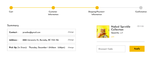
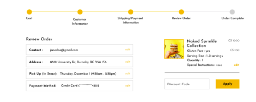
Participants also provided two key points of feedback. First, some participants noted that the Order Overview in the checkout process was a bit ambiguous, as the prototype did not include complete order details. Additionally, participants C4, P3 and P6 all expressed interest in seeing more information about the product on this page, such as whether the gluten-free option was selected for the Naked Sprinkle cake (figure 15).
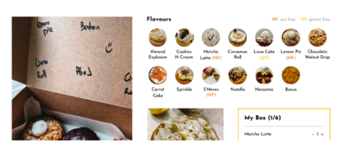
Another point of feedback was related to the addition of nut-free (NF) and gluten-free (GF) indicators on the prototype. All eight participants successfully used the nut-free indicator to select the appropriate cookie flavours for their task, as it provided quick information about potential allergens in the products. However, P3 wished that the NF label would also appear next to the flavours selected in their box (figure 16), and C6 and P6 wanted to see the NF labels on the Order Overview page as well to confirm that they selected the correct flavours.
6.4 Limitations
The most impactful hindrance of our study was the limited functionality of the prototype. Due to the short timeline of our project as well as the limited features offered by Figma’s prototyping tool, the prototype was not fully functional. Only a few user paths were fully interactive (figure 17), and participants often tried to click on non-functional elements in their exploration of the site. This caused confusion for some participants and may have inadvertently affected their experience with the new design. By further fleshing out the prototype’s functionality, we would be more certain that participant dissatisfaction comes from the design itself (internal validity).
Another limitation was a lack of environmental control due to conducting the study over Zoom. Although this made the study more accessible for participants, the inability to standardize the devices used to explore the prototype created a few unforeseen issues. For instance, although participants were asked to join on the video call on a desktop device, some participants ran into technical difficulties while using laptops with touchscreens or Google Chromebooks. While beneficial in seeing the design’s performance on different interfaces (external validity), the inconsistency in devices hindered our understanding of the user’s experience with a prototype lacking in robustness (internal validity).
7. Final Prototype
Based on the feedback collected during the usability study with the prototype, our team made a few minor changes to refine and finalize the design (see Appendix 2.3.3).
First, we moved the order review section to its own page, and added more detail to the order summary information regarding gluten-free options and flavours selected, serving sizes, and special instructions (figure 18).
We also updated the look of the nut-free (NF) and gluten-free (GF) indicators to be more prominent and added the tags in a consistent fashion across the site (figure 19).
8. Conclusions and Discussion
8.1 Final Recommendations
In summary, our team has highlighted three key recommendations to optimize the online ordering process on the Bonus Bakery website.
Recommendation 1: Product Sorting and Labeling
In the usability studies conducted on the existing website and prototype, participants expressed a need for more clarity on important product attributes, such as potential allergens and product types (e.g., cookies, cakes, pastries). To address these information needs, we recommend adding nut-free and gluten-free tags to appropriate products, labeling each bakery item with its product type, and adding a filter by type feature on the All Products page (figure 20).
Recommendation 2: Product Details and Information
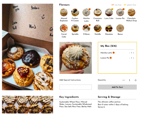
Participants also indicated a need for more general details about each product when considering making a purchase. To assist customers in their decision making process and ensure products meet their needs, we recommend adding ingredient and serving size information to each product page, including a larger variety of photos to showcase different options, and implementing a button interaction as opposed to a text box input method for flavour selection (figure 21).
Recommendation 3: Refined Checkout Process
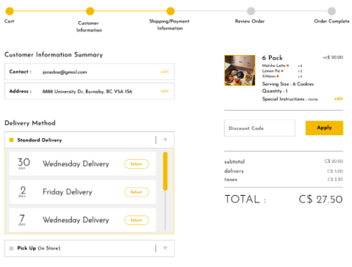
Finally, participants wanted more assurance that their order details would be correct before placing their order. To give customers more confidence in their purchase decision, we recommend providing a clear order summary with important product details as a separate page in the checkout process, moving the delivery and pickup selection to the shipping/payment page, and refining the progression bar at the top of the checkout pages to better indicate which steps have been completed and where customers are in the process (figure 22).
8.2 Next Steps
Moving forward, the next steps towards optimizing Bonus Bakery’s online ordering process would be to create a fully functioning prototype and run another series of usability studies with more tasks and room for user exploration. Based on the feedback from the studies, the prototype would then be refined and converted into a web product, which would be launched to the public. After some time, another customer feedback survey could be used to gather summative data and insight into customers’ experience and satisfaction with the redesigned site.
8.3 Key Performance Indicators
In addition to feedback from the customer survey, digital analytics could be used to measure the success of the redesigned website. Key performance indicators would include an increase in website traffic and conversion rate, and a decrease in cart abandonment and bounce rate.