Brodovitch Magazine Design
magazine spreads with graphic design principles in mind
Skills
Graphic Design Principles
Photography
Collaborators
Individual
Tools
Adobe Illustrator
Adobe Photoshop
Brodovitch Magazine Design
magazine spreads with graphic design principles in mind
Skills
Graphic Design Principles
Photography
Collaborators
Individual
Tools
Adobe Illustrator
Adobe Photoshop
Inspiration
These magazine spreads were inspired by the fashion magazine designer, Alexey Brodovitch. He was famous for his simplistic graphic design that allows the "hotspots" of the model to lead the readers eyes across the elements of the page. These spreads attempt to mimic that design approach using graphic design principles. (Hotspot of a photograph - usually the face of the model/the spot that one would look at first)
Alignment
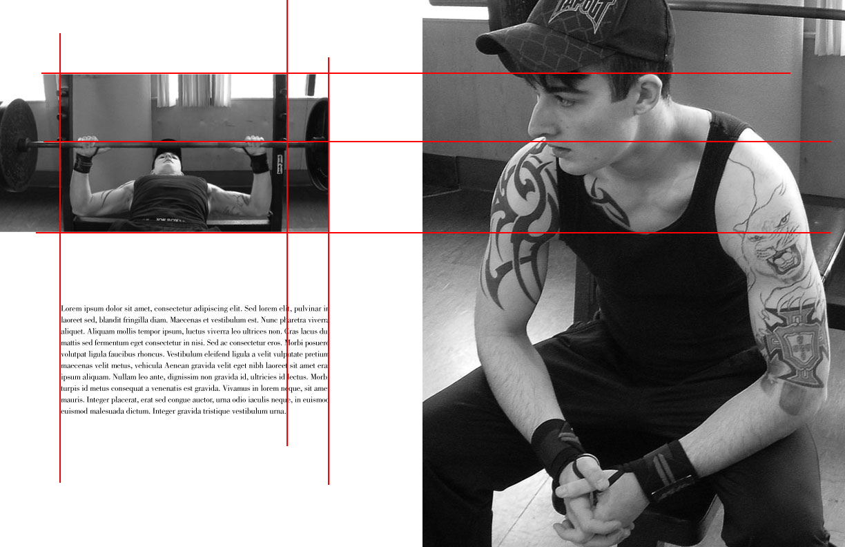
This is the second spread of the magazine project and it shows a great example of how I used alignment to mimic Brodovitch's technique. The "hotspot" of the large photograph is the model's face and neck; I used it to align the second photograph on the left page. I then used the elements of the second photograph, to align the body of text. This strategy will lead the reader's eyes around the page, creating a visual connection for every element.

Balance & Contrast
For the cover, I used a full bleed photograph and typography to give balance and structure to the spread. The light color tone of the model on the left and the black text on the right provides a contrast in elements. This creates a sense of balance in the spread, despite the difference in "weight" from the two elements.
Learning Outcomes
Following Brodovitch's design approach, I was able to effectively apply Graphic Design principles to simple elements (photograph & text) to create my spreads. I also learned how to take strategic photography to aid in my design; we were required to choose our own model and take our own photos. From this project, I am able to use my practices in graphic design to improve my proficiency with other aspects of design, such as web design.


