Chapter Contents
Previous
Next
|
Chapter Contents |
Previous |
Next |
| Managing Results in Projects |
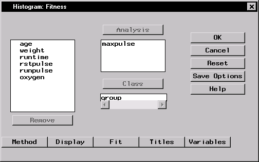
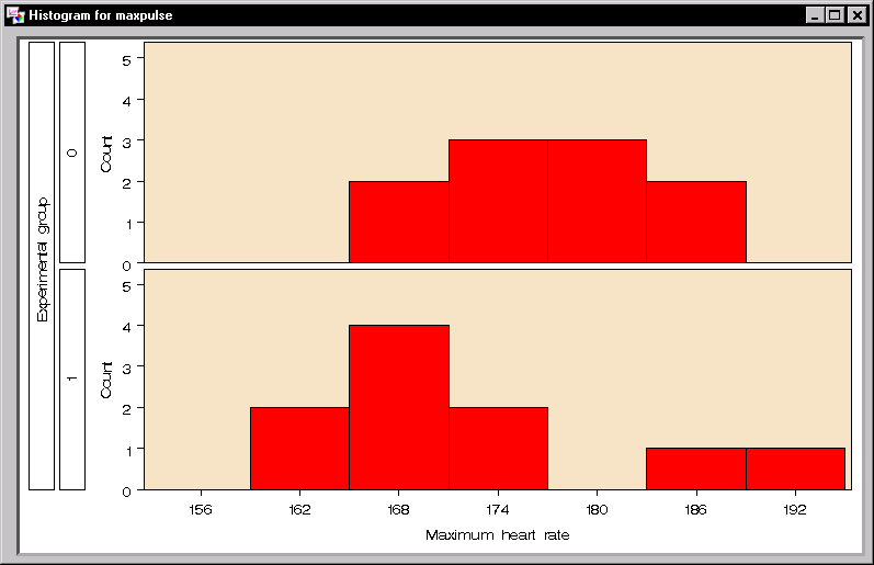
Histograms display the distribution of a particular variable over various intervals, or classes. You can use histograms to see the shape of the distribution and to determine whether the data are distributed symmetrically. A comparative histogram is produced if you specify a classification variable.
To generate comparative histograms of maximum heart rate for each experimental group from the Fitness data table, follow these steps:
|
|
|
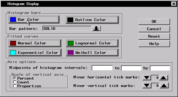
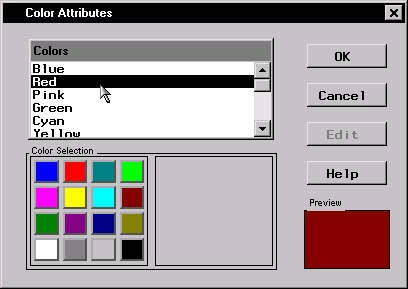
Click OK to change the bar color to red.
|
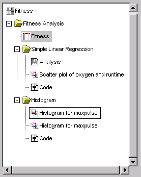
The histograms and the code that produced them have been added to the project tree.
|
|
Chapter Contents |
Previous |
Next |
Top |
Copyright © 1999 by SAS Institute Inc., Cary, NC, USA. All rights reserved.