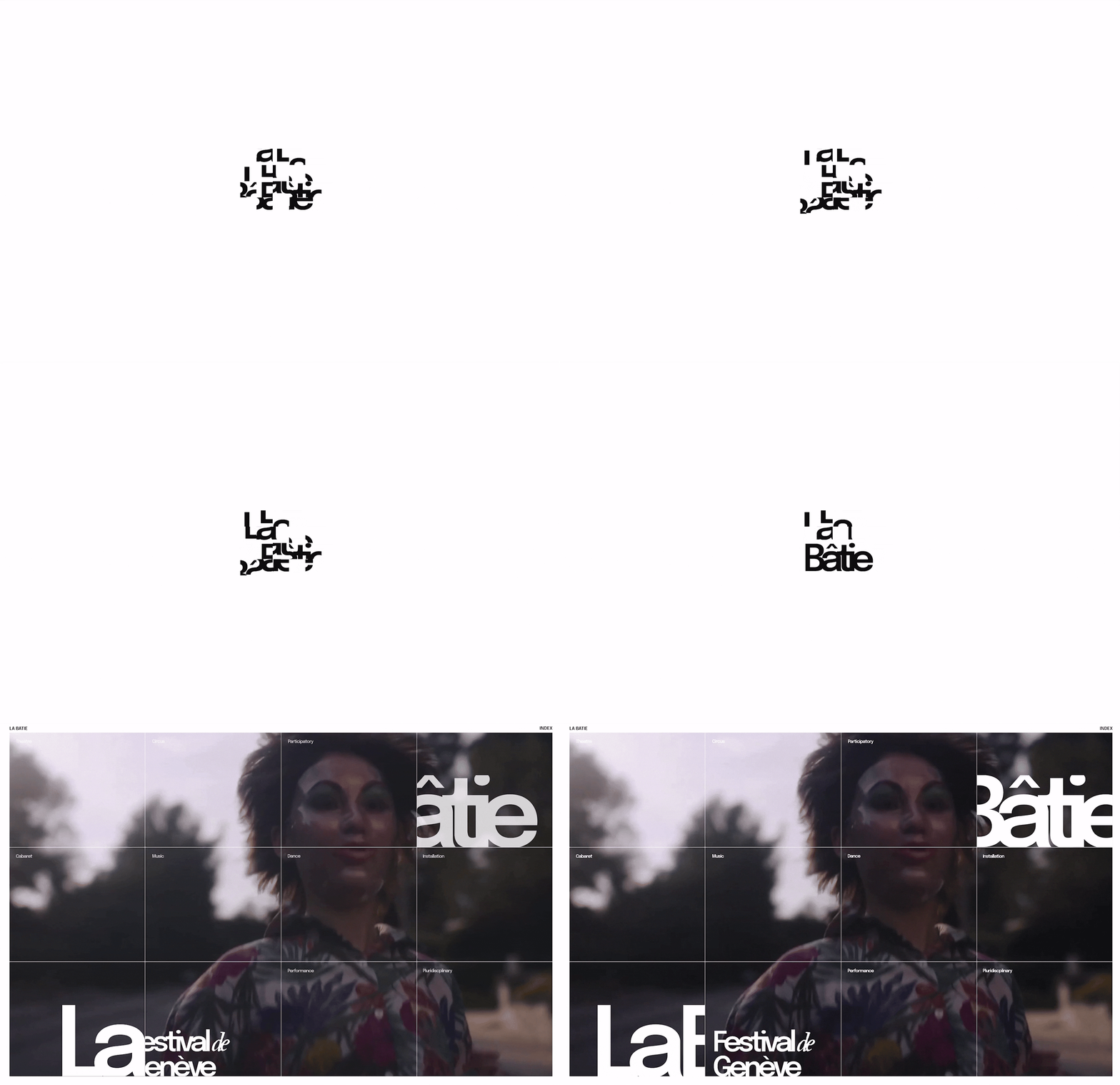
La Bâtie Festival Microsite
Off the Stage of the La Bâtie Festival Performers
Preserving festival’s momentum and fostering a lasting connection between artists and attendees beyond the event.
Preserving festival’s momentum and fostering a lasting connection between artists and attendees beyond the event.

5 Weeks (Feburary - March 2024)
Product design
Interaction design
Content strategy
Prototyping
Figma
Adobe Photoshop
Raymond Co, Christy Fang, Lori Jiang, Min Kang
Our team was tasked to craft a cohesive visual identity for a festival integrating content, interactions, and visuals across graphic assets and a microsite.
The central goal was to enhance the festival experience, while the visual identity was to be guided by art directions rooted in design qualities and principles from provided resource and precedent designer (refer model below for more info).


La Bâtie-Festival de Genève is an annual 18-day festival in Genève, Switzerland. Featuring a mix of emerging and renowned international and local artists, it is dedicated to fostering artistic innovation and community engagement across multiple venues in the city.
I believed researching the festival’s context was essential, as every detail of its meaning, purpose, and traditions would shape a visual identity that was both contextually relevant and culturally resonant, creating a more meaningful experience in our final product.


Beyond exploring the festival itself, I analyzed its website, which primarily served as a pre-event platform for ticket sales and general information. While it included performance overviews and artist social link or images from previous festivals, it lacked elements that fostered deeper connections between audiences and artists.
*Recognizing this gap became a key opportunity later in the process, allowing me to propose ways to guide the content strategy.
With numerous artists and performances, limited opportunities exist to foster deeper engagement on the website, potentially reducing the long-term impact.
While researching the client, we also analyzed the design qualities and principles from the provided resources. Through iterative process of image grouping other professional works, and adjusting these qualities and principles, below are the final five:

By mixing and matching the final five design qualities and principles, we developed three distinctive lines of art directions: one poster, poster in context, and two physical assets.

One of the best mock-up creation teams. The application rationale and context are clear and memorable, especially the face paint, bus, and photo booth.


Despite strong graphic work, we struggled to translate it into a microsite. To address this, I led the team in prioritizing content structure, emphasizing post-festival engagement based on my previous insights.
The shift from designing the microsite first to prioritizing content and user flow not only streamlined development but also helped to shape our final visual identity.

Post-festival microsite that offers an intimate glimpse into artists' creative processes and personal passions. By facilitating deeper connections, it bridges the gap between visitors and artists, fostering lasting engagement beyond the festival.


If I were to revisit this project, I would explore a feature allowing visitors to contribute their own photos and videos. This would turn the microsite into a digital keepsake, preserving festival memories in a more interactive and personal way.