Chapter Contents
Previous
Next
|
Chapter Contents |
Previous |
Next |
| Labeling Observations |
| Open the GPA data set. |
| Choose Analyze:Scatter Plot ( Y X ). |
This displays a scatter plot variables dialog,
as shown in Figure 8.2.
| Select SATM and SATV as X variables and GPA as the Y variable. |
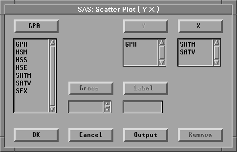
| Click the OK button. |
This creates two scatter plots, as shown in Figure 8.3.
| Click on an observation in one of the plots. |
The observation is highlighted in both plots,
and a label appears beside the observation
in the plot in which you clicked.
This label is temporary;
it disappears when you deselect the observation.
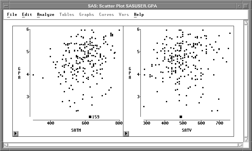
You can turn this label into a permanent label.
| Choose Edit:Observations:Label in Plots. |
This labels the observation in all plots, and the
label remains if you deselect the observation.
![[menu]](images/labeq1.gif)
Figure 8.4: Edit: Observations Menu
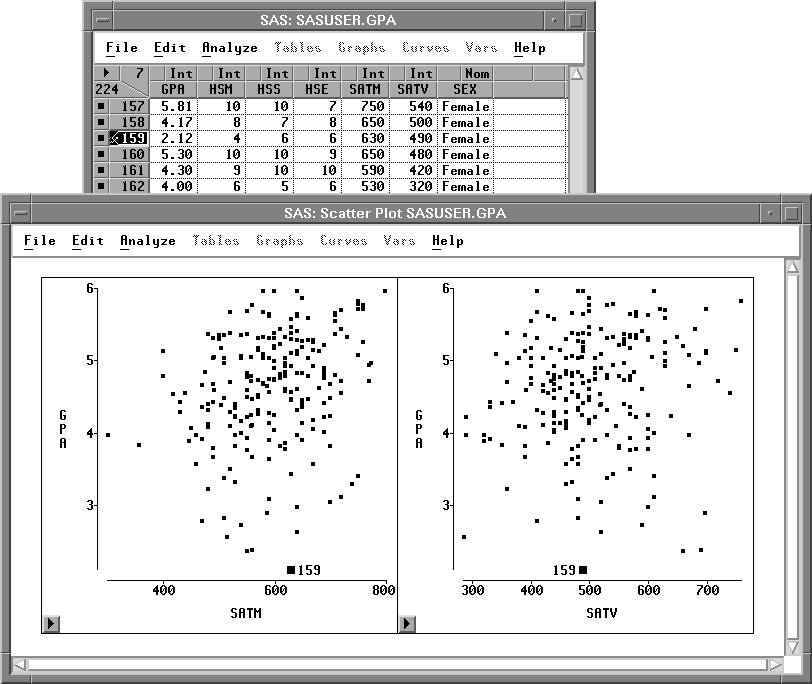
Notice in the data window that the observation is displayed with a picture of a label. This indicates that a label will always be displayed for this observation in all plots.
If you change your mind, you can remove the permanent
label by choosing Edit:Observations:UnLabel in Plots.
|
Chapter Contents |
Previous |
Next |
Top |
Copyright © 1999 by SAS Institute Inc., Cary, NC, USA. All rights reserved.