Chapter Contents
Previous
Next
|
Chapter Contents |
Previous |
Next |
| Hiding Observations |
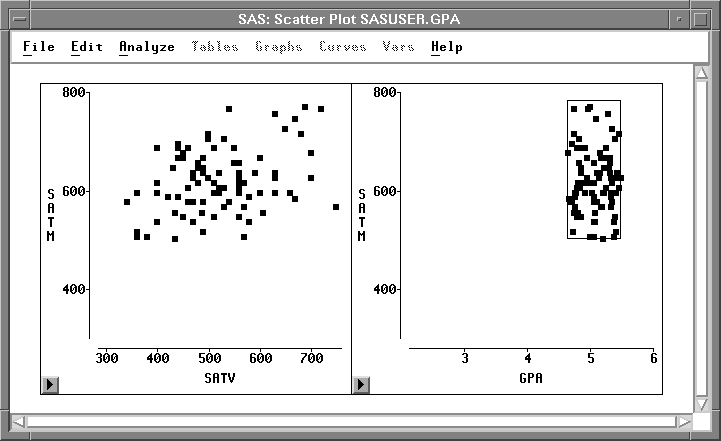
Follow these steps to see how GPA is related to the two SAT scores.
| Drag a rectangle with the mouse in the scatter plot of SATM versus GPA. |
This selects the observations within the
rectangle and creates a rectangular brush.
| Move the brush by dragging with the mouse inside the brush. |
Observations that are selected by the brush become visible
in both scatter plots. The second plot shows the conditional
distribution of the data as restricted by the position of
the brush in the first plot.
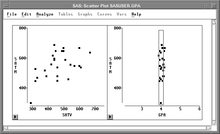
| Drag the corners of the brush to make it tall and thin. |
This restricts selected observations
to a narrow range of values for GPA.
| Move the brush to the left and right. |
The scatter plot of SATM versus SATV in
Figure 9.16 shows the joint distribution
of the two SAT scores when GPA is near 4.0.
By sliding the brush, you can see whether the distributions
change significantly as GPA increases or decreases.
| Use the scatter plot pop-up menu to make observations visible again. |
![[menu]](images/hideq3.gif)
Figure 9.17: Scatter Plot Pop-up Menu
|
Chapter Contents |
Previous |
Next |
Top |
Copyright © 1999 by SAS Institute Inc., Cary, NC, USA. All rights reserved.