How can we bring branding guidelines to its breaking points?
ISEA2015 (International Symposium of Electronic Arts) is an international nomadic conferences dedicated to showcasing electronic art. It is a non-profit organization that fosters interdisciplinary academic discourse and exchange among culturally diverse organization and individuals working with art, science and technology. From Aug 14-19 2015, it was held in Vancouver, inviting over 200 artist from around the world to display their work to thousands of people under the theme of ‘Disruption’.
My Role
I had the opportunity to work with as the head web coordinator and graphic designer for this conference. I works with a number of web designers, and as the head UX designer redesigned the initial site to be more inviting and user friendly, accurately reflecting the brand of this year's ISEA conference on their products. Though, the initial theme was not done by myself, the designs and how it was implemented into the products was done by myself.
Skills Used
Graphic design
Illustrator
Event planning
My Web
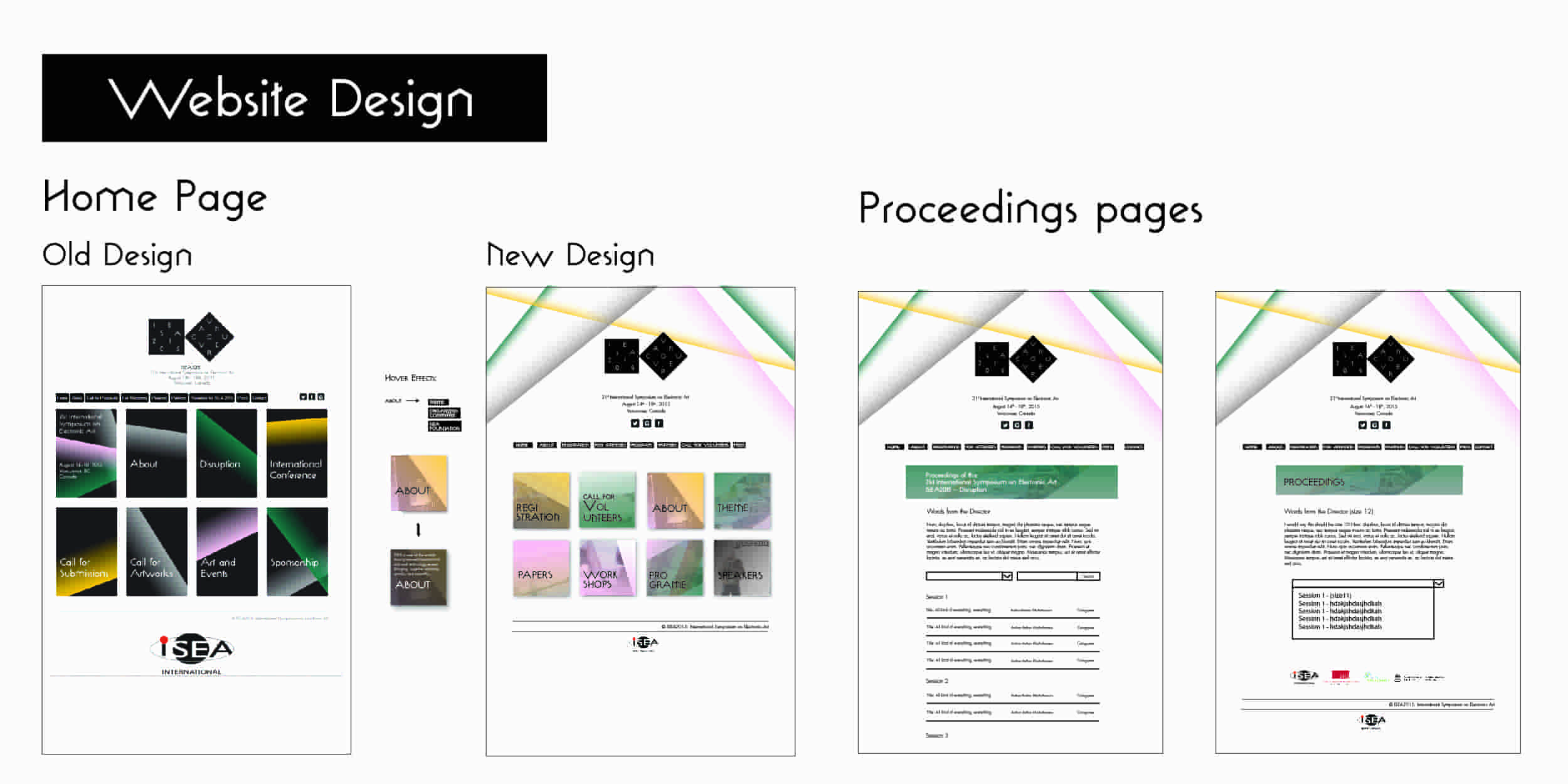
When I joined the team, ISEA2015 was already well on its way. I was able to rally and head a team of web designers to revamp the website to show a lighter atmosphere and pull it away from its dark and out of date design. Along with the main website and updating all its content, we also worked to create a proceedings database, a full listing of all the papers and research articles that was presented at the conference, available for viewing indefinitely. The ISEA2015 proceedings joined the leagues with all its previous conferences proceedings predecessors as it went live on the last days of the conference. The website can be found HERE
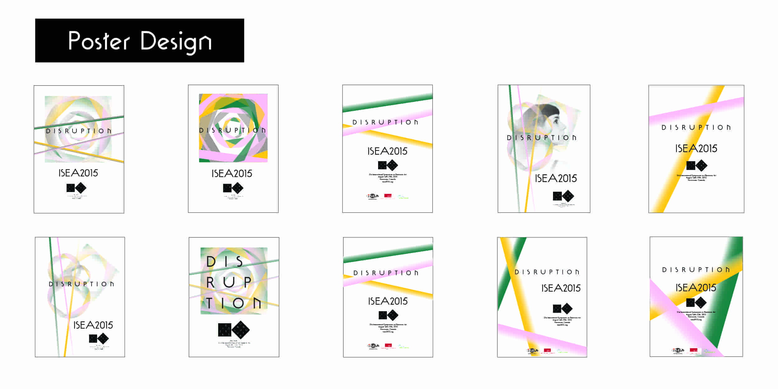
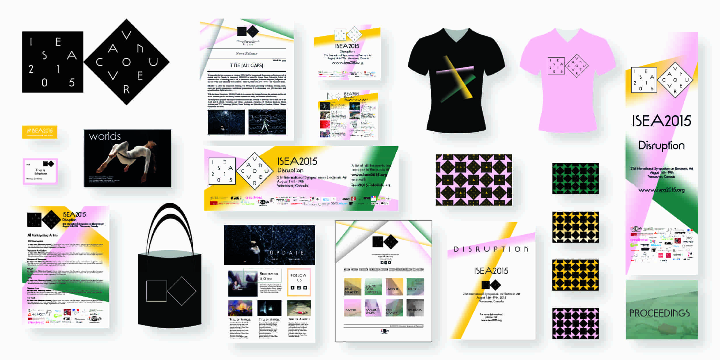
Besides the digital platform, there was a plethora of print products that were made from signs and banners to news releases and posters. I had went through a number of design for the conference chairs, and below are some of the samples. It was a thorough exploration of design direction and understanding what clients what and needed out of each product. I tried to maintain the simple, clean and striking look that ISEA stood for while still playing with what we could.
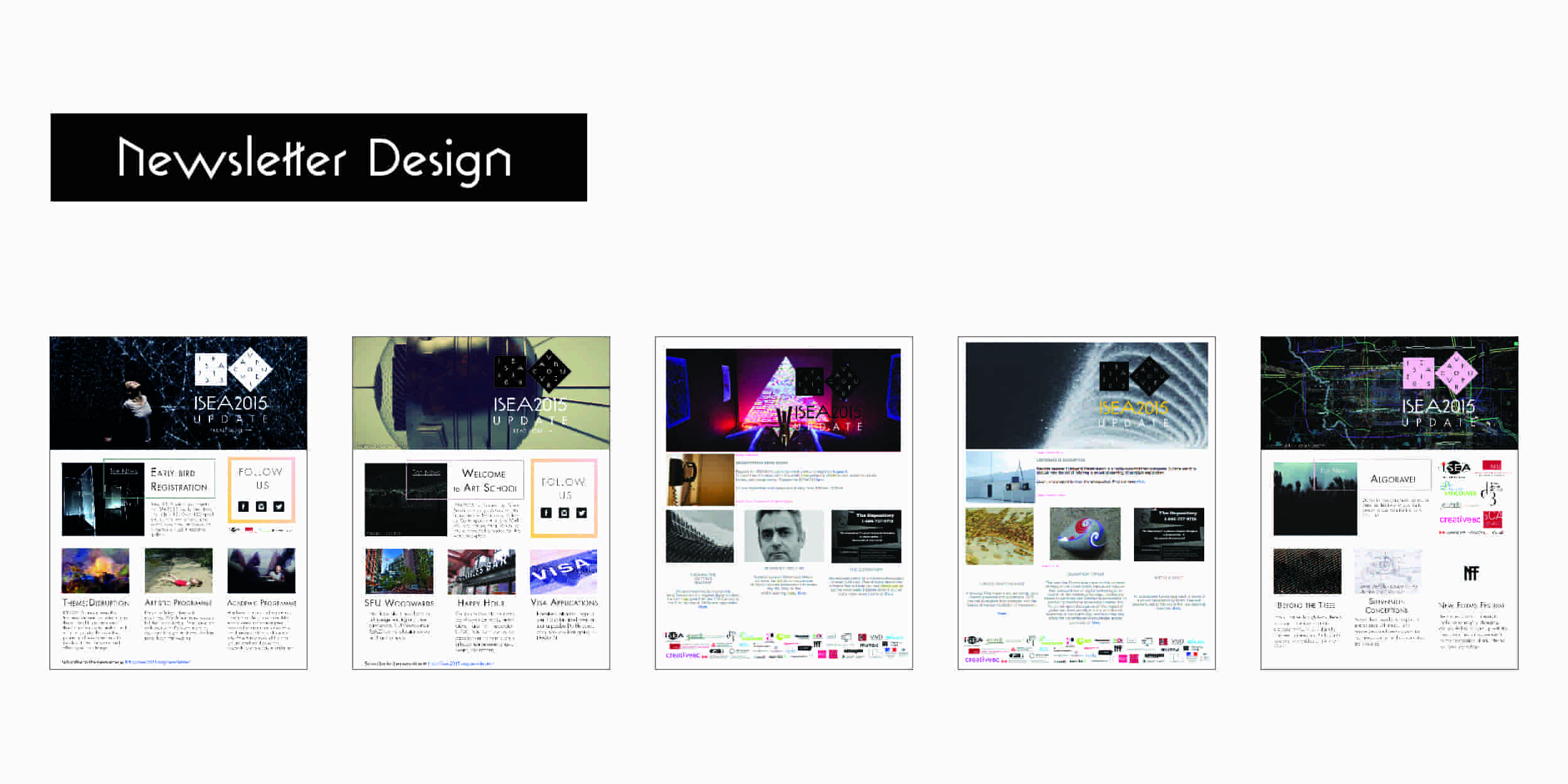
The newsletters took on more of a modern look, with emphasis on typography and attractive imagery. They most often features the work of artist that were participating in the conference paired with sharp colors and geometric frames.
Others
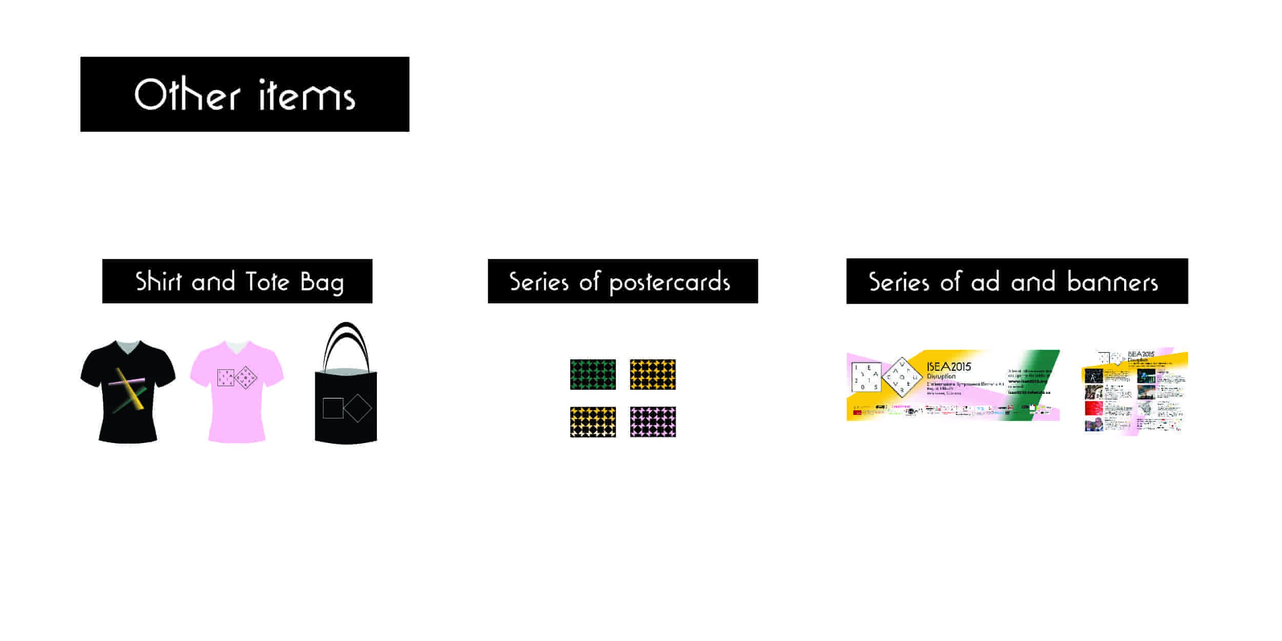
Other items that were design included T shirts and tank tops for volunteers and for conference go-ers to purchase, a series of postcards that promoted the conference as it began its approach to build anticipation along with a series of ads that were places in Beatroute Magazine, the Georgia Straight and the 24hr news papers.
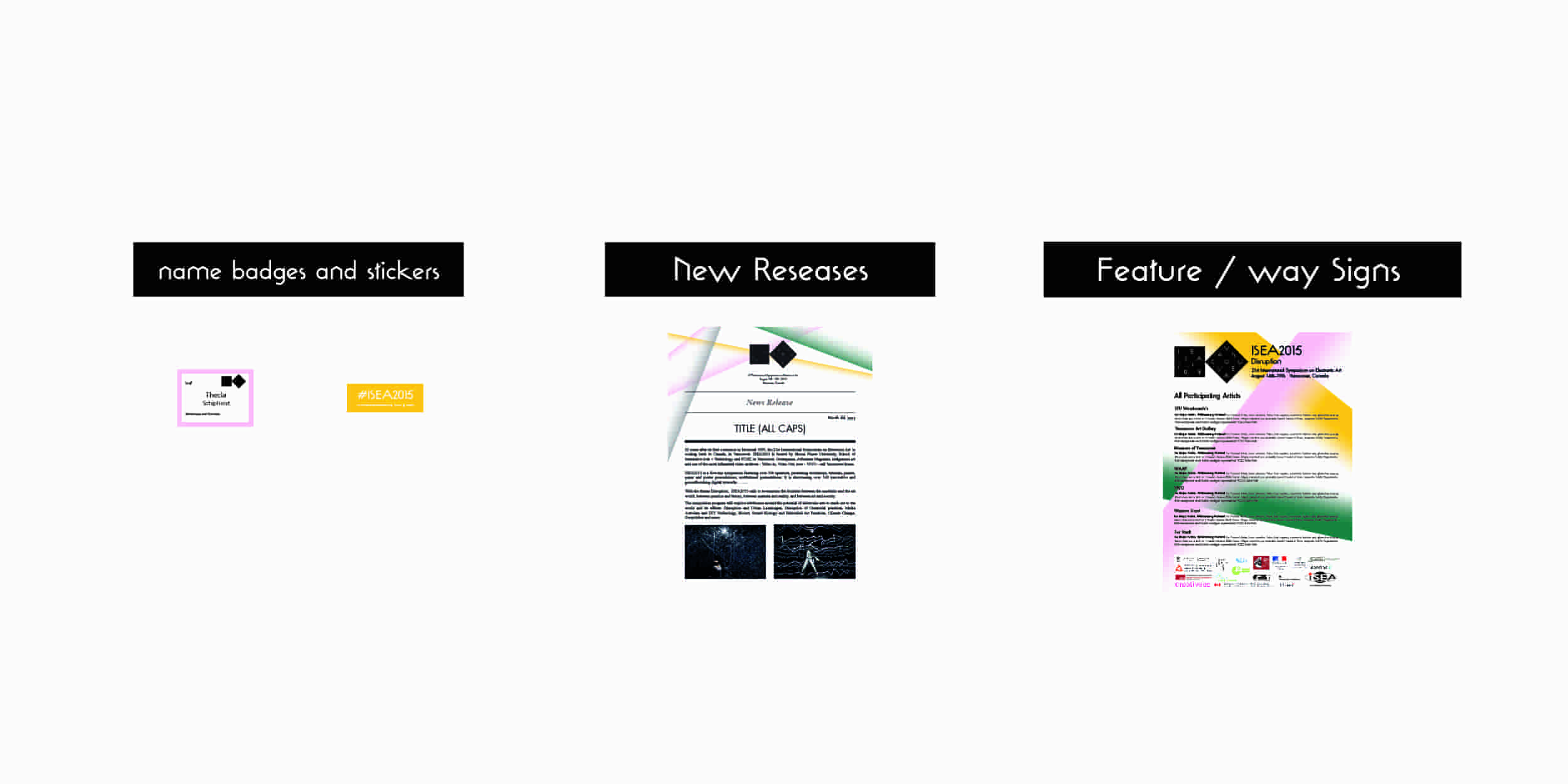
On more of a logistics note, I designed all the conference badges which each participant received. I organized and put together news releases for local news, media outlets and also design all wayfinding and presentation signage for the actual event along with a series of banners that hung from the Woodwards building and within its walls.