Leica M-System project is a mobile and tablet application that connects potential customers with Leica’s values while promoting confidence in using their products. The application encourages potential and existing customers to immerse themselves Leica’s stories, while they explore and test drive a variety of Leica M products.
Project role: Research, wireframes, interface design, information design, visual design
Team: Madison Sim, Rex Shi, Tony Jing, Aaron Law, & Marina Khvan
Tools: Illustrator, InDesign, Sketch, Photoshop
the problem
Founded in Germany in 1849 as an optics manufacturer, Leica developed the world’s first portable camera. Owing to their compact, resilient design and superior capabilities, Leica M’s have been a standard for street photographers and photojournalists worldwide. However, perspective customers find it difficult to build personal connection with the brand due to Store scarcity(Customer cannot try a product before buying), Reputation for being complicated (due to its manual controls and stripped-down analogue features), and High cost (with its price tag of $8,000).
Reframing the problem
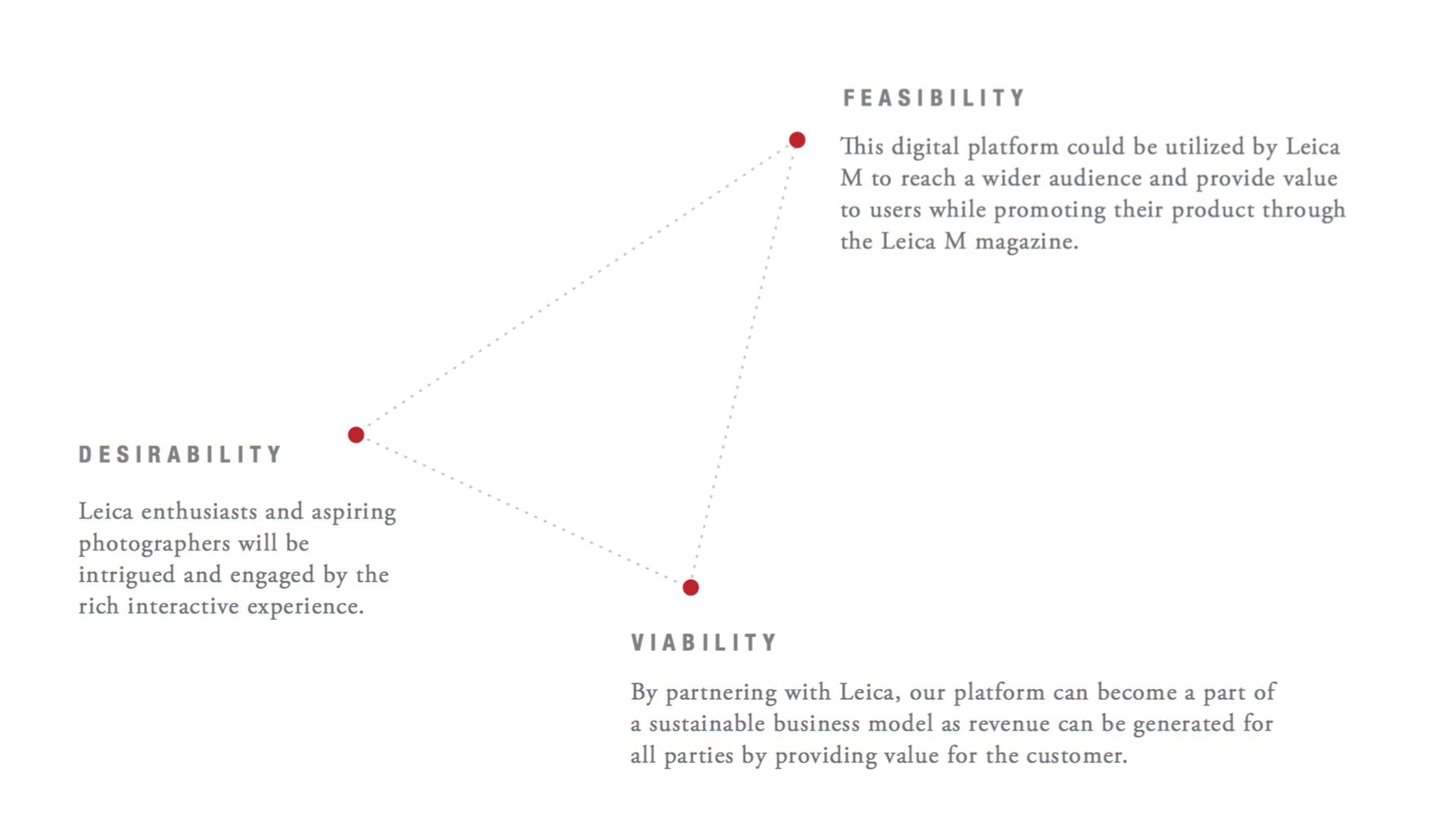
After considering some of the core issues and frictions facing the Leica M System, we asked ourselves: How can we connect people with the brand and give them confidence in buying Leica M? How can we clearly illustrate to users what sets the Leica M System apart from its competitors?
the opportunity
Leica M customers range from first-time users to hobbyist or professional photographers. With deep study in the needs and mindsets of our audience, we understood that the high cognitive overhead faced by users when they first use the Leica M presented a key friction that could be address through hands-on interactions. We also realized that the large and vibrant community of Leica photographers and their vast catalogue of stories and photos could supply engaging and content for the app.

the approach
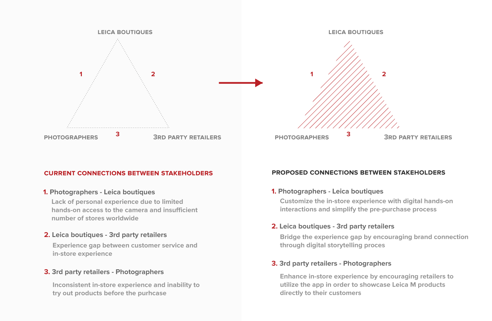
Stakeholder analysis
To begin addressing the friction, we organized research into a stakeholder’s map. Here, we examined the relationship between photographers, Leica stores, and third-party retailers.
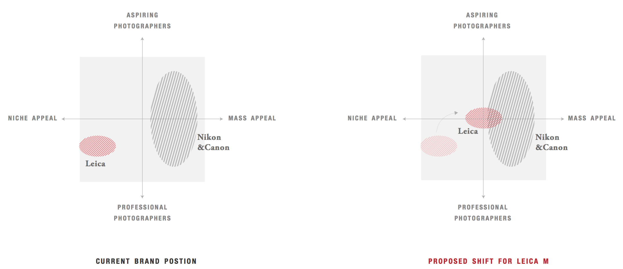
Brand positioning
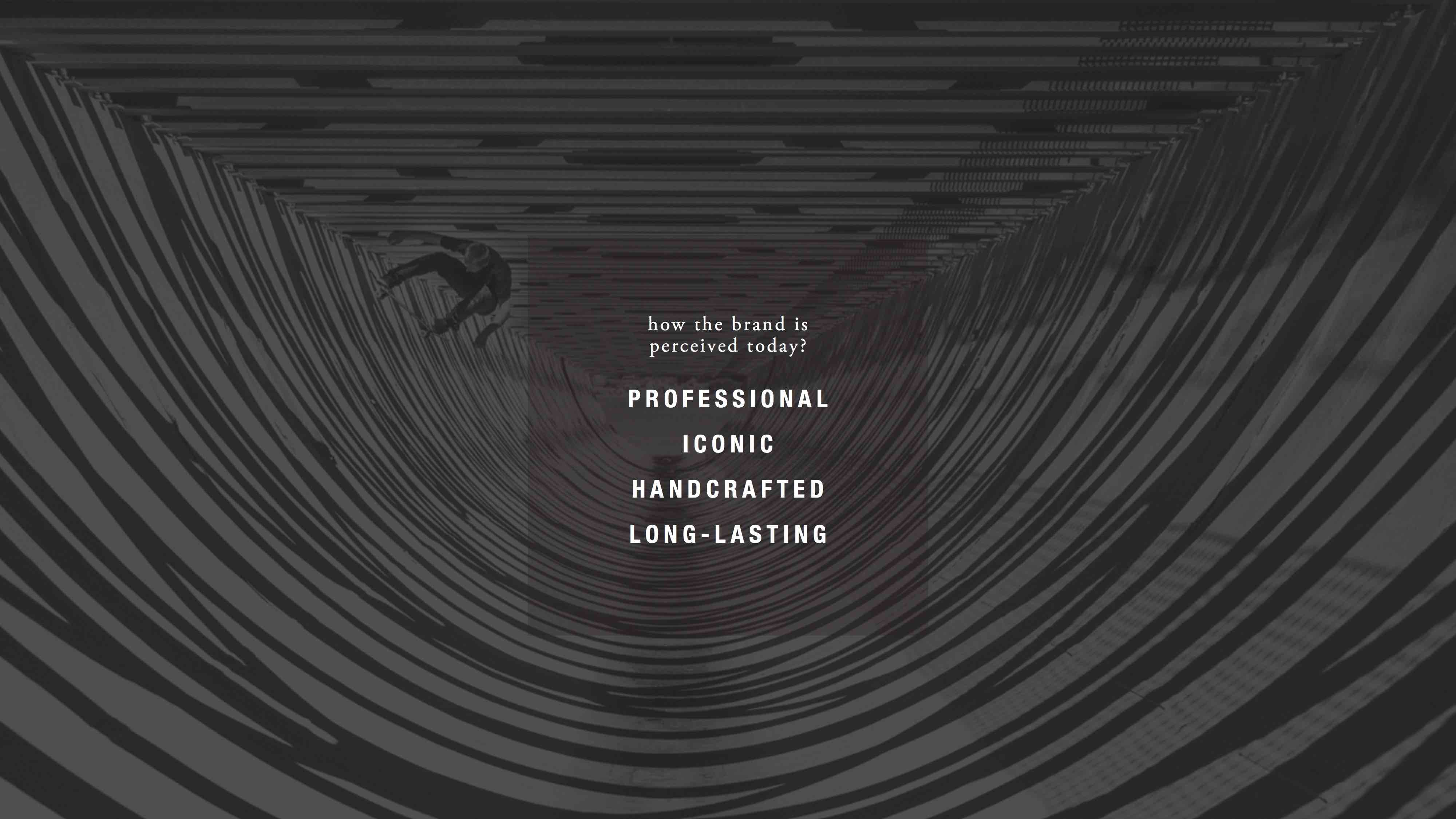
We then envisioned how this app can help improve Leica M’s brand position in the marketplace and among its competitors.
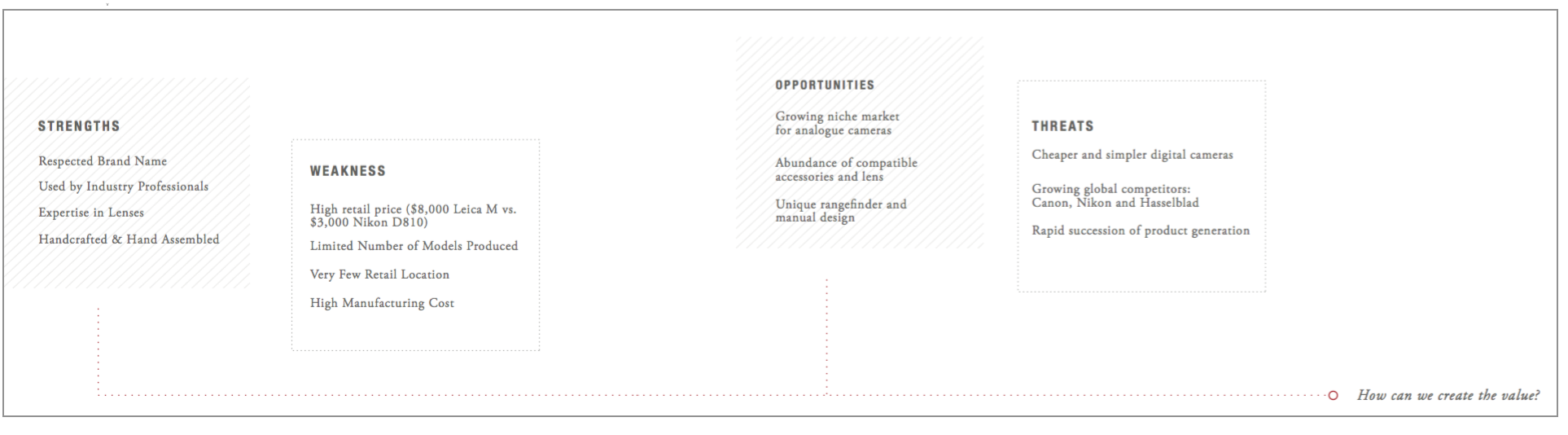
SWOT analysis
SWOT model (strengths, weaknesses, opportunities, and threats) was used to analyze Leica’s competencies and challenges in a more comprehensive way.
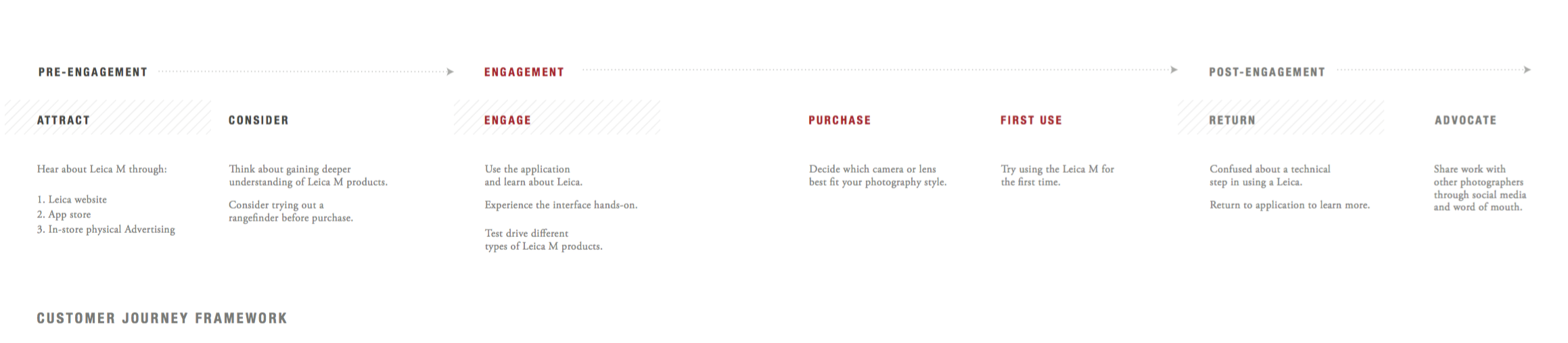
Journey Framework
We created journey frameworks that visually illustrate an individual customer’s needs, the series of interactions that are necessary to fulfill those needs, and the resulting emotional states a customer experiences throughout the process.
Value propositions
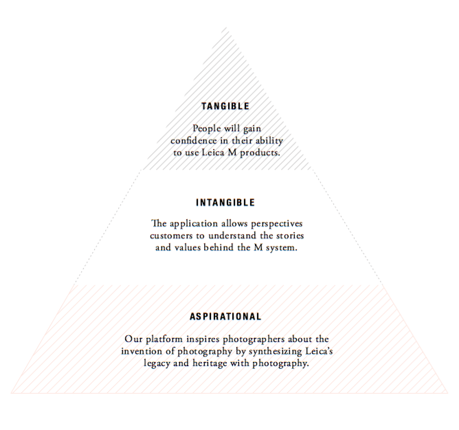
For Customers
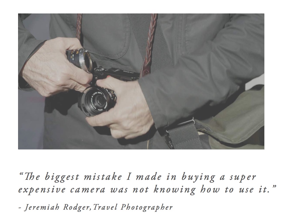
Through using this app, customers can understand the unique benefits of the M System while being introduced to Leica’s vibrant community. Enthusiasts of Leica can explore different lenses and models and be inspired from the rich content of the M Magazine.
For Business
The layout of the site deviates away from the rigid grid style seen on most ecommerce sites to foster a sense of authenticity. These interactions and experiences bring the focus back to the obey story.
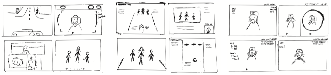
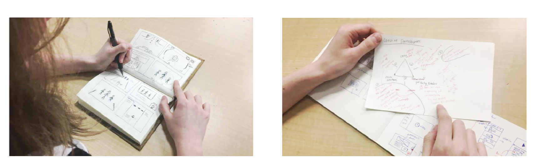
Form development
Sketching & Wireframing
Visual Branding
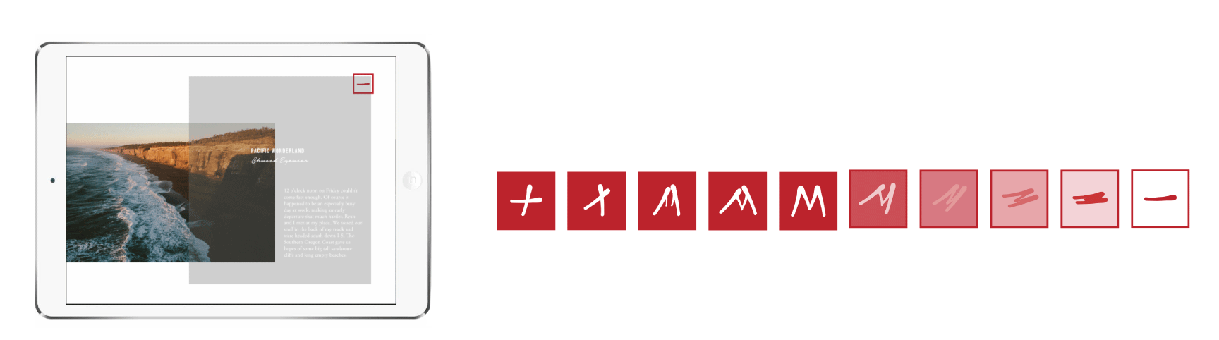
The design language used throughout our platform was inspired by Leica’s existing style which uses red, white, and black.
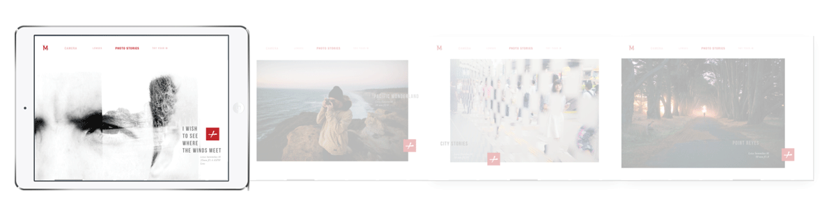
We included handwritten stroke icons to represent the human touch of the photographer and to symbolize the fact that Leica M cameras and lenses are handcrafted. The overlapping of the Photo Stories pages act as a metaphor for flipping through the pages of a magazine.
The calligraphy style of the button introduces the human element to the mechanical process of the Leica M system. Representing an organic but elegant aspect that can only be done by the precision of human hands.
Information architecture
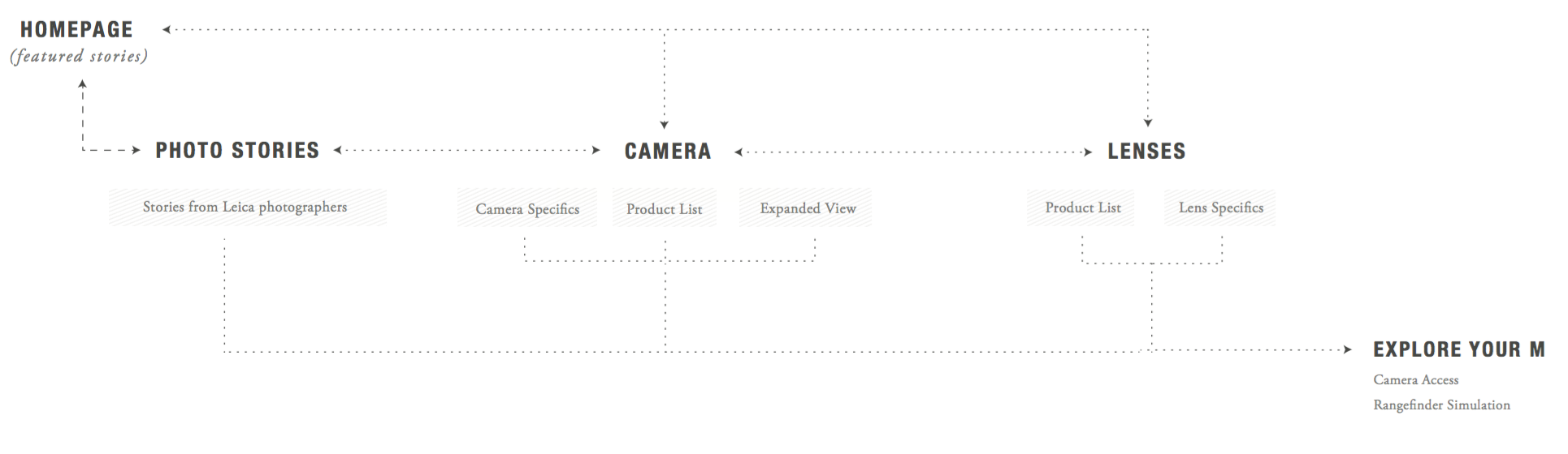
Interface Design
Swipe to find out Leica M stories
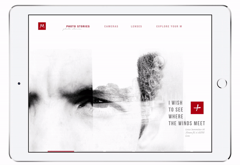
To read a specific story
Main Interactions
Swiping offers users the opportunity move through the app quickly to uncover additional information without a typical on-screen target to focus on. The action of swiping through stories from the side was inspired by the act of flipping through the pages of a magazine.
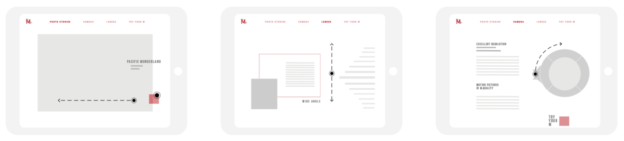
The ring(figure 3) used to switch between different M System model is based on the focus ring tab, unique to analogue cameras. As the users rotates this ring from side to side the image of the camera gets blurry, representing a change in focus.
Reflection
In developing this product, I gained a better understanding of digital experience design at every phase. Through research on the company we chose as well as our design domain, we made a number of insights that inspired continuous iterations on our application. We maintained a user-centric approach and designed our application with intent of providing long term value to the customers and business alike.