Chapter Contents
Previous
Next
|
Chapter Contents |
Previous |
Next |
| Working with Time Series Data |
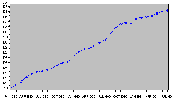
The following statements use the GPLOT procedure to plot CPI in the USCPI data set against DATE. (The USCPI data set was shown in a previous example; the data set plotted in the following example contains more observations than shown previously.) The SYMBOL statement is used to draw a smooth line between the plotted points and to specify the plotting character.
   proc gplot data=uscpi;
      symbol i=spline v=circle h=2;
      plot cpi * date;
   run;
The plot is shown in Figure 2.6.
|
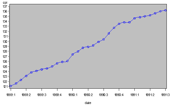
   proc gplot data=uscpi;
      symbol i=spline v=circle h=2;
      format date yyqc.;
      plot cpi * date /
           haxis= '1jan89'd to '1jul91'd by qtr;
   run;
The plot is shown in Figure 2.7.
|
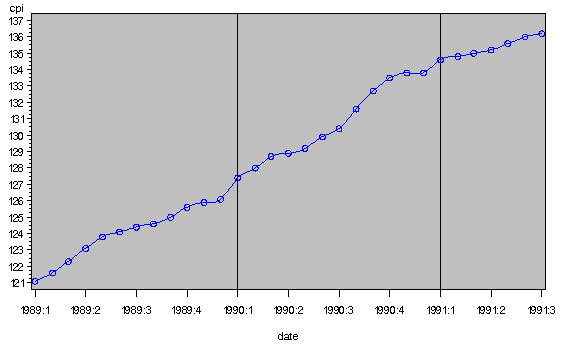
The following example changes the plot by using year and quarter value to label the tick marks. The FORMAT statement causes PROC GPLOT to use the YYQC format to print the date values. This example also shows how to place reference lines on the plot with the HREF=option. Reference lines are drawn to mark the boundary between years.
   proc gplot data=uscpi;
      symbol i=spline v=circle h=2;
      plot cpi * date /
           haxis= '1jan89'd to '1jul91'd by qtr
           HREF='1jan90'd to '1jan91'd by year;
      format date yyqc6.;
   run;
The plot is shown in Figure 2.8.
|
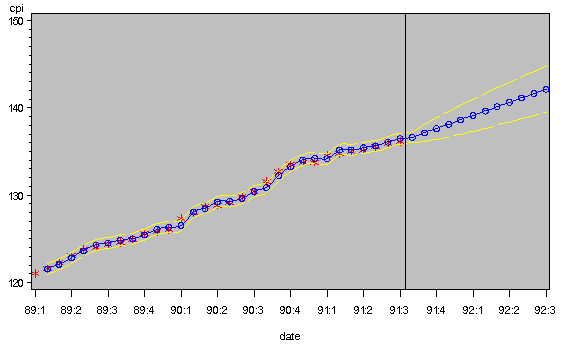
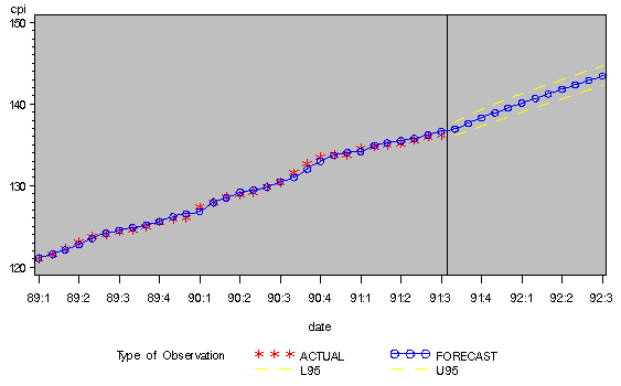
For example, the following statements plot the CPI, FORECAST, L95, and U95 variables produced by PROC ARIMA in a previous example. The SYMBOL1 statement is used for the actual series. Values of the actual series are labeled with a star, and the points are not connected. The SYMBOL2 statement is used for the forecast series. Values of the forecast series are labeled with an open circle, and the points are connected with a smooth curve. The SYMBOL3 statement is used for the upper and lower confidence limits series. Values of the upper and lower confidence limits points are not plotted, but a broken line is drawn between the points. A reference line is drawn to mark the start of the forecast period. Quarterly tick marks with YYQC format date values are used.
   proc arima data=uscpi;
      identify var=cpi(1);
      estimate q=1;
      forecast id=date interval=month lead=12 out=arimaout;
   run;

   proc gplot data=arimaout;
      symbol1 i=none   v=star h=2;
      symbol2 i=spline v=circle h=2;
      symbol3 i=spline l=5;
      format date yyqc4.;
      plot cpi * date = 1
           forecast * date = 2
           ( l95 u95 ) * date = 3 /
           overlay
           haxis= '1jan89'd to '1jul92'd by qtr
           HREF='15jul91'd ;
   run;
The plot is shown in Figure 2.9.
|
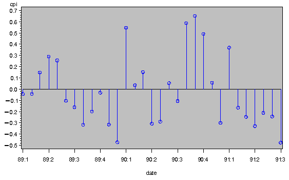
The following example plots the output data set produced by PROC FORECAST in a previous example. Since the residual series has a different scale than the other series, it is excluded from the plot with a WHERE statement.
The _TYPE_ variable is used on the PLOT statement to identify the different series and to select the SYMBOL statements to use for each plot. The first SYMBOL statement is used for the first sorted value of _TYPE_, which is _TYPE_=ACTUAL. The second SYMBOL statement is used for the second sorted value of the _TYPE_ variable (_TYPE_=FORECAST), and so forth.
   proc forecast data=uscpi interval=month lead=12
                 out=foreout outfull outresid;
      var cpi;
      id date;
   run;

   proc gplot data=foreout;
      symbol1 i=none   v=star h=2;
      symbol2 i=spline v=circle h=2;
      symbol3 i=spline l=20;
      symbol4 i=spline l=20;
      format date yyqc4.;
      plot cpi * date = _type_ /
           haxis= '1jan89'd to '1jul92'd by qtr
           HREF='15jul91'd ;
      where _type_ ^= 'RESIDUAL';
   run;
The plot is shown in Figure 2.10.
|
   proc gplot data=foreout;
      symbol1 i=needle v=circle width=6;
      format date yyqc4.;
      plot cpi * date /
           haxis= '1jan89'd to '1jul91'd by qtr ;
      where _type_ = 'RESIDUAL';
   run;
The plot is shown in Figure 2.11.
|
|
Chapter Contents |
Previous |
Next |
Top |
Copyright © 1999 by SAS Institute Inc., Cary, NC, USA. All rights reserved.