Chapter Contents
Previous
Next
|
Chapter Contents |
Previous |
Next |
| Coloring Observations |
| Create a scatter plot of GPA versus SATV. |
| Create a blue-to-yellow blend in the tools window. |
Drag the blue color to the left end of the multiple colors
button, and drag the yellow color to the right end.
| Select observations with values of GPA less than or equal to 4. |
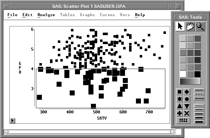
| Click the multiple colors button. |
This displays a variables dialog, as shown in Figure 11.8.
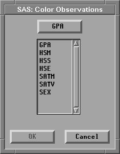
| In the variables dialog, select GPA, then click OK. |
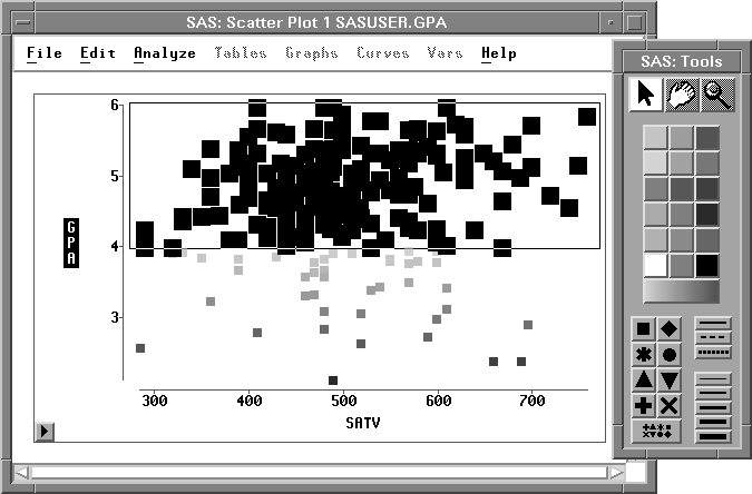
This assigns the blue-to-yellow blend to observations
with values of GPA less than or equal to 4.
You can use similar steps to assign a yellow-to-red blend to all observations with values of GPA greater than 4. To save time, select both observations and variables using extended selection instead of using the variables dialog.
| Create a yellow-to-red blend in the tools window. |
Drag the yellow color to the left end of the multiple
colors button, and drag the red color to the right end.
| Select observations with values of GPA greater than or equal to 4. |
| Using extended selection, select the variable GPA. |
| Click the multiple colors button. |
This assigns the yellow-to-red blend to observations
with values of GPA greater than or equal to 4.
Now all observations are assigned a color based
on their value for GPA, with colors smoothly
blended from blue through yellow to red.
Note | In addition to the two-color blends described above, you can create a blended color strip based on the interpolation of up to five colors. |
To do this, follow these steps:
|
Chapter Contents |
Previous |
Next |
Top |
Copyright © 1999 by SAS Institute Inc., Cary, NC, USA. All rights reserved.