Chapter Contents
Previous
Next
|
Chapter Contents |
Previous |
Next |
| Exploring Data in One Dimension |
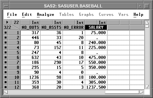
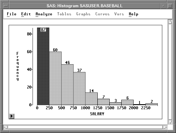
Interval variables contain values distributed over a continuous range. For example, in Figure 4.2 baseball players' salaries are stored in SALARY, an interval variable. To create a bar chart of players' salaries, follow these steps.
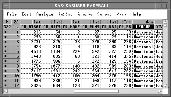
| Select SALARY in the data window. |
Scroll all the way to the right to find the SALARY variable.
Point and click on the variable name.
| Choose Histogram/Bar Chart ( Y ) from the Analyze menu. |
Figure 4.3: Creating a Bar Chart
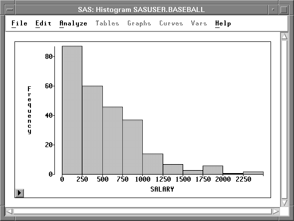
This creates a bar chart, as shown in Figure 4.4.
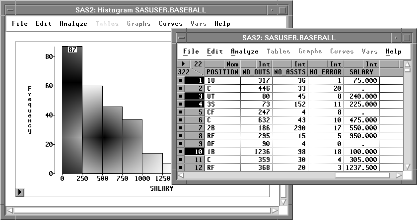
| Point and click on any bar. |
This labels the bar with its frequency
and selects all the observations in the bar.
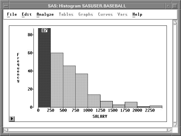
Notice that the observations are selected in the data window as well as in the bar chart window. Windows in SAS/INSIGHT software are just different views of the same data, so observations you select in one window are selected in all other windows.
From this bar chart, you can see that the distribution of players' salaries is skewed to the right, with a few players earning high salaries. To find the number of players making the highest salaries, you can label all bars with their heights.
| Click on the menu button in the bottom left corner of the chart. |
This displays the bar chart pop-up
menu in Figure 4.7.
Click on Values.
![[menu]](images/oneeq2.gif)
Figure 4.7: Bar Chart Pop-up Menu.
This toggles the display of values for all bar heights. There are three players making salaries above $2,000,000.
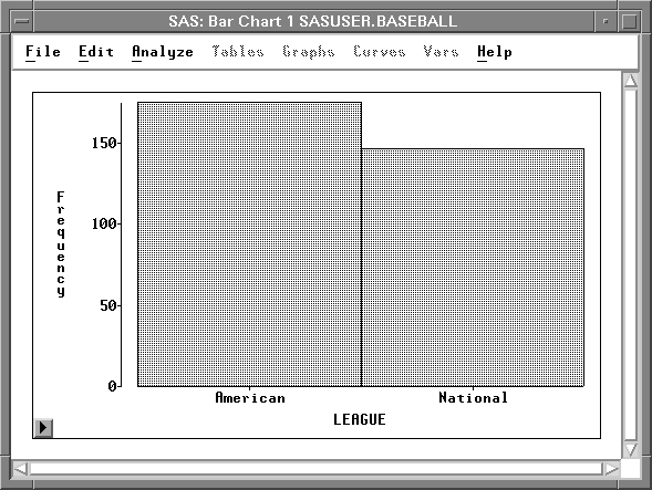
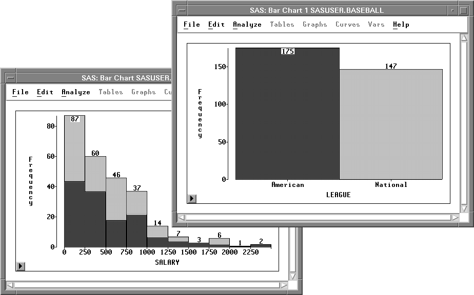
It would be interesting to determine whether salaries differ in the American and National leagues. To compare the distribution of salaries from both leagues, follow these steps.
| Select LEAGUE in the data window. |
Note that LEAGUE is a nominal variable. Nominal variables contain a discrete set of values. For example, LEAGUE contains only two values, American and National, for the American and National leagues.
| Choose Histogram/Bar Chart ( Y ) from the Analyze menu. |
From the bar chart in Figure 4.10
you can see that the BASEBALL data set has
more observations from the American League.
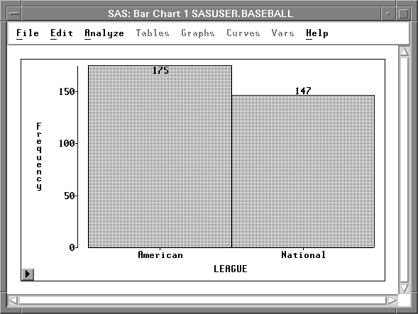
| Select Values from the bar chart pop-up menu in the new bar chart. |
This displays the frequencies for each of the
leagues at the top of the bars on the bar chart.
| Arrange the windows so you can see both bar charts. |
| Click on the bar that represents the American League. |
This selects all observations for players in the American League.
| Click on the bar that represents the National League. |
This selects all observations for players in the National League.
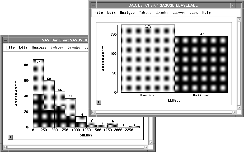
Both leagues have a broad distribution of SALARY with most players earning below $1,000,000 and a few earning much more.
You can examine the distributions in more detail by creating box plots.
Related Reading | Bar Charts, Chapter 32. |
|
Chapter Contents |
Previous |
Next |
Top |
Copyright © 1999 by SAS Institute Inc., Cary, NC, USA. All rights reserved.
![[menu]](images/oneeq1.gif)