Chapter Contents
Previous
Next
|
Chapter Contents |
Previous |
Next |
| Graphical Enhancements |
The following statements create ![]() and s charts
for the diameter data:
and s charts
for the diameter data:
   title f=qcfont4 'X '
         f=swiss   'and s Chart for Diameter';
   symbol v=dot c=salmon;
   proc shewhart data=toolwear;
      xschart diameter*hour /
         outhistory = submeans
         nolegend
         cframe     = vibg
         cinfill    = ywh
         cconnect   = salmon;
      label diameter = 'Mean in mm';
      label hour     = 'Hour';
   run;
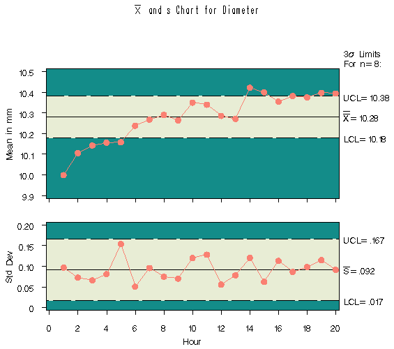
The charts are shown in Figure 47.23. The subgroup
standard deviations are all within their control limits,
indicating the process variability is stable. However,
the
|
Note that the symbol ![]() is displayed in the title with
the special font QCFONT4, which matches the SWISS font used
for the remainder of the title.
See Appendix D, "Special Fonts in SAS/QC Software"
for a description of the fonts available
for displaying
is displayed in the title with
the special font QCFONT4, which matches the SWISS font used
for the remainder of the title.
See Appendix D, "Special Fonts in SAS/QC Software"
for a description of the fonts available
for displaying ![]() and related symbols.
and related symbols.
|
Chapter Contents |
Previous |
Next |
Top |
Copyright © 1999 by SAS Institute Inc., Cary, NC, USA. All rights reserved.