Chapter Contents
Previous
Next
|
Chapter Contents |
Previous |
Next |
| PPPLOT Statement |
A P-P plot compares the empirical cumulative distribution function (ecdf) of a variable with a specified theoretical cumulative distribution function F(·). The ecdf, denoted by Fn(x), is defined as the proportion of nonmissing observations less than or equal to x, so that Fn (x(i)) = [i/n].
To construct a P-P plot, the n nonmissing values are first sorted in increasing order:
Then the i th ordered value x(i) is represented on the plot by the point whose x-coordinate is F(x(i)) and whose y-coordinate is [i/n].
Like Q-Q plots and probability plots, P-P plots can be used to determine how well a theoretical distribution models a data distribution. If the theoretical cdf reasonably models the ecdf in all respects, including location and scale, the point pattern on the P-P plot is linear through the origin and has unit slope.
Unlike Q-Q and probability plots, P-P plots are not invariant to changes in location and scale.
| See CAPPP2 in the SAS/QC Sample Library |
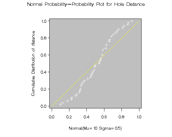
For example, the data in the "Getting Started" section are reasonably described by a normal distribution with mean 10 and standard deviation 0.3. It is instructive to display these data on normal P-P plots with a different mean and standard deviation, as created by the following statements:
   title 'Normal Probability-Probability Plot for Hole Distance';
   proc capability data=sheets noprint;
      ppplot distance / normal(mu=9.5 sigma=0.3 color=yellow)
                        square
                        vaxis  = axis1
                        cframe = ligr;
      ppplot distance / normal(mu=10 sigma=0.5 color=yellow)
                        square
                        vaxis  = axis1
                        cframe = ligr;
      axis1 label=(a=90 r=0);
   run;

|
|
Specifying a mean of 9.5 instead of 10 results in the plot shown in Figure 8.2, while specifying a standard deviation of 0.5 instead of 0.3 results in the plot shown in Figure 8.3. Both plots clearly reveal the model misspecification.
|
Chapter Contents |
Previous |
Next |
Top |
Copyright © 1999 by SAS Institute Inc., Cary, NC, USA. All rights reserved.