Chapter Contents
Previous
Next
|
Chapter Contents |
Previous |
Next |
| Getting Started |
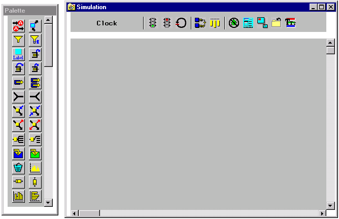
When you invoke the QSIM Application, a Simulation window and a palette opens, as shown in Figure 1.2. The Simulation window has two panels; the command panel on the top and the model panel on the bottom. The palette contains the components that can be used to build a model. You build the model in the model panel, using the mouse to drag and drop model components from the pallette into the model panel. These model components are connected by arcs to produce a directed network representation of the model. You can change parameters and other properties of model components using pop-up menus from the components.
|
If you don't see the component that you want
in the palette, use the scrollbar on
its right side to scroll the palette.
You pick up the component from the palette
and drag it to the model panel and then drop it.
For example, to place a Sampler in the Simulation window,
you pick up the
 component in the palette
and then drop it on the model panel.
component in the palette
and then drop it on the model panel.
The command panel contains command buttons.
These are push buttons that execute commands.
For example, the animate button,
 ,
is a command button that
toggles animation on and off when pressed.
,
is a command button that
toggles animation on and off when pressed.
The QSIM Application also supports cursor tracking. As you move the cursor over a component, the shape of the cursor will change depending on where the cursor is in the component. When the cursor changes shape, you can click the left mouse button and elict location dependent behavior such as resizing the component, drawing an arc, or replicating (cloning) a component. For example, if you click when the cursor is a +, you can draw an arc from that component to the next component that you click. Also, picking and dragging a component with the cursor will move the component. Finally, clicking the right mouse button will always display a pop-up menu.
This paradigm for the user interface is used throughout the QSIM Application.
|
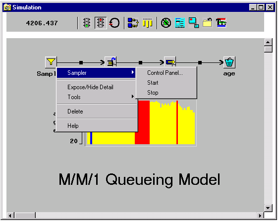
Figure 1.3 shows the pop-up menu on the Sampler obtained by clicking the right mouse button. Notice that the first item in the menu names the type of component. The submenu from the Sampler entry lists the actions that are specific to that component. In this case, it includes: Control Panel..., which opens a window that enables you to control the component, an action often used; Start, which starts the transaction sampling, an action seldom needed; and Stop, which stops the transaction sampling, also an action seldom needed. Other general actions include Expose/Hide Detail for changing the Sampler representation from an image to a line drawing, and Tools for other less frequently used tools.
Model components are connected by arcs. Transactions flow down arcs between components. You can connect two components with an arc by placing the cursor over the right side of a component. Notice that the cursor shape changes to +. If you click the left mouse button you will have a rubberband line to the cursor. Now when you select another component, an arc will connect the two components. If you move the cursor out of the Simulation window while the rubberband line is connected to it, the window may start power scrolling. Bringing the cursor back into the window will stop the scrolling. Clicking outside the window will take you out of the rubberband line mode.
Model components have control panels associated with them.
With these panels, you specify parameters and control the behavior of
the component.
The simulation also has a control panel, as
shown in Figure 1.5.
It is displayed by selecting the
 command button.
|
Chapter Contents |
Previous |
Next |
 Top |
Copyright © 1999 by SAS Institute Inc., Cary, NC, USA. All rights reserved.