Getting Started
The following example illustrates the basic features of PROC KDE.
Assume that 1000 observations are simulated from a bivariate normal
density with means (0,0), variances (10,10), and covariance 9.
The SAS DATA step code to accomplish this is as follows:
   data k;
      seed = 1283470;
      do i = 1 to 1000;
         z1 = rannor(seed);
         z2 = rannor(seed);
         z3 = rannor(seed);
         x = 3*z1 + z2;
         y = 3*z1 + z3;
         output;
      end;
      drop seed;
   run;
The following PROC KDE code computes a bivariate kernel density
estimate of these data:
   proc kde data=k out=o;
      var x y;
   run;
The output from this analysis is as follows.
|
| Inputs |
| Data Set |
WORK.K |
| Number of Observations Used |
1000 |
| Variable 1 |
x |
| Variable 2 |
y |
| Bandwidth Method |
Simple Normal Reference |
|
The "Inputs" table lists basic information about the density fit,
including the input data set, the number of observations, and the
variables. The bandwidth method is the technique used to select the
amount of smoothing in the estimate. A simple normal reference rule
is used for bivariate smoothing.
|
| Controls |
| |
x |
y |
| Grid Points |
60 |
60 |
| Lower Grid Limit |
-11.25 |
-10.05 |
| Upper Grid Limit |
9.1436 |
9.0341 |
| Bandwidth Multiplier |
1 |
1 |
|
The "Controls" table lists the primary numbers controlling the
kernel density fit. Here a 60 ×60 grid is fit to the entire
range of the data, and no adjustment is made to the default bandwidth.
|
| Statistics |
| |
x |
y |
| Mean |
-0.075 |
-0.070 |
| Variance |
9.72 |
9.92 |
| Standard Deviation |
3.12 |
3.15 |
| Range |
20.39 |
19.09 |
| Interquartile Range |
4.46 |
4.51 |
| Bandwidth |
0.99 |
1.00 |
|
The "Statistics" table contains standard univariate statistics
for each variable, as well as statistics associated with the density
estimate. Note that the estimated variances for both X and Y are
fairly close to the true values of 10.
|
| Bivariate Statistics |
| Covariance |
8.88 |
| Correlation |
0.90 |
|
The "Bivariate Statistics" table lists the covariance and
correlation between the two variables. Note that the estimated
correlation is equal to its true value to two decimal places.
|
| Percentiles |
| |
x |
y |
| 0.5 |
-7.71 |
-8.44 |
| 1.0 |
-7.08 |
-7.46 |
| 2.5 |
-6.17 |
-6.31 |
| 5.0 |
-5.28 |
-5.23 |
| 10.0 |
-4.18 |
-4.11 |
| 25.0 |
-2.24 |
-2.30 |
| 50.0 |
-0.11 |
-0.058 |
| 75.0 |
2.22 |
2.21 |
| 90.0 |
3.81 |
3.94 |
| 95.0 |
4.88 |
5.22 |
| 97.5 |
6.03 |
5.94 |
| 99.0 |
6.90 |
6.77 |
| 99.5 |
7.71 |
7.07 |
|
The "Percentiles" table lists percentiles for each variable.
|
| Levels |
| Percent |
Density |
Lower1 |
Lower2 |
Upper1 |
Upper2 |
| 1 |
0.001181 |
-8.14 |
-8.76 |
8.45 |
8.39 |
| 5 |
0.003028 |
-7.10 |
-7.14 |
7.07 |
6.77 |
| 10 |
0.004988 |
-6.41 |
-6.49 |
5.69 |
6.12 |
| 50 |
0.01592 |
-3.64 |
-3.58 |
3.96 |
3.86 |
| 90 |
0.02389 |
-1.22 |
-1.32 |
1.19 |
0.95 |
| 95 |
0.02525 |
-0.88 |
-0.99 |
0.50 |
0.62 |
| 99 |
0.02609 |
-0.53 |
-0.67 |
0.16 |
0.30 |
| 100 |
0.02630 |
-0.19 |
-0.35 |
-0.19 |
-0.35 |
|
The "Levels" table lists contours of the density corresponding to
percentiles of the bivariate data, and the minimum and maximum
values of each variable on those contours. For example, 5 percent
of the observed data have a density value less than 0.0030. The
minimum X and Y values on this contour are -7.10 and -7.14,
respectively (the Lower1 and Lower2 columns), and the maximum
values are 7.07 and 6.77, respectively (the Upper1 and Upper2
variables).
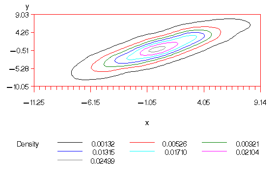
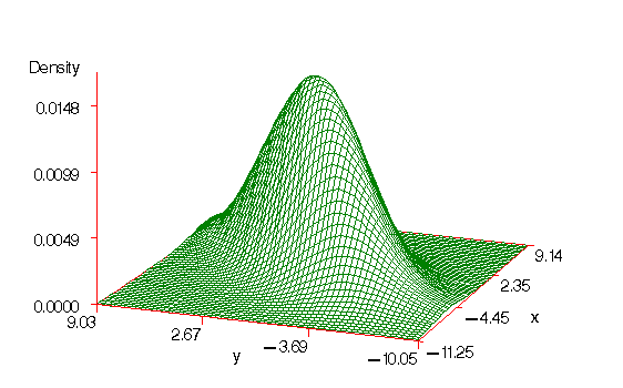
The output data set O from this analysis contains 3600 points
containing the kernel density estimate. You can generate surface
and contour plots of this estimate using SAS/GRAPH as follows:
   proc g3d data=o;
      plot y*x=density;
   run;

   proc gcontour data=o;
      plot y*x=density;
   run;
Figures 33.1 and 33.2 display these plots. Note that
the correlation of 0.9 in the original data results in oval-shaped
contours.
Figure 33.1: Surface plot of the bivariate kernel density estimate
Figure 33.2: Contour plot of the bivariate kernel density estimate
Suppose, after viewing Figures 33.1 and 33.2, that you
would like a slightly smoother estimate. You could then rerun the
analysis with a larger bandwidth:
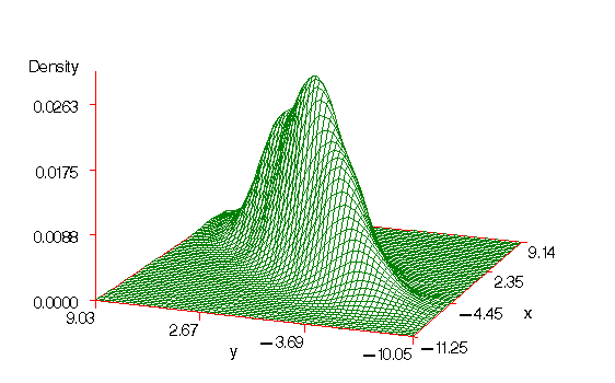
   proc kde data=k out=o1 bwm=2,2;
      var x y;
   run;
The BWM=2,2 option requests bandwidth multipliers of 2 for both X and
Y. The results of this fit and a subsequent call to PROC G3D produces
Figure 33.3. Note that the small flattish area behind the
main mode in Figure 33.1 has disappeared in Figure 33.3.
Figure 33.3: Surface plot of the bivariate kernel density estimate with additional smoothing
You can also use the results from the Levels table to plot specific
contours corresponding to percentiles of the data. For example, the
Levels table from the PROC KDE output using BWM=2,2 is as follows:
|
| Levels |
| Percent |
Density |
Lower1 |
Lower2 |
Upper1 |
Upper2 |
| 1 |
0.001238 |
-8.48 |
-8.76 |
8.45 |
8.39 |
| 5 |
0.003008 |
-7.10 |
-7.14 |
6.72 |
6.77 |
| 10 |
0.004625 |
-6.06 |
-5.85 |
6.03 |
6.12 |
| 50 |
0.01085 |
-3.30 |
-3.26 |
3.27 |
3.21 |
| 90 |
0.01430 |
-1.22 |
-1.32 |
1.19 |
0.95 |
| 95 |
0.01459 |
-0.88 |
-0.99 |
0.85 |
0.62 |
| 99 |
0.01478 |
-0.53 |
-0.67 |
0.50 |
0.30 |
| 100 |
0.01481 |
-0.19 |
-0.024 |
-0.19 |
-0.024 |
|
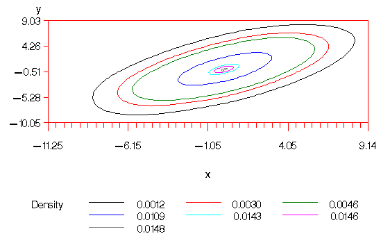
You can use the values from the Density column of this table with PROC
GCONTOUR to plot the 1, 5, 10, 50, 90, 95, and 99 percent levels of
the density:
   proc gcontour data=o1;
      plot y*x=density / levels=0.0012 0.0030 0.0046 0.0109
         0.0143 0.0146 0.0148;
   run;
This plot is displayed in Figure 33.4.
Figure 33.4: Contour plot of the bivariate kernel density
estimate with additional smoothing and levels corresponding
to percentiles
The next-to-outermost contour of Figure 33.4 represents an
approximate 95 percent ellipsoid for X and Y.
Copyright © 1999 by SAS Institute Inc., Cary, NC, USA. All rights reserved.