
Report Statistics
Throughout the report, the results of multiple-choice questions are reported with the descriptive statistics and graph shown below:
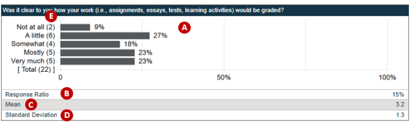
A. Response distribution graph: For all multiple-choice questions, the students’ selections of response categories are visualized with percentages. This graph is useful to understand how students’ responses vary and what responses are most and least frequent.
B. Response Ratio: This statistic shows the percentage of students responding to each question. It is not uncommon that students skip questions while taking the survey. It is recommended to check whether there are questions having a noticeably low response ratio (i.e., high missing rate) compared to the other questions. If there are questions with a high missing rate, instructors should be cautious about interpreting the results and identify possible reasons.
C. Mean: The mean score is a statistic summarizing the overall response to the question. The score is computed based on the scores assigned to response categories.
D. Standard deviation: Standard deviation describes the degree of variation in students’ responses. That is, this statistic reflects the amount of variation in the response distribution graph. The standard deviation would be smaller when students’ responses are consistent (e.g., most students selected the same response categories). In contrast, the standard deviation would be larger when students tend to select different response categories.
E. Frequency: The numbers presented beside the response category in parentheses is the number of students selecting each category. For example, ‘Not at all (2)’ means two students selected this category.