UI PATTERN ELEMENTS
ACCORDION
Orci quis quam facilisis molestiel Donec sitae amet diam a velit effic venenatis. In dictu nunc libero, eul pharetra magna laoreet sitarm am. Morbi quis semper mi. Curabituras ornare orci. Aliquam erat volutpat.
NOTE
Accordions are a collapsible content module. They should be implemented in mobile settings when organisms get too lengthy for default display, or for customization menus in product detail pages.
For additional inquiries contact the designer, Rowina Chan.
CODE SNIPPET
									<!-- HTML -->
									<button class="accordion>Accordion</button>
									<div class="panel">
										<p class="accordion-content">Orci quis quam facilisis molestiel Donec sitae amet diam a velit effic venenatis. In dictu  nunc libero, eul pharetra magna laoreet sitarm am. Morbi quis semper mi. Curabituras ornare orci. Aliquam erat volutpat.<p>
									</div>
									<hr class="accordion-hr">


									/* ---- CSS ---- */
									.accordion {
										background-color: #FFFFFF;
										color: #C98F7D;
										cursor: pointer;
										padding: 1rem;
										width: 100%;
										border: none;
										border-top: 0.5px solid #A9A2A1;
										text-align: left;
										outline: none;
										transition: 0.4s;
										font-size: 1.1rem;
									}

									/* padding for content within the accordion */
									.accordion-content {
										padding-bottom: 1.5rem;
									}

									/* states for acccordion */
									.active, .accordion:hover {
										color: #6D716F;
										transition-property: color;
										transition-duration: 0.3s;
										transition-timing-function: ease-out;
									}

									/* accordion decoratives (lines) */
									.accordion-hr {
										border-bottom: 0.5px solid #A9A2A1;
										margin-top: 0;
									}

									.accordion:after {
									  content: '\002B';
									  color: #C98F7D;
									  font-weight: bold;
									  float: right;
									  margin-left: 0.8rem;
									}

									.active:after {
									  content: "\2212";
									}

									/* content for accordions */
									.panel {
										display: grid;
										padding: 0 1rem;
										background-color: white;
										overflow: hidden;
										max-height: 0;
										transition: max-height 0.2s ease-out;
									}


									//JAVASCRIPT referenced from https://www.w3schools.com/howto/howto_js_accordion.asp;
									var numOfAccs = document.getElementsByClassName("accordion");
									var i;
									for (i = 0; i < numOfAccs.length; i++) {
									numOfAccs[i].addEventListener("click", function() {
									this.classList.toggle("active");
									var panel = this.nextElementSibling;
									if (panel.style.display === "block") {
									panel.style.display = "none";
									} else {
									panel.style.display = "block";
									}
									});
									}
FORM ELEMENTS
TEXT INPUT, DROP-DOWN, & SUBMIT BUTTON
NOTE
Forms are a way of storing user submitted information. Form containers should always adhere to the #F4F4F4 color swatch while interactives such as the call-to-action button as well as drop downs follow the #C98F7D color swatch, all listed under the Basic Styles Guide.
For additional inquiries contact the designer, Chantal Huang.
CODE SNIPPET
									<--HTML code snippet-->

									<!-- Text Label & Input -->
									<label for="name">First Name</label>
									<input type="text" id="fname" name="fname">

									<!-- Drop-down -->
									<label for="country">Country</label>
									<select id="country" name="country">
									<option value="canada">Canada</option>
									</select>

									<!-- Submit Button -->
									<input type="submit" value="Submit">

									/*---- CSS code snippet ----*/
									form {
										background-color: #F4F4F4;
										padding: 2rem 4rem;
									}

									label {
										display: inline-block;
										color: #7E7E7E;
										margin: 0.3rem 0;
									}

									form input{
										width: 100%;
										border-radius: 0.5rem;
										border: 1.8px solid #A9A2A1;
										padding-bottom: 0.5rem;
										margin-bottom: 1rem;
									}
ORDER SUMMARY
CODE SNIPPET
											<----HTML code snippet---->
											<form>
											<h2>ORDER SUMMARY</h2>

											<div class="order-summary-info">
											<div class="order-summary-grid">

											lt;div class="order-summary-labels">
											<p>Subtotal:</p>
											<p>Shipping:</p>
											<p>PST/GST:</p>
											<p>Total:</p>
											</div>

											<div class="order-summary-prices">
											lt;p>C$128.00</p>
											<p>-</p>
											<p>-</p>
											<p>C$128.00</p>
											</div>
											</div>
											<hr>
											</div>

											<div class="cta-container">

											<!-- Submit Button -->
											<input class="cta-button" type="submit" value="Place Order">
											</div>
											</form>

											/*----CSS code snippet----*/
											/* flexbox for order summary info */
											.order-summary-info {
												display: flex;
												flex-direction: column;
												align-items: center;
											}

											/* order summary note container */
											#order-summary .side-note .text-container {
												margin: 0;
												min-height: 27.2rem;
											}

											/* header 2 in order summary container */
											#order-summary .order-sum-ex h2 {
												padding: 1.7rem 0;
												padding-bottom: 1.5rem;
												margin: 0;
												text-align: center;
											}

											#order-summary hr {
												border-top: 0.01px solid #A9A2A1;
												width: 15.5rem;
												margin-bottom: 1rem;
											}

											#order-summary form {
												align-items: center;
											}

											#order-summary .cta-button {
												padding: 0.6rem 5.2rem;
												margin-bottom: 2rem;
											}
NOTE
The order summary is displayed in the checkout and review pages, outlining the subtotal, shipping expenses, tax, and the total after the calculated amounts. In a two column grid structure, the order summary is sticky when the user starts scrolling and should be in view at all times.
For additional inquiries contact the designer, Helen Nguyen.
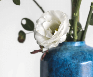
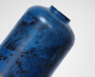
PRODUCT LISTING
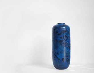
ORIENTO
Cry Me a River
C$75
Orci quis quam facilisis molestie moi. Donec sitae amet diam a velit efficitur venenatis. In dictu nunc libero, euste pharetra magna laoreet sitarm amet. Morbi quis semper mi.
Dimensions: 16cm x 40.3 cm
Color
Finish
NOTE
A detailed product listing provides information relating to it's artist, item name, price, dimensions, and options for customization. On desktop sizes, it is constructed with a larger two column mixed grid, with an image gallery on the left and product information on the right. Active images on display should be outlined in the #C98F7D swatch in the preview gallery. At smaller screen sizes, the grid will flow into one column.
For additional inquiries contact the designer, Chantal Huang.
CODE SNIPPET
									<----HTML code snippet---->

									<!-- Product image grid -->
									<div class="product-listing-grid">
										<div class="gallery-container">
											<div class="product-preview">
												<img src="img/vase-wideshot.png" alt="a wideshot of a blue vase">
											</div>

											<div class="product-preview">
												<img src="img/vase-staged.png" alt="a closeup of a blue vase with white flowers in it">
											</div>

											<div class="product-preview">
												<img src="img/vase-cu.png" alt="a closeup of the neck of a blue vase">
											</div>

											<!-- thumbnail images -->
											<div class="gallery-row">
												<div class="gallery-column">
													<img class="demo gallery-cursor" src="img/vase-wideshot.png" onclick="currentSlide(1)" alt="a wideshot of a blue vase">

													<img class="demo gallery-cursor" src="img/vase-staged.png" onclick="currentSlide(2)" alt="a closeup of a blue vase with white flowers in it">

													<img class="demo gallery-cursor" src="img/vase-cu.png" onclick="currentSlide(3)" alt="a closeup of the neck of a blue vase">
												</div>
											</div>
										</div>


										<div class="product-info">
											<!-- Product Information -->
											<div>
												<p class="artist-name">ORIENTO</p>
												<h1>Cry Me a River</h1>
												<h2>C$75</h2>

												<p>Orci quis quam facilisis molestie moi. Donec sitae amet diam a velit efficitur venenatis. In dictu  nunc libero, euste pharetra magna laoreet sitarm amet. Morbi quis semper mi.</p>
												<p class="dimensions">Dimensions: 16cm x 40.3 cm</p>
											</div>

											<!-- Customization -->
											<div>
												<button class="accordion">Want to Customize?</button>

												<div class="panel">
													<div class="product-color">
														<!-- Swatches -->
														<h3 class="cust-heading">Color</h3>
														<!-- blue -->
														<label class="cust color" aria-label="blue">
															<input type="radio" id="blue" name="swatch" value="blue" checked="checked">
															<span class="checkmark blue"></span>
														</label>
														<!-- green -->
														<label class="cust color" aria-label="green">
															<input type="radio" id="green" name="swatch" value="green">
															<span class="checkmark green"></span>
														</label>
														<!-- grey -->
														<label class="cust color" aria-label="grey">
															<input type="radio" id="grey" name="swatch" value="grey">
															<span class="checkmark grey"></span>
														</label>
													</div>

													<div class="product-finish">
														<!-- Checkboxes-->
														<h3 class="cust-heading">Finish</h3>
														<label class="cust finish first-cust-option" for="glossy">
															<input type="radio" id="glossy" name="finish" value="glossy" checked="checked">
															<span class="checkmark finish"></span>
															Glossy
														</label>
														<label class="cust finish" for="matte">
															<input type="radio" id="matte" name="finish" value="matte">
															Matte
															<span class="checkmark finish"></span>
														</label>
													</div>
												</div>
												<hr class="accordion-hr">
											</div>

											<a href="" class="cta-button cta-container">Add to Cart</a>
										</div>
									</div>


									/*---- CSS code snippet ----*/
									/* gallery container for images */
									.gallery-container {
										position: relative;
									}

									/* product thumbnails under gallery */
									.product-preview {
										display: none;
									}

									/* images in gallery thumbnails */
									.product-preview img {
										width: 100%;
									}

									.gallery-row img {
										width: 100%;
										height: auto;
										max-height: 85%;
									}

									/* cursor pointer for gallery images*/
									.gallery-cursor {
										cursor: pointer;
									}

									/* image number/position in preview gallery  */
									/*.number-text {
									  color: #A9A2A1;
									  font-size: 1.1rem;
									  padding: 1rem 1rem;
									  position: absolute;
									  top: 0;
									}*/

									/* make inactive thumbnails transparent */
									.demo {
									  opacity: 0.6;
									}

									/* hover / active thumbanils in the preview should be fully opaque */
									.thumbnail-active, .demo:hover {
									  opacity: 1;
									  transform: scale(1.025);
									  transition-property: transform;
									  transition-duration: 0.3s;
									  transition-timing-function: ease-out;
									}

									/* active thumbnail in gallery preview */
									.thumbnail-active {
										border: 2px solid #C98F7D;
									}

									/* artist label in product listing */
									.artist-name {
										margin-top: 0;
										margin-bottom: 1rem;
									}

									/* product name in listing */
									.product-info h1 {
										color: #6D716F;
										font-size: 2.5rem;
										margin-bottom: 0.7rem;
									}

									/* pricing in product listing */
									.product-info h2 {
										padding-top: 0;
										padding-bottom: 1rem;
										margin-top: 0.7rem;
										font-weight: 300;
									}

									/* dimension blurb in product listing */
									.dimensions {
										margin-top: 2rem;
									}

									/* customization accordion in product listing */
									.product-info .accordion {
										margin-top: 2rem;
									}


									//JAVASCRIPT code snippet
									var slideIndex = 1;
									showSlides(slideIndex);

									// Thumbnail image controls
									function currentSlide(n) {
									  showSlides(slideIndex = n);
									}

									function showSlides(n) {
									  var i;
									  var slides = document.getElementsByClassName("product-preview");
									  var dots = document.getElementsByClassName("demo");

									 if (n > slides.length) {
									    slideIndex = 1
									  }

									  if (n < 1) {
									    slideIndex = slides.length
									  }

									  for (i = 0; i < slides.length; i++) {
									    slides[i].style.display = "none";
									  }

									  for (i = 0; i < dots.length; i++) {
									    dots[i].className = dots[i].className.replace("thumbnail-active", "");
									  }

									  slides[slideIndex-1].style.display = "block";
									  dots[slideIndex-1].className += " thumbnail-active";
									}
QUANTITY BOX
NOTE
The quantity box enables the user to increase or decrease the amount of a product in the cart module. If the quantity is set to 0, the product should be automatically removed from the cart.
For additional inquiries contact the designer, Helen Nguyen.
CODE SNIPPET
									<!----HTML code snippet---->
									<div class="quantity">
										<div class="quantity-button quantity-down">-</div>
										<input type="number" min="0" max="20" step="1" value="0">
										<div class="quantity-button quantity-up">+</div>
									</div>


									/*---- CSS code snippet ----*/
									/* quantity box position */
									.quantity {
										position: relative;
										width: 100%;
										margin-top: 3rem;
										margin-bottom: 2rem;
										display: flex;
									}

									/* hide number input arrows; firefox */
									.quantity input[type=number] {
										-moz-appearance: none;
										-webkit-appearance: none;
										-moz-appearance: textfield;
									}

									/* hide number input arrows; chrome, safari, edge, opera */
									input::-webkit-outer-spin-button,
									input::-webkit-inner-spin-button {
									  -webkit-appearance: none;
									  margin: 0;
									}


									.quantity input:focus {
										outline: 0.5rem;
									}

									.quantity-button {
										cursor: pointer;
										border: solid 1px #eee;
										width: 2rem;
										text-align: center;
										color: #333;

										-moz-user-select: none;
										-ms-user-select: none;
										-o-user-select: none;
										user-select: none;
									}

									/* quantity box border styling*/
									.quantity-button.quantity-up,
									.quantity-button.quantity-down,
									.quantity input {
										border: solid 1px #ccc;
										display: inline-block;
										height: 2.5rem;
										line-height: 2.3rem;
									}

									/* quantity input / number */
									.quantity input {
										border-right-style: none;
										border-left-style: none;
										padding-left: 3rem;
										padding-right: 2rem;
										border-radius: 0;
										color: #6D716F;
									}

									/* "+" styling for quantity box */
									.quantity-button.quantity-up {
										border-left-style: none;
										color: #C98F7D;
										font-size: 1.5rem;
										padding-right: 0.75rem;
									}

									/* "-" styling for quantity box */
									.quantity-button.quantity-down {
										float: left;
										border-right-style: none;
										color: #C98F7D;
										font-size: 1.5rem;
										padding-left: 0.75rem;
									}


									//JAVASCRIPT code snippet
									jQuery('.quantity').each(function () {
									    var spinner = jQuery(this),
									    input = spinner.find('input[type="number"]'),
									    buttonUp = spinner.find('.quantity-up'),
									    buttonDown = spinner.find('.quantity-down'),
									    min = input.attr('min'),
									    max = input.attr('max');

									    buttonUp.click(function () {
									        var oldValue = parseFloat(input.val());
									        if (oldValue >= max) {
									            var newVal = oldValue;
									        } else {
									            var newVal = oldValue + 1;
									        }
									        spinner.find("input").val(newVal);
									        spinner.find("input").trigger("change");
									    });

									    buttonDown.click(function () {
									        var oldValue = parseFloat(input.val());
									        if (oldValue <= min) {
									            var newVal = oldValue;
									        } else {
									            var newVal = oldValue - 1;
									        }
									        spinner.find("input").val(newVal);
									        spinner.find("input").trigger("change");
									    });
									});
SWATCHES & CHECKBOXES
SWATCHES
CHECKBOXES
NOTE
Swatches and checkboxes allow users to customize a product if they wish and appear in product detail pages under the content for accordions. Swatches are styled radio buttons to show color options while also working in a form, and selected swatches should have a stroke of #C98F7D to show it's active state. Checkboxes should also have a stroke of #C98F7D as it is an interactive, also outlined under the color palette section.
For additional inquiries contact the designer, Helen Nguyen.
CODE SNIPPET
									<!---- HTML code snippet ---->
									<div class="swatches">
									<!-- style to look like swatches -->
										<h3 class="example-heading">SWATCHES</h3>

										<!-- blue -->
										<label class="cust color" aria-label="blue">
											<input type="radio" id="blue" name="radio" value="blue" checked="checked">
											<span class="checkmark blue"></span>
										</label>

										<!-- green -->
										<label class="cust color" aria-label="green">
											<input type="radio" id="green" name="radio" value="green">
											<span class="checkmark green"></span>
										</label>

										<!-- grey -->
										<label class="cust color" aria-label="grey">
											<input type="radio" id="grey" name="radio" value="grey">
											<span class="checkmark grey"></span>
										</label>
									</div>

									<!-- Checkbox Example -->
									<div class="checkboxes">
										<h3 class="example-heading">CHECKBOXES</h3>

										<!-- glossy -->
										<label class="cust finish first-cust-option" for="glossy-ex">
											<input type="radio" id="glossy-ex" name="radio" value="glossy-ex" checked="checked">
											<span class="checkmark finish"></span>
											Glossy
										</label>

										<!-- matte -->
										<label class="cust finish" for="matte-ex">
											<input type="radio" id="matte-ex" name="radio" value="matte-ex">
											Matte
											<span class="checkmark finish"></span>
										</label>
									</div>


									/*---- CSS code snippet ----*/

									/* first label for finishes in product listing*/
									.first-cust-option {
										padding-right: 0.3rem;
									}

									/* customization titles */
									.cust-heading {
										color: #7E7E7E;
										font-size: 1.1rem;
										margin: 0.6rem 0;
									}

									/* container for checkbox */
									.cust {
									  display: inline-block;
									  position: relative;
									  padding-left: 1.7rem;
									  margin-bottom: 3rem;
									  cursor: pointer;
									  -webkit-user-select: none;
									  -moz-user-select: none;
									  -ms-user-select: none;
									  user-select: none;
									}

									/* hide default radio button */
									.cust input {
									  position: absolute;
									  opacity: 0;
									  cursor: pointer;
									}

									/* custom radio button */
									.checkmark {
									  position: absolute;
									  top: 0;
									  left: 0;
									  height: 1.5rem;
									  width: 1.5rem;
									  background-color: #eee;
									  border-radius: 50%;
									}

									/* blue swatch */
									.checkmark.blue {
										background-color: #255481;
									}

									/* green swatch */
									.checkmark.green {
										background-color: #C7CEB3;
									}

									/* grey swatch*/
									.checkmark.grey {
										background-color: #949393;
									}

									/* radio hover state for color customization */
									.cust.color:hover input ~ .checkmark, .cust.color:focus input ~ .checkmark {
									  border: 2px solid #C98F7D;
									}

									/* when it's checked add a border for color customization */
									.cust.color input:checked ~ .checkmark {
									  border: 2px solid #C98F7D;
									}

									/* styling for 'finish' checkboxes under customization */
									.checkmark.finish {
										height: 1rem;
										width: 1rem;
										margin-top: 0.1rem;
										margin-right: 0.1rem;
										background-color: #FFFFFF;
										border: 2px solid #C98F7D;
									}

									/* customization finish labels */
									.product-finish label {
										padding-left: 1.2rem;
										margin-right: 0.5rem;
										margin-bottom: 0.5rem;
									}

									/* radio hover state for color customization */
									.cust.finish:hover input ~ .checkmark, .cust.finish:focus input ~ .checkmark {
										background-color: #F4F4F4;
									}

									/* indicator, hide it when not checked; for finishes */
									.checkmark:after {
									  content: "";
									  position: relative;
									  display: none;
									}

									/* indicator, show when checked; for finishes  */
									.cust.finish input:checked ~ .checkmark:after {
									  display: block;
									}

									/* radio indicator; for finishes */
									.cust.finish .checkmark.finish:after {
									 	top: 2px;
										left: 2px;
										width: 8px;
										height: 8px;
										border-radius: 50%;
										background: #C98F7D;
									}

									/* padding for checkboxes in the example section */
									.checkboxes .cust {
										padding-left: 1.3rem;
									}

									/* padding for checkboxes in the example section */
									.checkboxes .first-cust-option {
										padding-right: 1rem;
									}

									.cust.color label {
										padding-bottom: 1rem;
									}

									/* label for color swatches */
									.color-name {
										font-weight: 100;
										font-size: 0.7rem;
										text-align: center;
									}

									/* unchecked state for color labels */
									.cust.color input:not(:checked) + .color-name {
										 display: none;
										 background:red;
									}

									/* checked state for color labels */
									.cust.color input:checked + .color-name {
										 display: block;
										 margin-top: 2.4rem;
										 margin-left: -6.4rem;
										 margin-right: -5rem;
										 padding: 0;
									}
TABS
NOTE
Tabs are used for toggling between snippets of information or sections of a page. They are the primary means of organization on the Ceramics page for switching between the artists' collection, but should be swapped out for an accordion pattern on mobile sizes. Active tabs should also adhere to the #C98F7D swatch for interactives as outlined under the color palette section.
CODE SNIPPET
									<---- HTML code snippet ---->
									<!-- Tab Buttons -->
									<div>
										<button class="tab-links">Care Instructions</button>
										<button class="tab-links">Additional Information</button>
									</div>
									<!-- Tab Information -->
									<div class="tab-content">
										<p>As this item is rather delicate, we highly recommend handwashing only with hot soapy water.</p>
										<p>Tabs are used for toggling between snippets of information or sections of a page. They are the primary means of organization on the Ceramics page for switching between the artists' collections, but should be swapped out for an accordion pattern on mobile sizes. Active tabs should also adhere to the #C98F7D swatch for interactives as outlined under the color palette section.</p>
									</div>


									/*---- CSS code snippet ----*/

									/* Style the tab in table examples  */
									.tab {
										overflow: hidden;
										border-bottom: 1.7px solid #A9A2A1;
										margin-top: 5rem;
									}

									/* Style the buttons inside the tab */
									.tab button {
										background-color: inherit;
										color: #7E7E7E;
										float: left;
										border: none;
										outline: none;
										cursor: pointer;
										padding: 1rem 1.5rem 0.7rem 1.5rem;
										transition: 0.3s;
										font-size: 1.1rem;
										border: 1px solid #A9A2A1;
										border-bottom: none;
									}

									/* Change background color of buttons on hover */
									.tab button:hover, .tab button:focus {
										color: #C98F7D;
										font-weight: bold;
										transition-property: color;
										transition-duration: 0.3s;
										transition-timing-function: ease-out;
									}

									/* Create an active/current tablink class */
									.tab button.tab-active {
										color: #C98F7D;
										padding-bottom: 0.5rem;
										font-weight: bold;
										border: 1px solid #C98F7D;
										border-bottom: 4px solid #C98F7D;
									}


									/* Style the tab content */
									.tab-content {
									  display: none;
									  padding: 2rem 0;
									  border-bottom: 1px solid #A9A2A1;
									  border-top: none;
									}


									//JAVASCRIPT code snippet
									function openContent(event, tabName) {
										var i, tabContent, tabLinks;

										tabContent = document.getElementsByClassName("tab-content");
										for (i = 0; i < tabContent.length; i++) {
											tabContent[i].style.display = "none";
										}

										tabLinks = document.getElementsByClassName("tab-links");
										for (i = 0; i < tabLinks.length; i++) {
											tabLinks[i].className = tabLinks[i].className.replace(" active","");
										}

										document.getElementById(tabName).style.display = "block";
										event.currentTarget.className += " active";
									}