Presenting Your Data
Definitions
Bar Chart: a chart with horizontal bars that show frequencies or percentages for the categories. It is a graphical equivalent of a summary table.
Chartjunk: a chart that has unnecessary details. It can be misleading and/or difficult to read.
Classes: intervals for the numerical data.
Column Chart: a chart with vertical columns that show frequencies or percentages for the categories. It is a graphical equivalent of a summary table.
Contingency Table: a table/matrix that displays the frequencies of the observations with same values for two variables. Also called a two-way table.
Cumulative Frequency Distribution: for each value, shows the number of observations that are equal to or below that particular value. It is a table equivalent of an ogive.
Cumulative Percentage Distribution: for each value, shows the percentage of observations that are equal to or below that particular value. It is a table equivalent of an ogive.
Frequency Distribution: for each value, shows the number of observations that are equal to that particular value. It is a table equivalent of a histogram.
Histogram: a chart with bars that show frequencies or percentages for the classes. The area of a bar is proportional to the frequency or percentage.
Line Plot: a line with categories marked on it, and with stacked Xs above each category mark, where each X is for one observation that falls into that category. It is a primitive analog of a column chart, and a graphical equivalent of a summary table.
Ogive: the curve of a cumulative distribution function. It is a graphical equivalent of a cumulative distribution table.
Ordered Array: the values sorted in order, from the smallest to the largest.
Pareto Chart: a combination of a bar chart and an ogive. The categories must be sorted from the largest frequency to the lowest frequency.
Percentage Distribution: for each value, shows the percentage (of the total number of observations, for all values) of observations that are equal to that particular value. It is a table equivalent of a histogram.
Percentage Polygon: the percentage frequency of each class is represented with a dot, and the dots are connected with a line. This is similar to a histogram.
Pie Chart: a circle divided into sectors that each represent a proportion of the whole.
Scatter Plot: a graph with the variables on the axes where each observation is plotted as a dot with the coordinates equal to the values of the two variables for that observation.
Stem-and-Leaf Display: an alternative to a histogram. Each value is split into a stem and a leaf, a list of the stems is written in a column, and beside each stem the leaves are recorded in a row.
Summary Table: list of the categories along with their counts or percentages. It is a table equivalent of a bar/column chart.
Time-Series Plot: displays observations on the y-axis against equally spaced time intervals on the x-axis.
These are the illustrations I have used in class:
Stem-and Leaf Display at Minato Mirai train station in Yokohama, Japan.
Notes
The term "summary table" is used for all kind of summaries. We will reserve it, in this class, for a simple summary of the counts/frequencies or percentages.
- If you want to see relative frequencies, the percentages are more helpful.
A contingency table is most often useful when we summarize the relationship between two variables each taking on two or three values.
- Look for some cells having larger numbers than other cells in the same row and/or column.
- We will come back to these tables when we learn probabilities.
An ordered array is limited in use:
- An ordered array is good for spotting an outlier in a small data set.
- An ordered array is also good for counting the frequencies in a small data set.
A frequency distribution is for numerical (not for categorial) data.
- In a frequency distribution, the classes must be ordered.
- In a frequency distribution, any datum must belong to one class only.
- Try hard to make the class boundaries round integer numbers.
- Try hard to make the midpoints representative of the numbers in the classes.
- When comparing two or more groups with different sample sizes, must use either a relative frequency or a percentage distribution.
The line plot conveys same information as the column chart.
- It is for a small data set, to make a quick illustration/analysis.
- It should be used if you have no more than 30 observations.
The bar chart and the column chart convey exactly same information.
- The length of a bar/column is proportional to the frequency or percentage.
- There must be a gap between the bars/columns.
- Avoid using different colours for different bars/columns. It may change the visual perception of proportions.
- Use the column chart if there is some order in the categories, from left to right.
- Use the bar chart if there are many categories. It is easier to read.
- Use your own judgement when deciding which one to present.
- Make sure you have a graph title and informative axis labels.
- Start the verical axis at zero.
The pie chart is used to show the parts of a whole.
- Go clockwise, from the largest to the smallest (�other� last).
- The pie chart is not that useful if you have more than 6 categories or if your categories have approximately same frequencies.
The Pareto chart is a combination of a bar chart and an ogive. The categories must be sorted from the largest frequency to the lowest frequency.
- It is used to separate the �vital few� from the �trivial many.�
- Latest version of MS Excel has a Pareto chart built in. Older versions don't.
The main advantage of the stem-and-leaf display is that it preserves the original data while showing the distribution.
A histogram is a graphical counterpart of a frequency distribution.
- It is for numerical (not for categorial) data.
- As in a frequency distribution, the classes must be ordered.
- As in a frequency distribution, any datum must belong to one class only.
- Try hard to make the class boundaries round integer numbers.
- Try hard to make the midpoints representative of the numbers in the classes.
- Do not leave gaps in between the columns.
- Remember that the area (not height!) of a bar is proportional to the frequency or percentage.
A percentage polygon is (usually) also a graphical counterpart of a frequency distribution.
- It is for numerical (not for categorial) data.
- As in a frequency distribution, the classes must be ordered.
- As in a frequency distribution, any datum must belong to one class only.
- It is useful for comparing two (sometimes three) frequency distributions.
An ogive is a graphical counterpart of a cumulative frequency distribution.
- It is for numerical (not for categorial) data.
- As in a frequency distribution, the classes must be ordered.
- As in a frequency distribution, any datum must belong to one class only.
- It may be used to determine how many data values lie above or below a particular value in a data set.
- It may be used to determine the quantiles (we will discuss these in the next topic).
- It may be useful for comparing two (sometimes three) frequency distributions.
An scatter plot shows the relationship between two variables.
- It shows how they are related (positively, negatively, etc).
- It also shows how strongly they are related.
A time-series plot shows how a variable behaves over time.
- One thing we commonly look for with a time-series plot is a trend: does the value of a variable generally increase or fall over time.
- Another thing we commonly look for with a time-series plot is a cyclical pattern: does the value of a variable tend to repeat over time.
- The time intervals on the x-axis must be equally spaced.
Avoid chartjunk. It is annoying, unprofessional, and misleading.
Read These
Chapter 2. Organizing and Visualizing Variables in the textbook:
2.1 Organizing Categorical Variables (pp. 38-40)
- Notice that a summary table may or may not have the Total in the last row. It is a good practice to have that Total, especially when percentages are presented in the table.
- Make sure you know the difference between the joint and marginal counts/percentages in a contingency table.
2.2 Organizing Numerical Variables (pp. 42-48)
- You may omit the boxes "Classes and Excel Bins" and "Stacked and Unstacked Data."
2.3 Visualizing Categorical Variables (pp. 51-55)
- You may omit "The Side-by-Side Bar Chart" section.
- Pay attention to the paragraph that argues for and against the use of the pie charts.
2.4 Visualizing Numerical Variables (pp. 57-62)
2.5 Visualizing Two Numerical Variables (pp. 65-67)
- Figure 2.14 shows "a linear regression prediction line" on a scatter plot. It is usually a good idea not to put that line on a scatter plot.
2.7 Challenges in Organizing and Visualizing Variables (pp. 70-74)
- Think about examples in "Obscuring Data" and "Creating False Impressions." Try to figure out what information id hard to see in each of them and/or what they may lead people to believe that is not really correct.
- Try to google "Statistics" in Google Images. Is there any chartjunk in the serach results that come up?
Watch This
Answer These
The video clip in Figure 0030.040. A Beginner's Guide to Graphing Data, tells you how to graph. Use it to answer the following 2 questions:
(from 0030.040) Explain what is bad about the pie chart Paul Anderson gives as an example.
(from 0030.040) The vertical axis does not start at 0 in Atmospheric Carbon Dioxide. Try to present same graph with the vertical axis starting at 0. Does it appear to tell a different story about the changes in the atmospheric carbon dioxide? If you were trying to present the data and downplay the changes, would you use the graph with the vertical axis starting at 0 or one that is shown in the clip? If you were trying to present the data and emphasize the changes, would you use the graph with the vertical axis starting at 0 or one that is shown in the clip?
Do problem 2.14 (p. 49 in the textbook).
Do problem 2.27 (p. 56 in the textbook). You do not need the files it mentions; just use the tables given in the question.
Do problem 2.48 (p. 67 in the textbook).
This one is a little more difficult: What is the number of the people under 21 in the work force (the histogram below)? Explain.
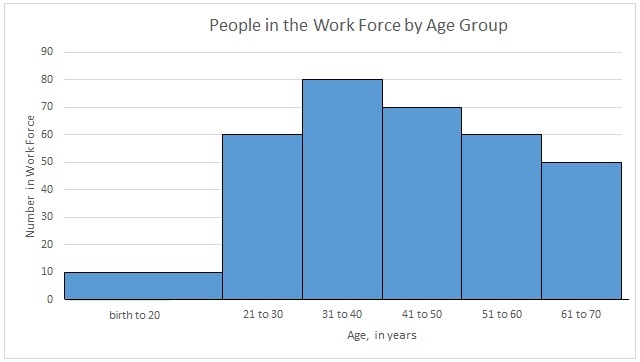
Figure 0030.040. A Beginner's Guide to Graphing Data. Notice the terminology. Paul Anderson calls a time-series plot in his illustration a "line graph." He may be using this term to refer to a whole family of graphs, all using a line to present the data, of which a time-series plot is one.