 |
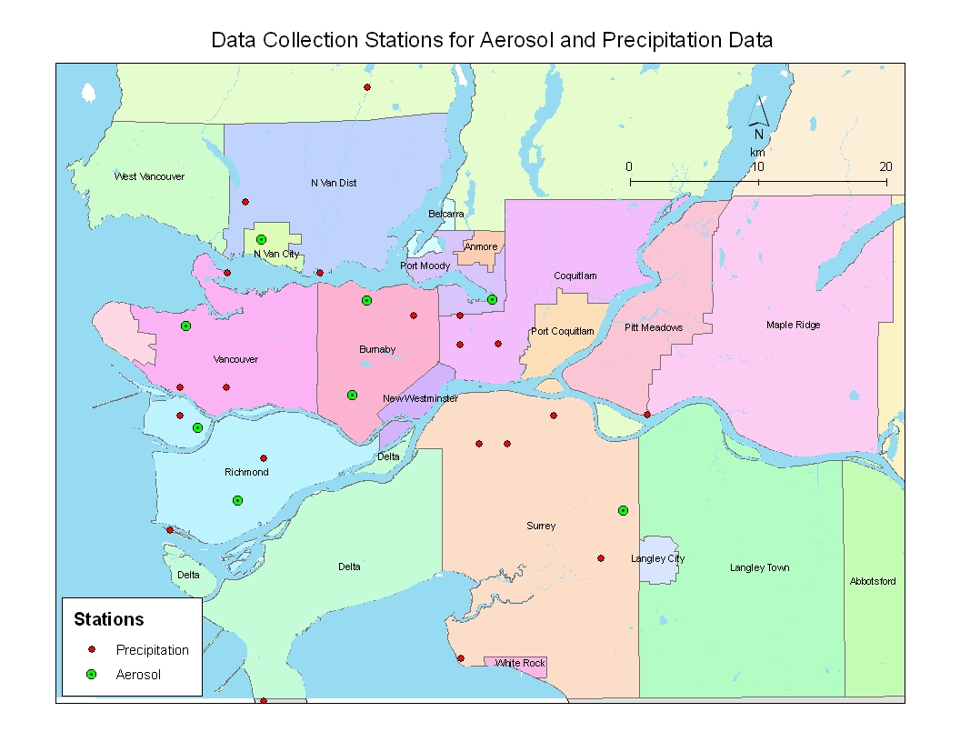
| Map 1. Data collection points for aerosol and precipitation data |
To analyze the precipitation and aerosol data, a visual approach is first undertaken using GIS maps. All stations with their corresponding precipitation and aerosol data for 2001 are being digitized (drawn on/data input) on the GVRD basemap using ESRI’s ArcMap 9. Each of the precipitation stations are referenced by latitude and longitude, and aerosol stations are referenced by addresses. In ArcMap 9, a vector GIS program, the data is plotted as points, lines, and polygons. In this case, the data stations are the points and the GVRD basemap is represented by polygons. As seen in Map 1, point locations of the precipitation and aerosol stations are shown on the map. In order to go further for this analysis, values for aerosol and precipitation in between the stations have to be estimated. This has to be done by a raster program called IDRISI. Using IDRISI, the entire map is represented by grid cells and can therefore show continuous variations throughout the landscape. It also has a function called “interpolation” to estimate all the data in between the individual data points. After the precipitation and aerosol maps are interpolated, continuous spatial variations for these two variables can be visualized.
|
| Map 1. Data collection points for aerosol and precipitation data |
The interpolated and aerosol maps provides the reader with a visual clue as to which part of the GVRD has higher precipitation or aerosol. However, just knowing these spatial distributions visually is not enough to carry on the objective of finding a suitable area for a new clean rapid transit line. More variables has to be taken into account when a new line is built. First, the slopes of the GVRD has to be taken into account. Usually, these light rapid transit lines are only built where lands are flat and less than 5 degrees in slope. After this, two other social geographical variables must be taken into consideration. The first is population density, a new line is not feasiable when there aren't enough people being able to ride on it within an area. Therefore, a population density map of the GVRD has to be created. Secondly, average family income is also a good indicator of public transit riders. Usually people of the extreme upper class will not ride public transit even if the network coverage is good. Therefore, one has to take a close look at where the distribution of middle to lower income families. These are the families that takes public transit the most. Thus, a map of population density has to be created.
The slope map is created in IDRISI. A digital elevation map (DEM) has to be attained first from the help of ArcMap. After importing the ArcMap DEM file into IDRISI, a SLOPE operation is being executed on the DEM map using the macro modeller. The slope is calculated as degrees and the resultant map will show a wide range of slopes within the topographically variable landscape of the GVRD. Once the slope of all land is determined, a RECLASS operation has been executed on the slopes, where only slopes of lower than 5 degrees are considered suitable (1), and those over 5 degrees are unsuitable (0). By executing this RECLASS option, a boolean map of suitable slope is created for analysis.
Population density and average family income maps can be created in ArcMap. There, the Census 2001 database and DA shapefile is being used. To obtain the population density, a new field is created (pop_den) in the Census attribute table. On that new field, a calcuation is executed to calculate the population density (people/unit area of DA) within each DA. The result of this calculation will yeild the number of people per sq.meter. Next, a symbol classification from the quantity of people is applied with a graduated colour ramp. The resultant map will show areas with darker coloured DA indicating the higher densities of population.
The average family income map is obtained using a similar way. Again, the data for average family income comes from Census 2001. This time, the data is readily avaliable and therefore, no calculation has to be applied to manipulate. Thus, the field for average family income in the attribute table is being classified by a graduated colour scheme. The resultant map is a map where higher income will show a darker colour in its DA.
Both the population density and average family income map has to be imported into IDRISI format and converted to raster before an aggregated anaylsis can take place for all the variables aformentioned.
The environmental variables in this analysis are precipitation and aerosol distributions, while the structural variable is the slope of the region. These variables inherently ties together because they all relate to the natural environment in some way. Thus, a macro model is built to analyze all these variables combined together using OVERLAY operations. In the end, a suitability map for the areas most demanding of a new rapid transit line according to environmental and structural characteristics will show up. Note that the suitability map will be indicated by a suitability index where a higher suitability has a higher value.
In the macro model (Figure 1), notice that the water layer (water_ras) is being reclassed as a boolean image to overlay with the good_areas, which are areas of good air quality. The overlaying of good_areas and water_bool is a division process where the areas with water is acting to calculate an inverse of the values in good_areas to create a layer where areas with worse air quality (higher need for new rapid transport). All other overlays in this model is a multiplication (AND) process. The bottom part of the model shows how the gvrd_dem image is used to calculate the slope for a boolean image (opt_slopes). The boolean image is then used to overlay with the areas with the worse combined qualities of aerosol and precipitation to create a final map for the optimal locations where a new transit line should be built according to the environment. Also, note that the water_bool, and opt_slopes layer will be used as constraints in the MCE described in the later section.
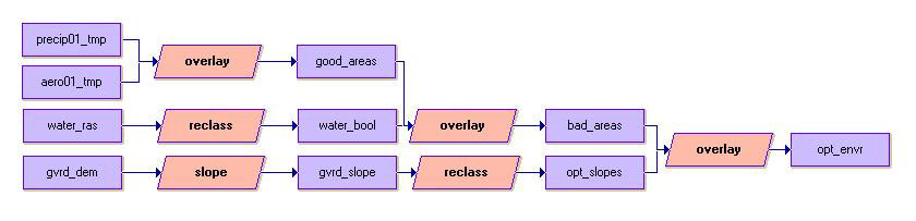 |
| Figure 1. Macro model for environmental and structural analysis. |
Multi-criteria evaluations (MCE) are known for their good capability
of allowing fuzziness and weighting for different variables within a project
design. Thus, MCE is also very suitable for this analysis of finding the areas
with the greatest need for non-polluting rapid transit. Because environmental
concerns of air pollution and acid rain generation is of the highest concern
in this analysis, social geographic factors are necessary but are secondary.
Also, two environmental/structural constrains of the landscape has to be taken
into account as constraints. First of all, the light rail cannot travel over
water. Second, only areas with slope less than 5 degrees will be good for this
new rail line. A step-by-step screenshot and descriptions
of this MCE should help you understand more about the operations of this
process.