Chapter Contents
Previous
Next
|
Chapter Contents |
Previous |
Next |
| Getting Started with Time Series Forecasting |
In the Develop Models window, select the row in the table containing the Linear Trend model so that this model is highlighted. The model list should now appear as shown in Display 23.38.
Display 23.38: Selecting a Model to View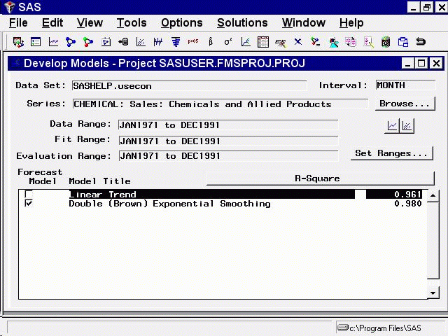
Note that the Linear Trend model is now highlighted, but the Forecast Model column still shows the Double Exponential Smoothing model as the model chosen to produce the final forecasts for the series. Selecting a model in the list means that this is the model that menu items such as View Model, Delete, Edit, and Refit will act upon. Choosing a model by selecting its check box in the Forecast Model column means that this model will be used by the Produce Forecasts process to generate forecasts.
Now bring up the Model Viewer by selecting the right icon under the Browse button, or by selecting Model Predictions in the tool-bar or from the View pull-down menu. The Model Viewer displays the Linear Trend model, as shown in Display 23.39.
Display 23.39: Model Viewer: Actual and Predicted Values Plot
This graph shows the linear trend line representing the model predicted values together with a plot of the actual data values, which fluctuate about the trend line.
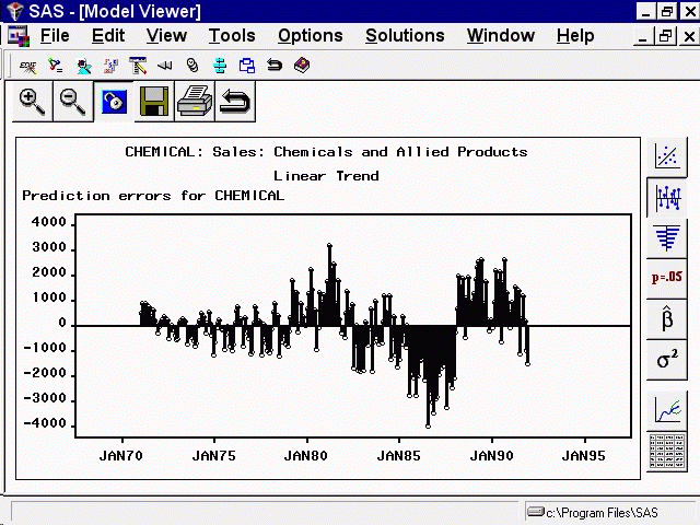
If the model being viewed includes a transformation, prediction errors are defined as the difference between the transformed series actual values and model predictions. You can choose to graph instead the difference betwen the untransformed series values and untransformed model predictions, which are called model residuals. You can also graph normalized prediction errors or normalized model residuals. Use the Residual Plot Options submenu under the Options pull-down menu.
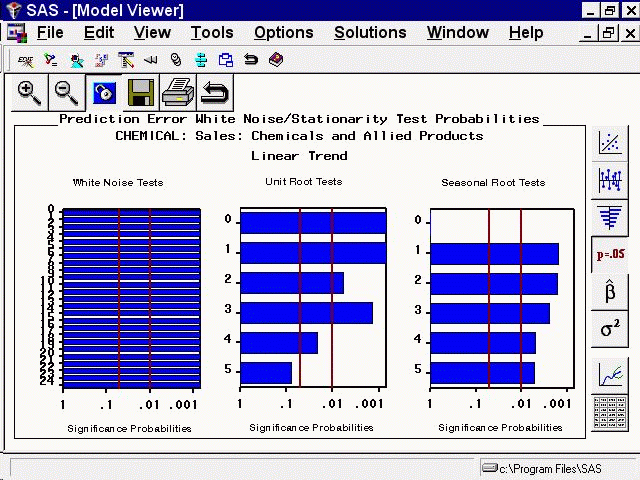
The white noise test bar chart shows significance probabilities of the Ljung-Box Chi Square statistic. Each bar shows the probability computed on autocorrelations up to the given lag. Longer bars favor rejection of the null hypothesis that the prediction errors represent white noise. In this example they are all significant beyond the .001 probability level, so that we reject the null hypothesis. In other words, the high level of significance at all lags makes it clear that the linear trend model is inadequate for this series.
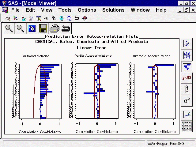
The second bar chart shows significance probabilities of the Augmented Dickey-Fuller test for unit roots. For example, the bar at lag three indicates a probability of .0014, so that we reject the null hypothesis that the series is nonstationary. The third bar chart is similar to the second except that it represents the seasonal lags. Since this series has a yearly seasonal cycle, the bars represent yearly intervals.
You can select any of the bars to display an interpretation. Select the fourth bar of the middle chart. This displays the Recommendation for Current View, as shown in Display 23.43. This window gives an interpretation of the test represented by the bar that was selected; it is significant, therefore a stationary series is likely. It also gives a recommendation: You do not need to perform a simple difference to make the series stationary.
Display 23.43: Model Viewer: Recommendation for Current View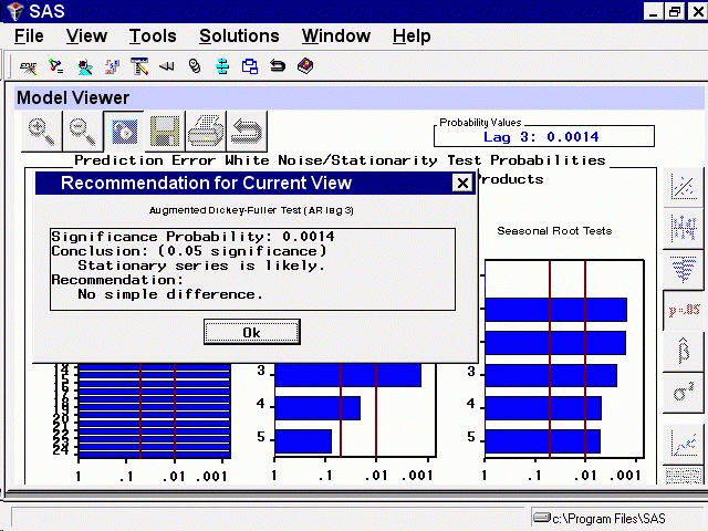
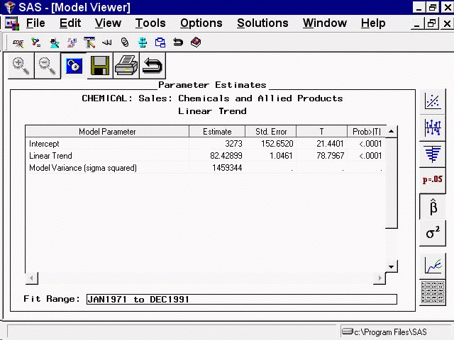
For the linear trend model, the parameters are the intercept and slope coefficients. The table shows the values of the fitted coefficients together with standard errors and t-tests for the statistical significance of the estimates. The model residual variance is also shown.
Now return to the Develop Models window, but do not close the Model Viewer window. You can use the Next Viewer icon in the tool-bar or your system's window manager controls to switch windows. You can resize the windows to make them both visible.
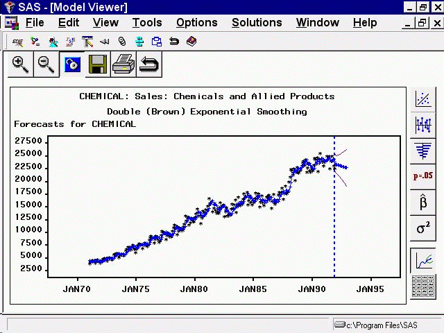
Select the Double Exponential Smoothing model so that this line of the model list is highlighted. The Model Viewer window is now updated to display a plot of the predicted values for the Double Exponential Smoothing model, as shown in Display 23.46. The Model Viewer is automatically updated to display the currently selected model, unless you specify Unlink (the third icon in the window's horizontal tool-bar).
Display 23.46: Model Viewer Plot for Exponential Smoothing Model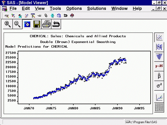
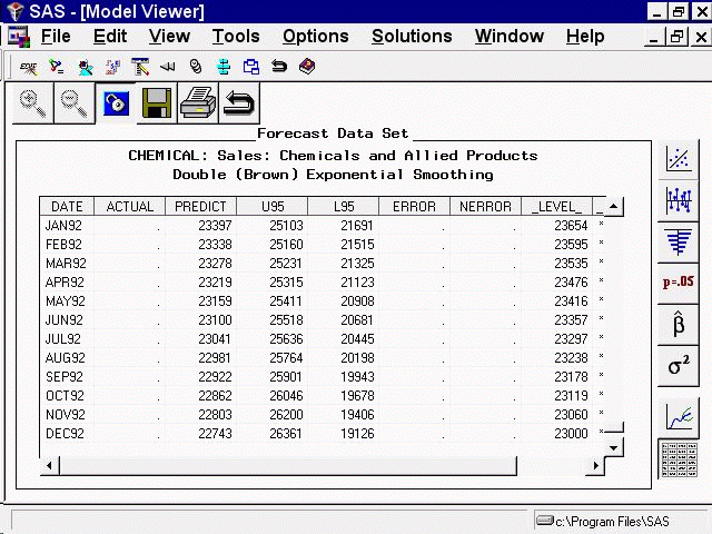
To view the full data set, use the vertical and horizontal scroll bars on the data table or enlarge the window.
To close the Model Viewer window, select Close from the window's horizontal tool-bar or from the File pull-down menu.
|
Chapter Contents |
Previous |
Next |
Top |
Copyright © 1999 by SAS Institute Inc., Cary, NC, USA. All rights reserved.