Chapter Contents
Previous
Next
|
Chapter Contents |
Previous |
Next |
| Examining Distributions |
A box plot is a schematic representation of a distribution. The vertical lines in the box mark the 25th, 50th, and 75th percentiles of the data. The pth percentile of a distribution is the value such that p percent of the observations fall at or below it. The 50th percentile is also called the median, and the 25th and 75th percentiles are called quartiles.
The narrow boxes extending to the left and right are called whiskers. Whiskers extend from the quartiles to the farthest observation not farther than 1.5 times the distance between the quartiles (the interquartile range). Beyond the whiskers, extreme observations are plotted individually.
The box plot gives a concise picture of the distribution and emphasizes any extreme values. This particular box plot appears fairly symmetric, with median around 600. You can see two extreme values.
| Identify the extreme observations by clicking on them. |
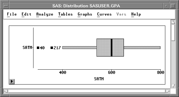
These are observations 40 and 217. When you click on them, the observations are selected in the box plot, the histogram, and the data window as well.
Related Reading | Box Plots, Chapter 33. |
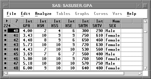
| Click in the upper left corner of the data window. |
This displays the data pop-up menu.
| Choose Find Next from the pop-up menu. |
This scrolls the data window to the next selected
observation, as shown in Figure 12.7.
By choosing Find Next again, you can examine
all values for the extreme observations.
|
Chapter Contents |
Previous |
Next |
Top |
Copyright © 1999 by SAS Institute Inc., Cary, NC, USA. All rights reserved.
![[menu]](images/exdeq2.gif)