Chapter Contents
Previous
Next
|
Chapter Contents |
Previous |
Next |
| Multivariate Analyses |
You can request a plot of the first two principal components or the first three principal components from the Principal Components Options dialog, shown in Figure 40.6, or from the Graphs menu, shown in Figure 40.34. Select Principal Components from the Graphs menu to display the Principal Component Plots dialog.
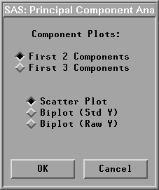
In the dialog, you choose a principal component scatter plot (Scatter Plot), a principal component biplot with standardized Y variables (Biplot (Std Y)), or a principal component biplot with centered Y variables (Biplot (Raw Y)).
A biplot is a joint display of two sets of variables. The data points are first displayed in a scatter plot of principal components. With the approximated Y variable axes also displayed in the scatter plot, the data values of the Y variables are graphically estimated.
The Y variable axes are generated from the regression coefficients of the Y variables on the principal components. The lengths of the axes are approximately proportional to the standard deviations of the variables. A closer parallel between a Y variable axis and a principal component axis indicates a higher correlation between the two variables.
For a Y variable Y1, the Y1 variable value of a data point y in a principal component biplot is geometrically evaluated as follows:
Two sets of variables are used in creating principal component biplots. One set is the Y variables. Either standardized or centered Y variables are used, as specified in the Principal Component Plots dialog, shown in Figure 40.36.
The other set is the principal component variables. These variables have variances either equal to one or equal to corresponding eigenvalues. You specify the principal component variable variance in the Multivariate Method Options dialog, shown in Figure 40.3.
Note | A biplot with principal component variable variances equal to one is called a GH' biplot, and a biplot with principal component variable variances equal to corresponding eigenvalues is called a JK' biplot. |
A biplot is a useful tool for examining data patterns and outliers. Figure 40.37 shows a biplot of the first two principal components from the correlation matrix and a rotating plot of the first three principal components. The biplot shows that the variable SEPALWID (highlighted axis) has a moderate negative correlation with PCR1 and a high correlation with PCR2.
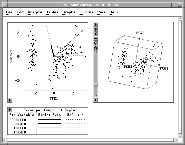
Figure 40.37: Principal Component Plots
|
Chapter Contents |
Previous |
Next |
Top |
Copyright © 1999 by SAS Institute Inc., Cary, NC, USA. All rights reserved.