Chapter Contents
Previous
Next
|
Chapter Contents |
Previous |
Next |
| HBAR Statement |
For example, you can use the FREQ procedure to obtain the compressed data set FAILURE2 from the data set FAILURE1.
   proc freq data=failure1;
      tables cause / noprint out=failure2;

   proc print;
   run;
A listing of FAILURE2 is shown in Figure 27.2.
|
The following statements produce a Pareto chart for the data in FAILURE2:
   title 'Analysis of IC Failures';
   symbol color = salmon h = .8;;
   proc pareto data=failure2;
      hbar cause / freq       = count
                   scale      = count
                   interbar   = 1.0
                   last       = 'Miscellaneous'
                   nlegend    = 'Total Circuits'
                   cframenleg = ywh
                   cframe     = ligr
                   cbars      = vigb
                   cconnect   = salmon;
   run;
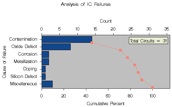
The chart is displayed in Figure 27.3.
|
A slash (/) is used to separate the process variable CAUSE from the options specified in the HBAR statement. The frequency variable COUNT is specified with the FREQ= option. Specifying the keyword COUNT with the SCALE= option requests a frequency scale for the horizontal axis.
The INTERBAR= option inserts a small space between the bars, and specifying LAST='Miscellaneous' causes the category Miscellaneous to be displayed last regardless of its frequency. The NLEGEND= option adds a sample size legend labeled Total Circuits, and the CFRAMENLEG= option frames the legend. The SYMBOL statement marks points on the curve with dots. There are two sets of tied categories in this example; Corrosion and Metallization each occur twice, and Doping and Silicon Defect each occur once. The procedure displays tied categories in alphabetical order of their formatted values. Thus, Corrosion appears before Metallization, and Doping appears before Silicon Defect in Figure 27.3. This is simply a convention, and no practical significance should be attached to the order in which tied categories are arranged.
|
Chapter Contents |
Previous |
Next |
Top |
Copyright © 1999 by SAS Institute Inc., Cary, NC, USA. All rights reserved.