Chapter Contents
Previous
Next
|
Chapter Contents |
Previous |
Next |
| Details and Examples |
| See PARETO7 in the SAS/QC Sample Library |
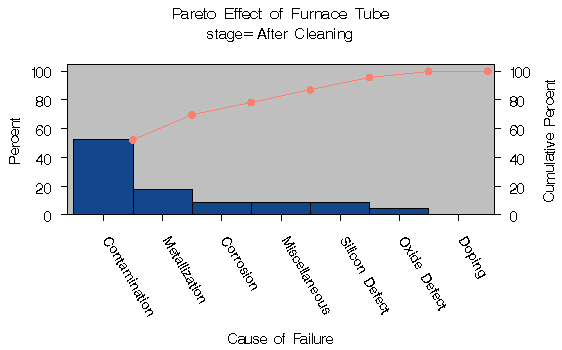
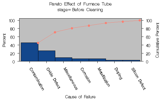
During the manufacture of a metal-oxide semiconductor (MOS) capacitor, causes of failures were recorded before and after a tube in the diffusion furnace was cleaned. This information was saved in a SAS data set named FAILURE3.
   data failure3;
      length cause $ 16 stage $ 16 ;
      label  cause = 'Cause of Failure' ;
      input  stage $ 1-16 cause $ 19-34 counts;
      datalines;
   Before Cleaning   Contamination    14
   Before Cleaning   Corrosion         2
   Before Cleaning   Doping            1
   Before Cleaning   Metallization     2
   Before Cleaning   Miscellaneous     3
   Before Cleaning   Oxide Defect      8
   Before Cleaning   Silicon Defect    1
   After Cleaning    Doping            0
   After Cleaning    Corrosion         2
   After Cleaning    Metallization     4
   After Cleaning    Miscellaneous     2
   After Cleaning    Oxide Defect      1
   After Cleaning    Contamination    12
   After Cleaning    Silicon Defect    2
   ;
To compare distribution of failures before and after cleaning, you can create two separate Pareto charts, one for the observations in which STAGE is equal to Before Cleaning and one for the observations in which STAGE is equal to After Cleaning. You can do this with the BY statement.
   proc sort data=failure3;
      by stage;

   title 'Pareto Effect of Furnace Tube' ;
   proc pareto data=temp1;
      vbar cause / freq     = counts
                   angle    = -60
                   cframe   = ligr
                   cbars    = vigb
                   cconnect = salmon;
      by stage;
   run;
The SORT procedure sorts the observations in order of the values
of STAGE. It is not necessary to sort by the values of CAUSE
since this is done by the PARETO procedure. The two charts,
displayed in Output 29.1.1 and Output 29.1.2,
reveal a reduction in oxide defects after the tube was
cleaned. This is a relative reduction, since the
primary axes are scaled in percent units.
Output 29.1.1: "After" Analysis Using STAGE as a BY Variable
|
|
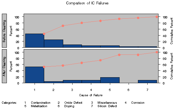
In general, it is difficult to compare Pareto charts created with BY processing because their axes are not necessarily uniform. A better approach is to construct a comparative Pareto chart, as illustrated by the following statements:
   title 'Comparison of IC Failures' ;
   proc pareto data=failure3;
      vbar cause / class      = stage
                   freq       = counts
                   intertile  = 1.0
                   classkey   = 'Before Cleaning'
                   cframeside = ligr
                   cframe     = ligr
                   cbars      = vigb
                   cconnect   = salmon;
   run;
| See PARETO8 in the SAS/QC Sample Library |
The CLASS= option designates STAGE as a classification variable, and this directs the procedure to create the one-way comparative Pareto chart, shown in Output 29.1.3, that displays a component chart for each level of STAGE.
Output 29.1.3: Before-and-After Analysis Using Comparative Pareto Chart
|
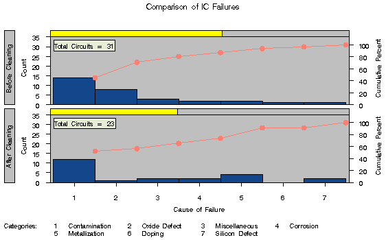
In many applications, it may be more revealing to base comparisons on counts rather than percents. The following statements construct a chart with a frequency scale:
   title 'Comparison of IC Failures' ;
   proc pareto data=failure3;
      vbar cause / class      = stage
                   freq       = counts
                   scale      = count
                   intertile  = 1.0
                   nlegend    = 'Total Circuits'
                   cframenleg = ywh
                   cprop      = yellow
                   classkey   = 'Before Cleaning'
                   cframe     = ligr
                   cbars      = vigb
                   cconnect   = salmon
                   cframeside = ligr;
   run;
The chart is shown in Output 29.1.4.
Output 29.1.4: Before-and-After Analysis Using Comparative Pareto Chart
|
Note that the lower cumulative percent curve in Output 29.1.4 is not anchored to the first bar. This is a consequence of the uniform frequency scale and of the fact that the number of observations in each cell is not the same.
|
Chapter Contents |
Previous |
Next |
Top |
Copyright © 1999 by SAS Institute Inc., Cary, NC, USA. All rights reserved.