Chapter Contents
Previous
Next
|
Chapter Contents |
Previous |
Next |
| Graphical Enhancements |
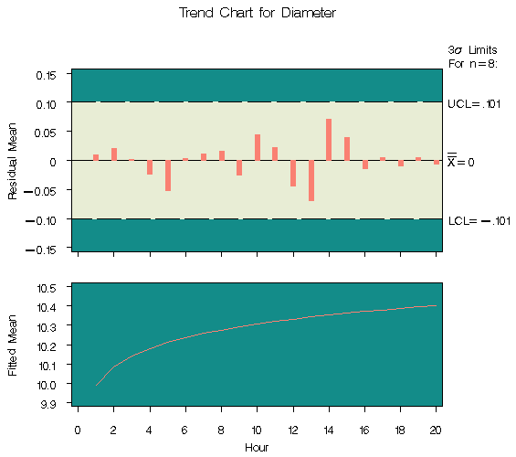
The third step is to create a trend chart with the SHEWHART
procedure, as follows:
   title 'Trend Chart for Diameter';
   symbol v=none c=salmon w=5;
   proc shewhart history=regdata;
      xchart diameter*hour /
         stddeviations
         trendvar = fitted
         cneedles = black
         wtrend   = 1
         split    = '/'
         nolegend
         cframe   = vibg
         cinfill  = ywh;
      label diameterx = 'Residual Mean/Fitted Mean';
   run;
|
If the data are correlated in time, you can use the ARIMA or AUTOREG procedures in place of the REG procedure to remove autocorrelation structure and display a control chart for the residuals; for an example, see "Autocorrelation in Process Data" . Another application of the TRENDVAR= option is the display of nominal values in control charts for short runs; see "Short Run Process Control" .
|
Chapter Contents |
Previous |
Next |
Top |
Copyright © 1999 by SAS Institute Inc., Cary, NC, USA. All rights reserved.