Chapter Contents
Previous
Next
|
Chapter Contents |
Previous |
Next |
| Graphical Enhancements |
| See SHWCLIP in the SAS/QC Sample Library |
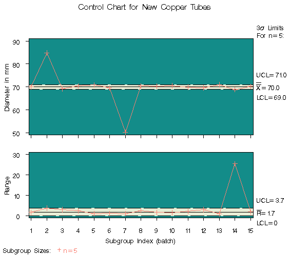
In some control chart applications, the out-of-control points can be so extreme that the remaining points are compressed to a scale that is difficult to read. In such cases, you can clip the extreme points so that a more readable chart is displayed, as illustrated in the following example.
A company producing copper tubing
uses ![]() and R charts to monitor the diameter of the tubes.
Based on previous production, known values of 70mm and 0.75mm
are available for the mean and standard deviation of the diameter.
The diameter measurements
(in millimeters) for 15 batches of five tubes each
are provided in the data set NEWTUBES.
and R charts to monitor the diameter of the tubes.
Based on previous production, known values of 70mm and 0.75mm
are available for the mean and standard deviation of the diameter.
The diameter measurements
(in millimeters) for 15 batches of five tubes each
are provided in the data set NEWTUBES.
   data newtubes;
      label diameter='Diameter in mm';
      do batch = 1 to 15;
         do  i = 1 to 5;
            input diameter @@;
            output;
         end;
      end;
   datalines;
   69.13  69.83  70.76  69.13  70.81
   85.06  82.82  84.79  84.89  86.53
   67.67  70.37  68.80  70.65  68.20
   71.71  70.46  71.43  69.53  69.28
   71.04  71.04  70.29  70.51  71.29
   69.01  68.87  69.87  70.05  69.85
   50.72  50.49  49.78  50.49  49.69
   69.28  71.80  69.80  70.99  70.50
   70.76  69.19  70.51  70.59  70.40
   70.16  70.07  71.52  70.72  70.31
   68.67  70.54  69.50  69.79  70.76
   68.78  68.55  69.72  69.62  71.53
   70.61  70.75  70.90  71.01  71.53
   74.62  56.95  72.29  82.41  57.64
   70.54  69.82  70.71  71.05  69.24
   ;
The following statements create the
   title  'Control Chart for New Copper Tubes' ;
   symbol v=plus c=salmon;
   proc shewhart data=newtubes;
      xrchart diameter*batch /
         mu0      = 70
         sigma0   = 0.75
         cinfill  = ywh
         cconnect = salmon
         cframe   = vibg;
   run;
Batches 2 and 7 result in extreme out-of-control points on the mean chart, and batch 14 results in an extreme out-of-control point on the range chart. The vertical axes are scaled to accommodate these extreme out-of-control points, and this in turn forces the control limits to be compressed.
|
You can request clipping by specifying the option CLIPFACTOR=factor, where factor is a value greater than one (useful values are typically in the range 1.5 to 2). Clipping is applied in two steps, as follows:
Notes:
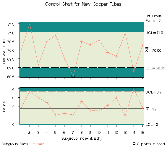
The following statements create ![]() and R charts, shown
in Figure 47.28, that use a clipping factor of 1.5:
and R charts, shown
in Figure 47.28, that use a clipping factor of 1.5:
   proc shewhart data=newtubes;
      xrchart diameter*batch /
         mu0        = 70
         sigma0     = 0.75
         clipfactor = 1.5
         cclip      = black
         cconnect   = salmon
         cinfill    = ywh
         cframe     = vibg;
   run;
|
In Figure 47.28, the extreme out-of-control points are clipped making the points plotted within the control limits more readable. The clipped points are marked with a square, and a clipping legend is added at the lower right of the display.
Other clipping options are available, as illustrated by the following statements:
   proc shewhart data=newtubes;
      xrchart diameter*batch /
         mu0         = 70
         sigma0      = 0.75
         clipfactor  = 1.5
         clipsymbol  = dot
         cliplegpos  = top
         cliplegend  = '# Clipped Points'
         clipsubchar = '#'
         cclip       = black
         cconnect    = salmon
         cinfill     = ywh
         cframe      = vibg;
   run;

|
Specifying CLIPSYMBOL=DOT marks the clipped points with a dot instead of the default square. Specifying CLIPLEGPOS=TOP positions the clipping legend at the top of the chart. The options CLIPLEGEND='# Clipped Points' and CLIPSUBCHAR='#' request the clipping legend 3 Clipped Points. For more information about the clipping options, see the appropriate entries in Chapter 46, "Dictionary of Options."
|
Chapter Contents |
Previous |
Next |
Top |
Copyright © 1999 by SAS Institute Inc., Cary, NC, USA. All rights reserved.