Chapter Contents
Previous
Next
|
Chapter Contents |
Previous |
Next |
| Building a Model with Compound Components |
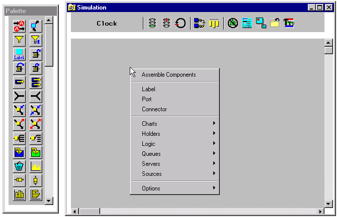
The pop-up menu on the Simulation window (see Figure 5.2) has as its first entry Assemble Components. When you choose this selection, you get a rubberband rectangle with which you can sweep out an area on the Simulation Window. Any components that are completely within this region will be encapsulated in a compound component.
|
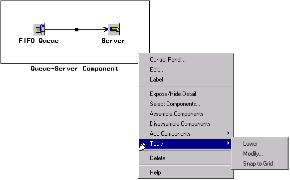
Figure 5.1 shows an example compound component. This encapsulated queue and server can now be treated as a single unit, called a compound component. It has a pop-up menu, shown in Figure 5.3, which includes Assemble Components and Disassemble Components for assembling additional compound components within it and for removing the encapsulation.
|
This compound component also includes
Edit,
a selection that opens a separate window for
editing the contents of the compound component, and
Expose/Hide Details,
a selection that toggles the compound
component with an icon.
The default icon,
 ,
can be replaced with a user icon by using the
Component Attributes Panel selection on the Command Panel (see Figure 8.2).
,
can be replaced with a user icon by using the
Component Attributes Panel selection on the Command Panel (see Figure 8.2).
You can also pick up components and move them into and out of compound components. Compound components themselves can be moved into and out of compound components as well. And, it is not necessary to use drag and drop to accomplish this. You simply move the component by pressing the mouse button down as you scroll over the component when you see the hand icon. When you release the mouse button, the component will be in the new position within the compound component.
|
Chapter Contents |
Previous |
Next |
 Top |
Copyright © 1999 by SAS Institute Inc., Cary, NC, USA. All rights reserved.