New Image Gallery Component
A new Image Gallery Component is available in the CLF4 template. While the key component options remain the same as in the previous version, there are important differences in display styles and functionality.
Please note that only one Image Gallery Component can be added on a page.
Image selection
The new Image Gallery Component creates canvas based on the max width and max height of the widest and highest image. To optimize the display of your Image Gallery or Slideshow, use horizontal images with a 3:2 aspect ratio that are 2000px wide.
- If your images are smaller than 2000px in width and are viewed on larger screens, grey background will appear to the left and right of the image
- If you use horizontal images of different aspect ratios, grey background background will appear around, on top and bottom or left and right of some of the images to match the aspect ratio of the component canvas
- To use a portrait image, resize it to match the height of the heighest landscape image, then canvas, using transparent background, to match the width of the widest image in the gallery. Save the image as a PNG
Slideshow display
The slideshow automatically plays your images for a duration of 5 seconds each. The user can pause the slideshow anytime by clicking on the image or the pause button. Clicking on the image again or the play button restarts the slideshow. If less than 50% of the slideshow is visible on the screen, the slideshow automatically pauses and then restarts when more than 50% of it becomes visible.
- When used on a sub page, the slideshow will always fill 100% of the container
- When used on a home page, the slideshow will:
- fill 50% of the container on desktop if placed in no column, or 1 column layout
- fill 75% of the container on desktop if placed in a 67% column
- fill 100% of the container if placed in a 50% or less column, and always on tablet and mobile
Image Gallery display
The image gallery displays a feature image with five thumbnails placed below. The user can navigate between images by clicking on thumbnails, arrows or swiping the feature image on touch screens.
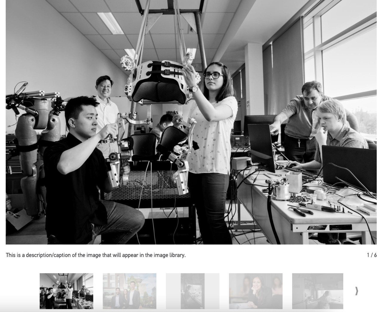
Please note that thumbnails disappear if the image gallery is placed in a column less than 50% and always on tablet and mobile.
- When used on a sub page, the Image Gallery will:
- fill 75% of the container on desktop if placed in no column, or 1 column layout
- fill 100% of the container if placed in any other layout, and always on tablet and mobile
- When used on a home page, the Image Gallery will:
- fill 50% of the container if placed in no column, or 1 column layout on desktop
- fill 75% of the container if placed in a 67% column on desktop
- fill 100% of the container if placed in a 50% or less column, and always on tablet and mobile