Academic Project
Slack Redesign
Date: Feb 2019
Duration: 3 weeks
Team: Rachel Bae, Jarielle Lim, Nijhum Nijhum
Role: Research, UX/UI Design, User Test facilitator

Overview
Slack redesign is an academic project focused on finding usability problems in an interface design by conducting UI usability testing and applied the research to design some potential improvements to the UI.
Preparing & Conducting a UI Test
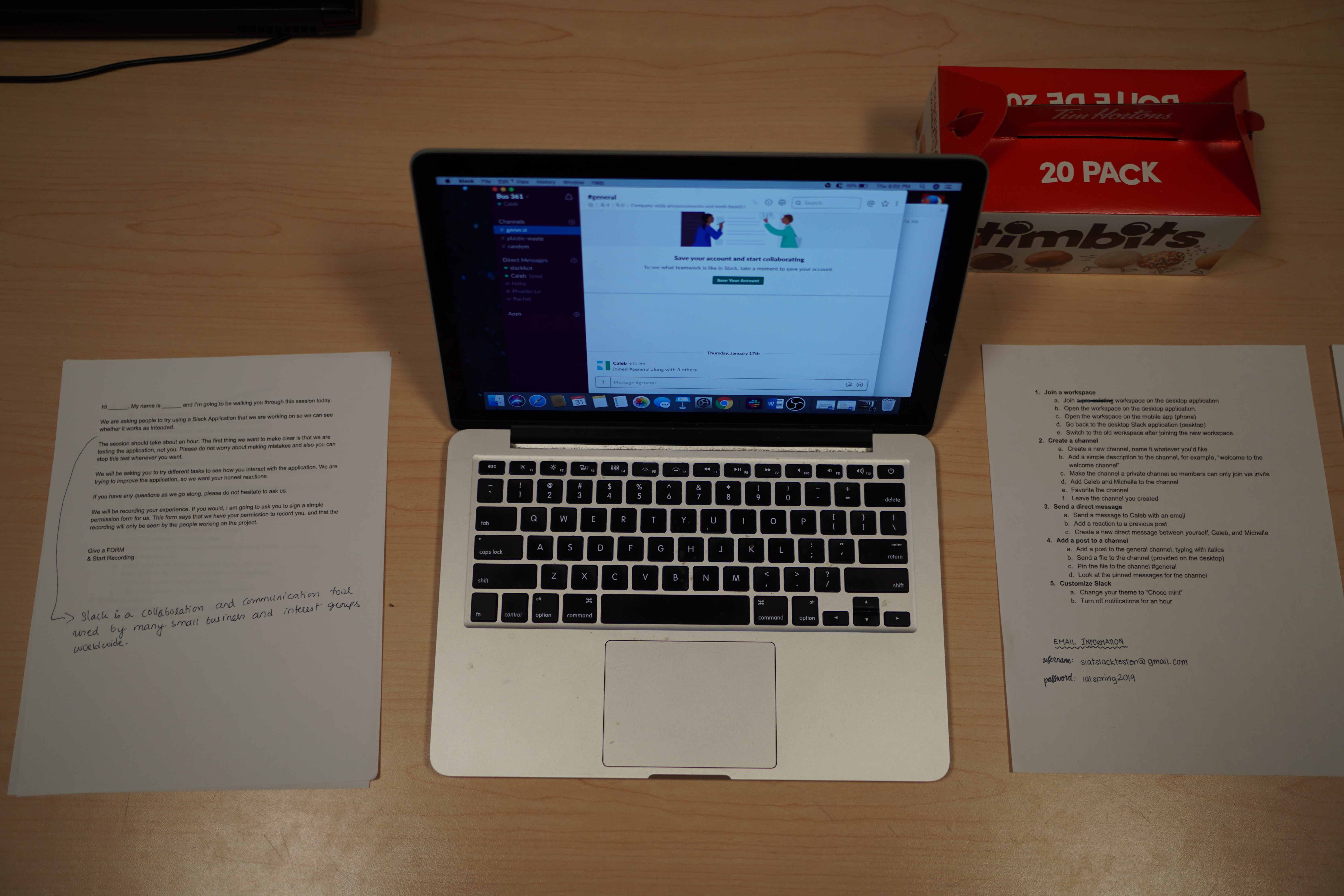
In the user testing study, we prepare pre-test and post-test questionnaires for the user testing. At the pre-test questionnaires, we collect some background information about the testers, such as their age, the familiar level with Slack and what kind of team collaboration service they use. After the pre-test questionnaires, we let our testers to complete the tasks list that we create and using a think-aloud protocol. In this test, we observe the tester react during the testing and how long they took in order to complete each task. After the tasks testing, we do a post-test interview with our tester. In this part, we will ask some question to the tester, they will express their feeling/ thought about Slack, this part give us better understand about the user what they are facing during the testing, what they like/ dislike about the app.
We had a total of 5 participants in this testing, most of our participants are in the age range of 20 – 34. Their professions are in the design, computer science, communications and marketing area. 3 out of 5 participants haven’t use Slack before, and the other two participants are notice and intermediate user of Slack.
Analyze of the Finding & User Feedback
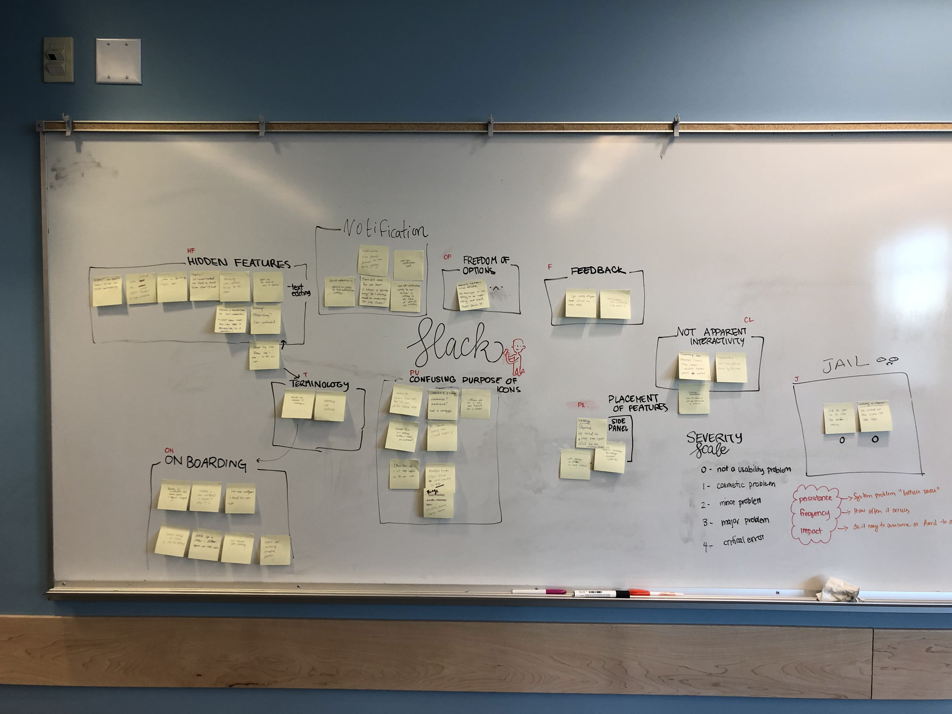
When we analyze the testing finding and users' feedback, we came up with 9 categories based on the data. And used the following severity scale to rate each category.
- Hidden Features
- Notification
- Freedom of control
- Feedback
- Not Apparent Interactivity
- Terminology
- Onboarding
- Confusing purpose of icons
- Placement of Features

Considering the severity level, onboarding, favoriting a channel, hidden features and confusing purpose of the icons were the top four heuristic brokens. We decide to redesign the application in four ways:
- Adding multiple workspaces easily when they are onboarding
- Favoriting a channel with a better UI design
- Intuitive way to provide guidance for the hidden features like customizing the text
- Removing all the unrelated icons on the channel panel
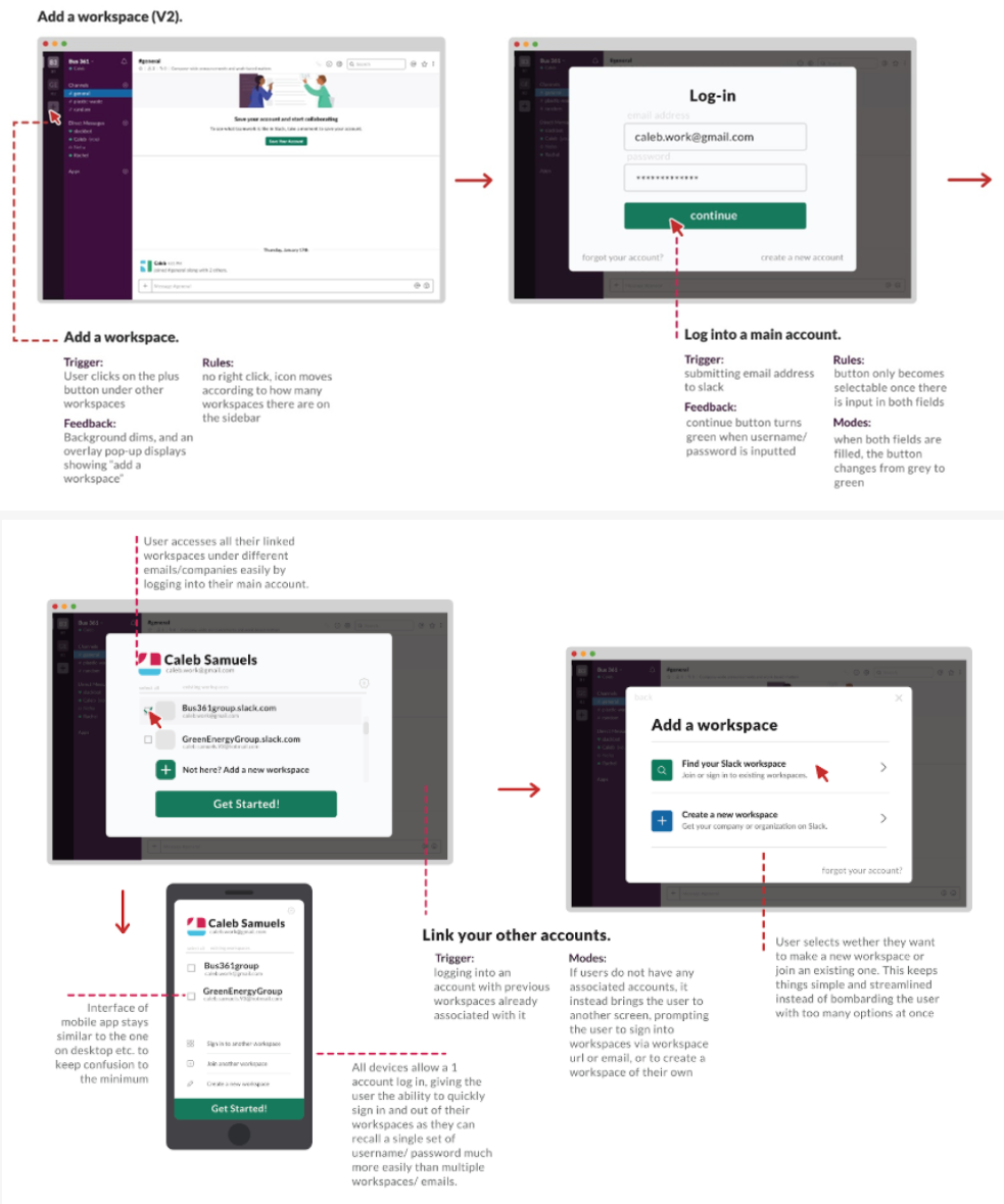
Issue of Adding Multiple Workspaces & Suggested Improvements
Issue 1: Adding Multiple Workspaces
Adding an additional workspace proved a huge hassle for many new users, especially since slack relies on the user to remember the workspace URL and hides away the sign in by email option that most users are familiar with.
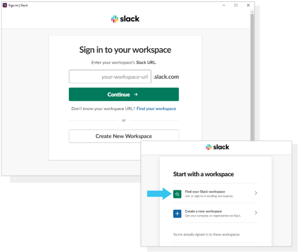
Solution 1: Start with email log-in instead of URL
Join a workspace starts with an Email sign-in instead of the workspace URL to make it easier for users to recall their account information in a more step-by-step approach following the Nielsen's heuristic of an aesthetic and minimalist design as well as a match between system and the real world.
Click here to view the IX flow.
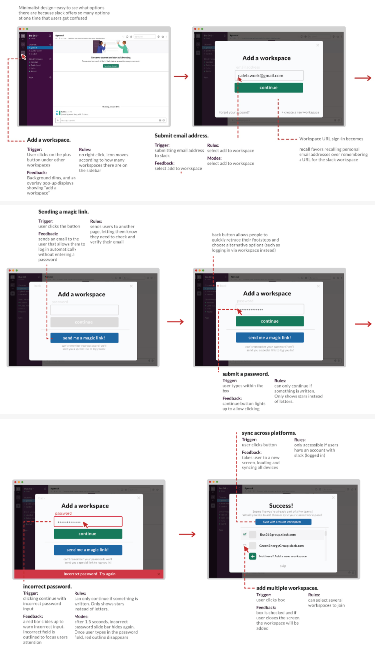
Solution 2: Main account for all workspaces
Instead of logging into several workspaces through multiple emails, having an overarching account that contains all workspaces under multiple emails can make the whole sign in process easier. Signing into multiple devices under one account makes it easier for users to join all their workspaces quickly. This also follows Nielsen's heuristic of aesthetic and minimalist design as well as consistency and standards.
Click here to view the IX flow.
Issue of Adding Channel to Favorites & Suggested Improvements
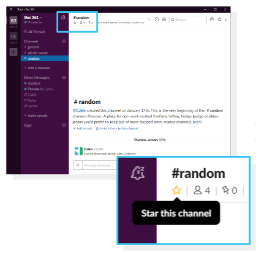
Issue 2: Adding a Channel to Favorites
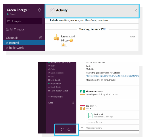
Favorite a channel icon is easy to get confused by the new user. The star icon is used to star a channel and post, however, the placement and icon user will mistake the star icon is used for view the starred item not to favorite the channel.
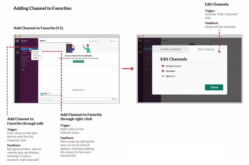
Solution 1: Add a Channel to Favorites through edit/ right click
Add Channel to Favorite through edit/ right click instead of the star icon, users can easier to manage multiple channels or access to several options, following the Nielsen's heuristic of flexibility and efficiency of use and help and documentation.
Click here to view the IX flow.
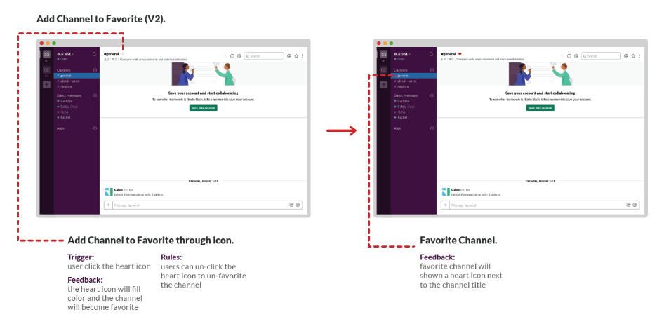
Solution 2: Add a Channel to Favorites through icon
Add Channel to Favorite through heart icon, users can easier to identify the icon and add channel to favorite, following the Nielsen's heuristic of aesthetic and minimalist design.
Click here to view the IX flow.
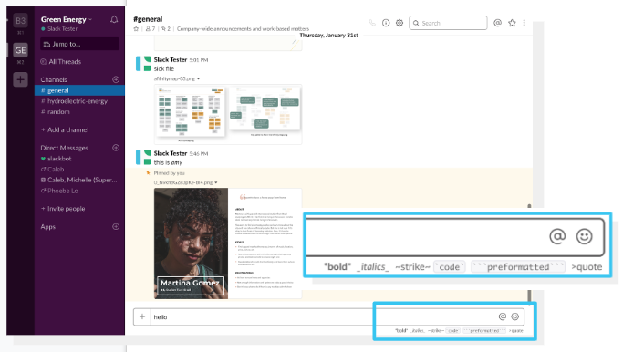
Issue of Formatting Text & Suggested Improvements
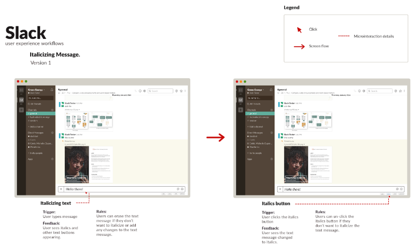
Issue 3: Formatting Text
The bold, italics and strikethrough options appear only when you start typing. The user has to follow a certain format to be able to italicize, bold or strikethrough a text which gives an impression of coding.
Solution 1: Making the italics option clickable
By making the text formatting option clickable, the italics option would be clearly visible to the users. It would also give the user to easily unclick the button if they don’t want certain text to be italicized, following Nielsen’s Heuristic flexibility and efficiency of use.
Click here to view the IX flow.
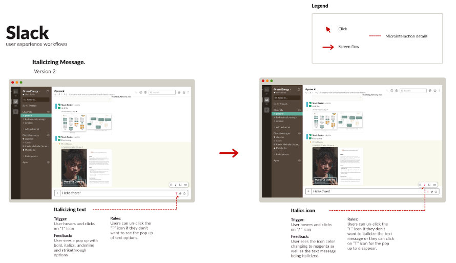
Solution 2: Adding ‘T’ icon for text format
The second solution is adding a “T” for text format beside the icons in the text box to italicize text. When the user clicks the “T” he/she gets a pop up that gives them the option to format their text. This follows the Nielsen’s Heuristic consistency and standard because it stays consistent with the other icons in the text panel.
Click here to view the IX flow.
Issue of Accessing The Channel Settings & Suggested Improvements
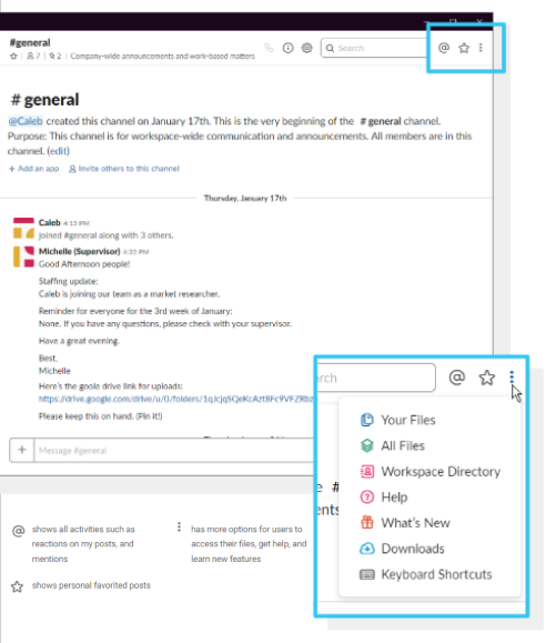
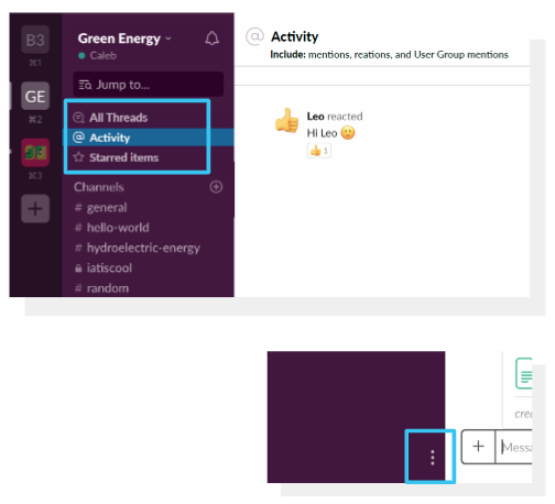
Issue 4: Accessing The Channel Settings
Icons on the top left corner are for global options instead of channel options. However, because of the placement, users often mistook them for channel options.
Solution 1: Separating the unrelated items
This first solution, we have changed the location of the Activity, Starred Items and More option icons to the bottom right corner of the purple menu bar. This will accelerate the use of three icons without any confusion. This follows Nielsen’s aesthetic and minimalist design and flexibility and efficiency of use.
Click here to view the IX flow.
Solution 2: Grouping with all threads
The second solution, we added Activity and Starred Items under the All Threads because all three are related to the personal use. We changed the location for the three horizontal dots, the more option, on the bottom right corner of the purple menu bar to minimize icons on the channel panel. This will allow users to access the channel settings more easily. This follows Nielsen's heuristic of flexibility and efficiency of use.
Click here to view the IX flow.
Reflection
Through this project, I learned lots of useful skills that allows me to apply it in my future UX project. First, I learned how best to develop usability study tasks, during the test, how to interact with study participants and document theirs react. Second, the finding from the user test let me understand what problems users face with the interface. Third, based on the result we found and made improvements to the interface by utilizing Heuristic evaluation.