Designing your homepage
The Basic Home Page template is designed to accommodate full-width static and dynamic images, news listings, event calendar feeds and more.
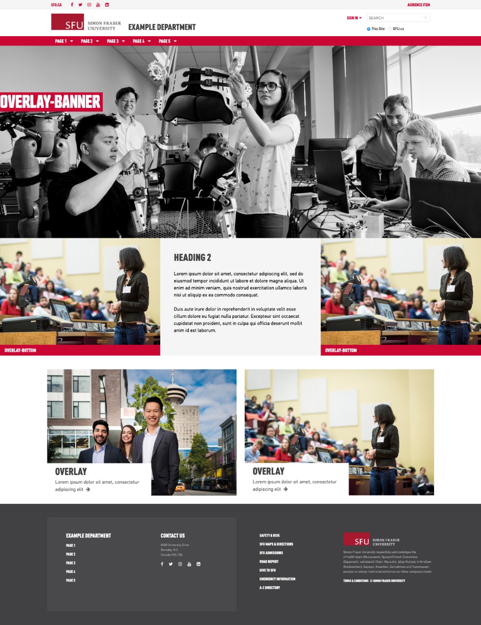
Content on your homepage can be organized in a number of ways by using our components and CSS classes.
Page title
Your homepage uses the site title as the page title, so don't duplicate it by adding a Page Title component or Heading 1.
Columns
All page components need to be placed within Column Control components.
To design the layout of your homepage use one or multiple Column Control components. The component allows you to split the page into a different number of columns, apply background colour, stretch content to fit the full width of the page and remove spacing between columns.
Padding and margins
To control padding and margins on your homepage:
- Use Full width and No spacing controls in your Column Control component
- Use pad and margin CSS classes in your Column Control and other content components. See generic styles >
Colour
Specify the background colour for your columns and components by applying one of the block CSS classes. See column styles >
- block grey or block red in the Column Control component will add a default outer padding (50px on desktop/tablet, 30px on mobile)
- block col- (ie. block col-1-red col-3-grey) in the Column Control component will add a default padding (50px on desktop/tablet, 30px on mobile) to each column
- To add additional padding, apply pad classes to the individual components within the Column Control component instead of the Column Control component itself.
- To remove all default padding, choose “No spacing” option in the Column Control component. You can then add pad classes to either the Column Control component or the components within it.
- margin-left and margin-right will have no effect on the Column Control component without “Full width” selected.