Column Control Component
When should it be used?
Use the Column Control component when you need to display content side-by-side in two or three columns.
Note: Column components cannot be nested (i.e., they cannot be placed within one another).
Column Control Settings
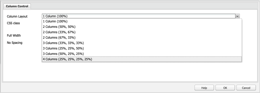
You can specify the column layout by choosing between the following 8 options:
- 1 Column (100%)
- 2 Columns (50%, 50%)
- 2 Columns (33%, 67%)
- 2 Columns (67%, 33%)
- 3 Columns (33%, 33%, 33%)
- 3 Columns (25%, 25%, 50%)
- 3 Columns (50%, 25%, 25%)
- 4 Columns (25%, 25%, 25%, 25%)
There are three additional layouts in CLF4:
- 2 Columns (25%, 75%)
- 2 Columns (75%, 25%)
- 3 Columns (25%, 50%, 25%)
General
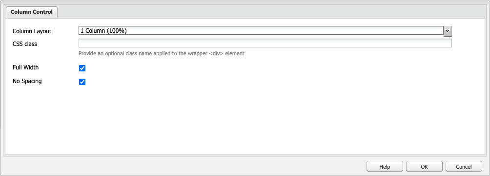
Additional column controls in CLF4:
- Use Full width to stretch your content to full width of the user's screen and/or No spacing to remove space between, above and below individual columns
- Use pad and margin CSS classes in your Column Control and other content components to further refine spacing.
See generic styles >
See how to design your homepage >
Examples of Column Control usage
See 2 Columns Component or 3 Columns Component for examples.