The Horizontal Navigation Bar

Visitors will use the horizontal navigation bar to navigate through your site. The horizontal navigation bar contains all of your site's top-level links. When users hover over a top-level link, any secondary-level (child) links will appear as a drop-down menu. An arrow appears alongside top-level links that have secondary links beneath them, providing a visual cue to your visitors that there are more options.
Setting it Up
Items are automatically added to your horizontal navigation bar as you create top-level pages. Unlike a vertical navigation bar, there are limitations to the number of top-level links you can include in your horizontal navigation bar. If you include too many, the links will not fit on the user's screen.
Viewing the horizontal navigation bar on a wide screen:

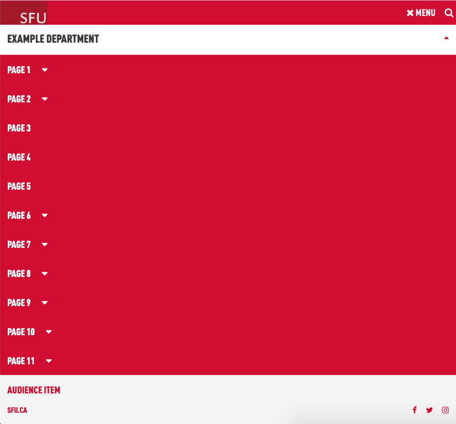
Viewing the horizontal navigation bar on a smaller screen:

Choosing the Right Number of Links
As demonstrated above, it's important to limit the number of top-level links in your horizontal navigation bar so users on smaller screens (such as laptops) are able to access all of your site's content.
Once your sitemap is developed, count the number of top-level links you plan to include. Refer to the following table to determine the maximum number of characters (letters, spaces) that can be used for the number of top-level links you have. For example, if your site will contain 7 top-level links, the total number of letters and spaces used cannot exceed 80. If necessary, consider shortening longer link names or reducing the number of top-level links.
| Links | Maximum Characters |
|---|---|
| 9 | 56 |
| 8 | 68 |
| 7 | 80 |
| 6 | 92 |
| 5 | 73 |
| 4 | 81 |
Navigating on Tablets, Phones, and Other Mobile Devices
Like all of SFU's AEM templates, the new templates use a responsive design which allows the page's contents to automatically fit on smaller devices. When viewed on a tablet, phone, or other mobile device, the horizontal navigation bar turns into the familiar "hamburger" icon. Links are displayed vertically when the hamburger icon is clicked.

Hiding Links in the Horizontal Navigation Bar
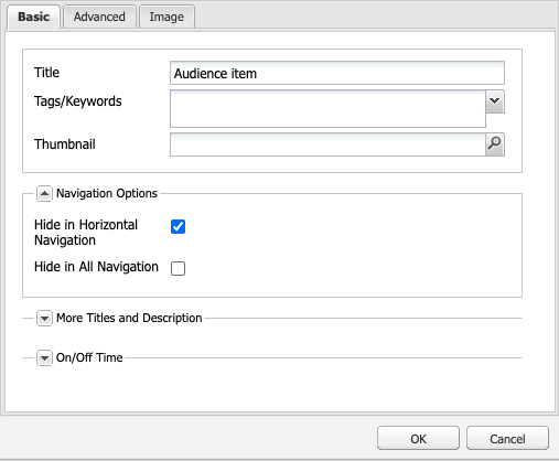
If you want to include a top-level link in your site, but don't want it to appear within the horizontal navigation bar, this can be set within the "Navigation Options" of the page's Page Properties. Expand the "Navigation Options" of the Basic tab and select the "Hide in Horizontal Navigation" checkbox. The page will now appear in all other contexts (List component, Carousel component, etc.) but will not show up in the horizontal navigation bar.