Organizing Content on Different Screen Sizes
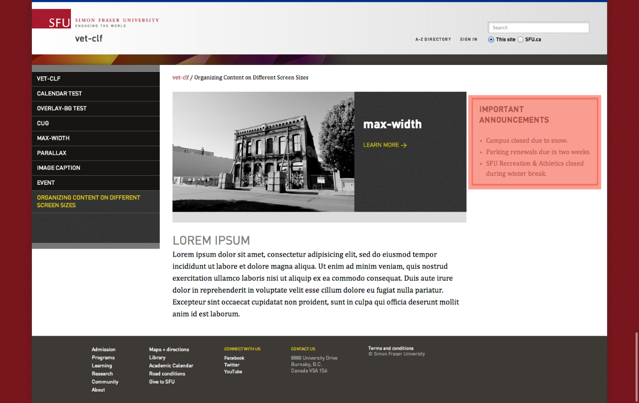
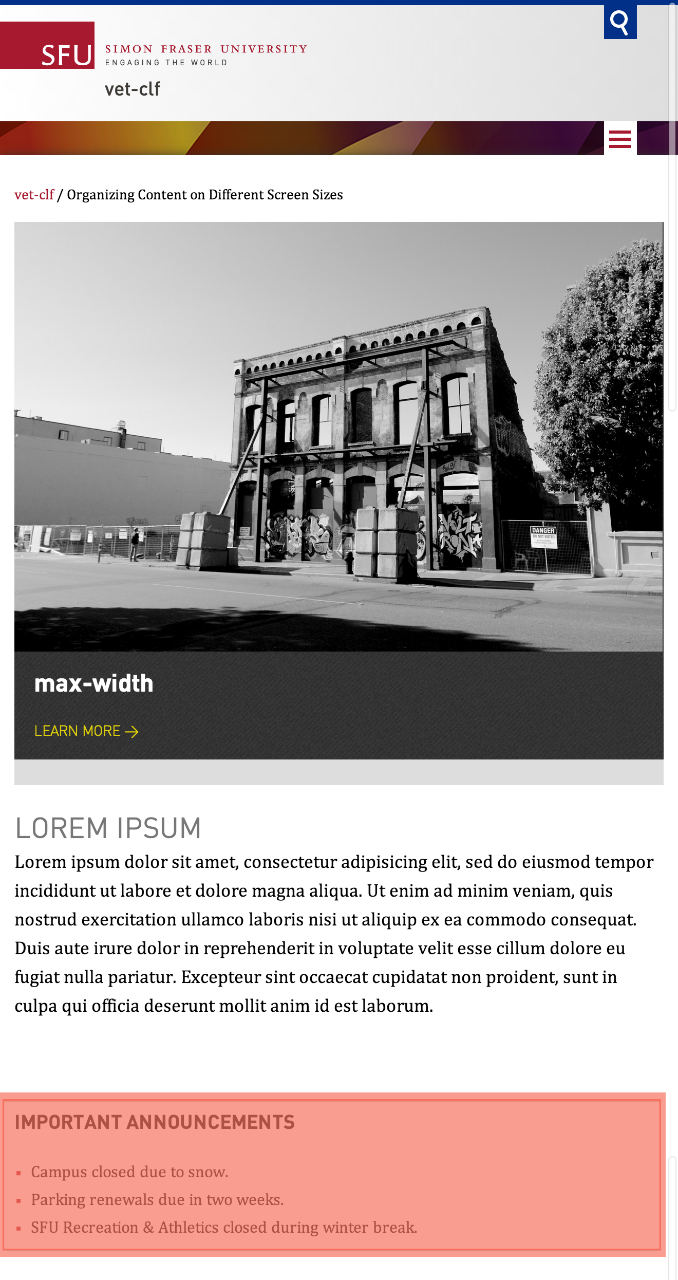
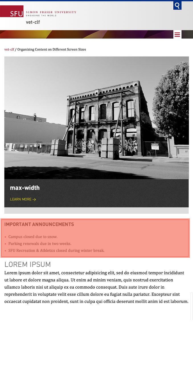
Contents are reorganized when moving from different screen sizes as a result of the responsive layout. It can sometimes cause an undesired result whereby important content is moved to the bottom of the page. In these situations, authors can use the Display Styles (CSS classes) to ensure that the important content is always located towards the top regardless of the screen size.
Visibility chart
| Display Style |
Browser Width |
|---|---|
| mobile | up to 527px |
| tablet | 528px to 979px |
| desktop | 980px and above |
Using Display Styles
There are cases where content needs to be visible towards the top regardless of the device or screen size it is viewed on. The example below shows how display styles can be used to make content always visible near the top of the screen.
- Copy the component that should always appear towards the top of the screen.
- Resize your browser window to emulate a tablet / mobile screen size and paste the component where you'd like it to appear.
- Choose the appropriate display style(s) for the duplicate component based on where it should be visible. For example, enter the mobile display style into the component's CSS Class field if it needs to be visible only on mobile devices. Two display styles can also be used in conjunction if a component needs to appear on both mobile and tablet devices by entering mobile tablet into the CSS Class field.
- Resize your browser back to the desktop size and enter desktop into the CSS class field of the original component.
- Test the display styles by resizing your browser window to ensure that the components appear as intended in the different screen sizes. The original component should now appear only on desktop while the duplicate component should appear in both tablet and mobile screen sizes.
Note: In the authoring environment, you may notice that a component with the mobile and/or tablet style will disappear in the desktop view. In order to edit that component, simply resize your browser until it's narrow enough to emulate a mobile or tablet device. This will make the component reappear.