Patterns
Can we easily explain our preference for some regions over others? Let’s start by looking again at the aggregate results of the study which map the proportion of historians working on a region against that region’s percentage of total world population. Again, where the blue bars are longer than the red, a region is overrepresented by historians (in raw population terms); where the red bars are longer, a particular region isn’t receiving the attention its population would demand.
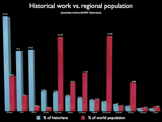
Europe, the US, the UK and Canada are greatly overrepresented; the non-western world is greatly underrepresented. Anatolia is the only exception to the western/non-western pattern; it’s slightly over-represented, buoyed partly by classical scholars and partly by a wave of recent PhDs that began to swell when the European Union agreed to negotiate the accession of Turkey.
For a number of reasons, we can dispense with the idea that population should precisely determine our historical curiosity. But if we concede that the number of people living in a particular region ought to exert some claim on our historical attention, we can identify alarming disparities. The level of interest from historians for the United Kingdom and Ireland is around twenty times the figure that population would suggest. (This makes the United States – which is over-represented by a factor of four – seem bashful.) Conversely, historians of East Asia comprise only around a quarter of the numbers we’d expect from the population data. The situation is worse for historians of South and Southeast Asia: they only manage to reach a tenth of the number that their population would demand, if history were a truly democratic enterprise. Although the number of historians of the Middle East roughly corresponds to that region's population, Latin America, Africa, and especially Asia are woefully underrepresented. If we were as interested, per capita, in South Asia as we are in the British Isles, we would expect the subcontinent's 1.6 billion people to correspond to some 8600 historians; in fact, our survey only found 57.
If population doesn’t determine the distribution of historians to particular regions, are there other indicators that might explain how the profession has reached this point?
Let’s try GDP. The blue line is the percentage of the total number of historians working on a particular region; the green line is a region’s percentage of total GDP.
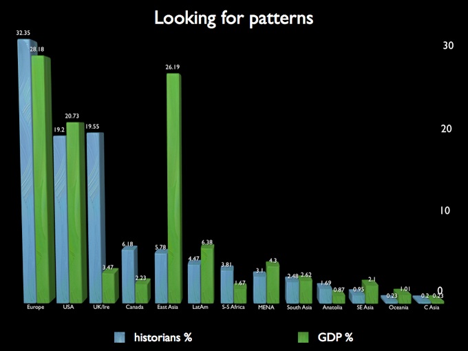
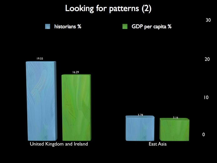
GDP does a surprisingly good job of tracking historical interest. It works neatly for Europe, the US, and South Asia; and it’s accurate for Latin America and the Middle East. The major outliers here are the UK, where historical interest overshadows even the world’s seventh-largest economy; and East Asia, where economic growth has comfortably outpaced our historical curiosity. For these two examples -- a country with a smallish population versus a region with a very large population -- GDP per capita produces a much closer fit: