Cards List
Cards List is only available in CLF4 and displays your content in a card view that contains an image, page title, date (optional) and call to action.
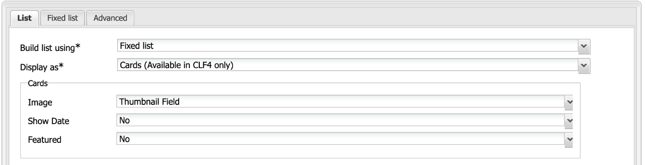
The following options are available:
- Image - Select where the image should be pulled from, the Thumbnail Field or Image Tab.
- Show Date - Select "Yes/No" to show the date, works with News Page.
- Featured - Select "Yes/No" to feature the card. The Featured option will increase the font size of the title and is only recommended for a single card.
Card List Layouts


CSS Classes
The Cards List will display content in one column by default. To display cards in multiple columns add col-2 or col-3 to the CSS Class field. In mobile view, all cards will display in 1 column.
Pleae note that the height of cards in each row will be equal and based on the longest item in that row.
- If placed in a 33% or 25% column, cards will always stack (2-col or 3-col CSS Class will be ignored)
- If placed in a 67% or 50% column, cards can be shown in maximum 2 columns