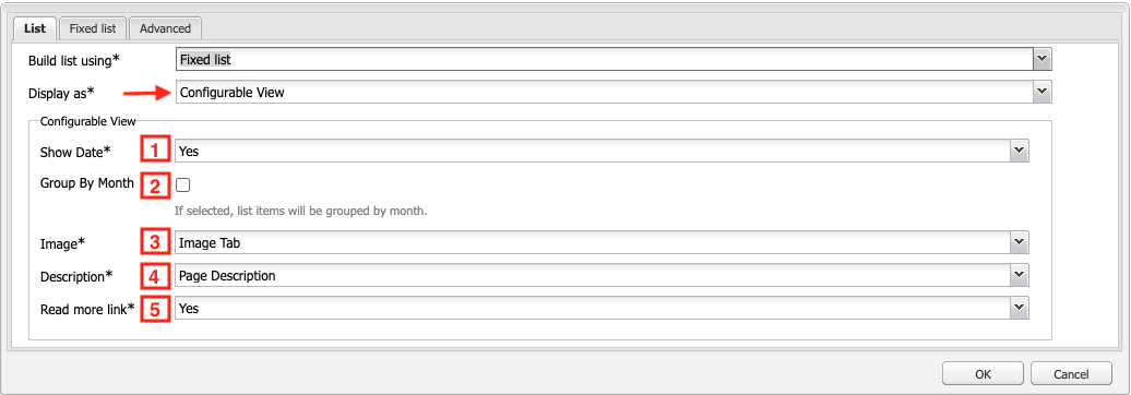
Configurable List
The Configurable List view gives you the most options to customize how the items in your list are displayed.
The following options are available:
- Show Date - Select "Yes/No" to show the date, works with News Page.
- Group By Month - If checked, the items in the list will be sorted and displayed by month.
- Image - Select where the image should be pulled from, the Thumbnail Field, Image Tab or choose not to show an image at all.
- Description - Select where the description should be pulled from, the Page Description in Page Properties, the page content (first 100 characters) or choose not to show a description at all.
- Read more link - Select "Yes/No" to show the "Read more →" link.
Configurable List Layouts
In addition to the options above, the following classes can be applied to the Configurable List view to adjust the layout of the fields. See example screenshots of a single list item below.
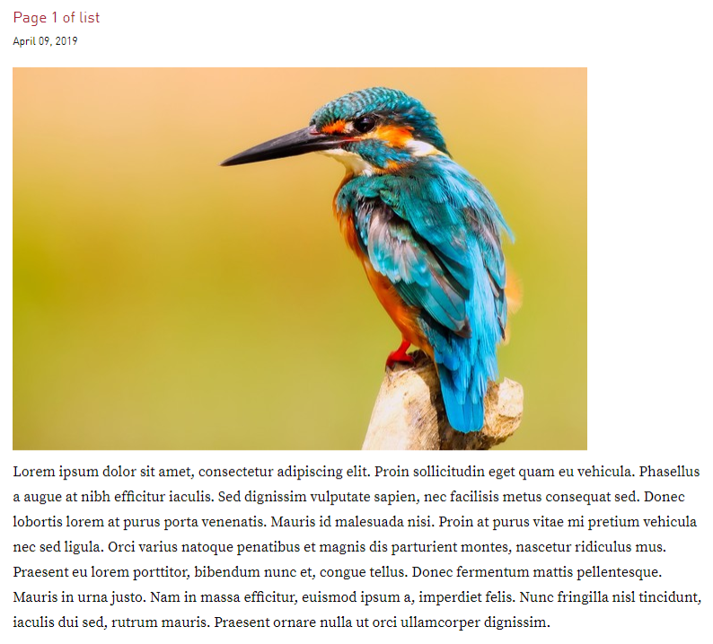
Default View
Each list item will be shown with an image on the left side, including the title, date and description stacked on top of each other on the right side.

Date Above
Component: List
CSS Class: date-above
Using this class will display the date above the title.

Date Overlay
Component: List
CSS Class: date-overlay
The date-overlay class will overlay the date on top of the image aligned to the bottom. It can also be used with the date-above class to align the date with the top of the image.
Using just date-overlay

Using date-overlay and date-above

Stack
Component: List
CSS Class: stack
Using stack will stack all fields on top of each other instead of showing the image and content side by side. The title and date are displayed above the image when using this class.
*Note: the classes listed above (date-overlay, date-above) work with stack.