Earthquake Early Warning Systems Modeling for North Vancouver
A Geography 355 Final Project by Tom McKay
Results and Output Maps
The output map from my MCE appeared as follows:
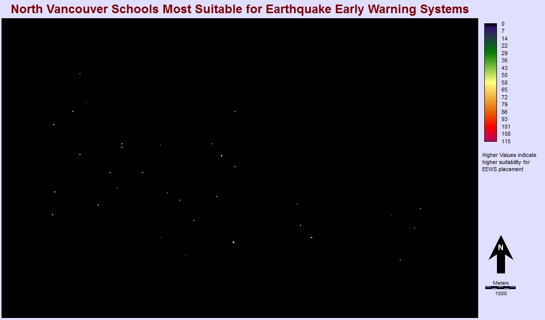
As point data in raster format is difficult to read and interpret, I took the values for the schools from my IDRISI MCE and applied them to my NVSD schools point dataset. Since this project is being delievered in web format, rather than producing a static map with my outcomes I produced an interactive web map to take advantage of the platform.
For this map I reclassified the suitability values into 3 categories, "High", "Medium", and "Low", to make it easier to understand the data at first glance. The user can mouse over individual locations to get the name of the school as well as the actual suitability rating. This model could be very useful for budgeting when considering the implementation of EEWS, as high location targets could be likely first candidates to have the systems installed on-site. For example, if the city budgeted $250,000 for installation of on-site EEWS, they could select 5 school locations with "High" suitability based on this map.