Color Adjustment
Basic Color Theory
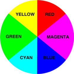
RGB (short for Red, Green, Blue) An RGB color space is any additive color model. The main purpose of the RGB color model is for the sensing, representation, and display of images in electronic systems, such as televisions and computers.
CMYK (short for cyan, magenta, yellow, and key (black), and often referred to as process color or four color) is a subtractive color model, primarily used in color printing.
The major difference is that in a RGB color space, all the colors information are resulted from the mixing of red, green, and blue; but in a CMYK color space, all the colors are results of the mixing from cyan, magenta, yellow, and black. RGB color space is also more accurate to human color sensory than CMYK.
When the same amount of contrast colors such as yellow/blue, red/cyan, and green/magenta mixing together, it will produce a neutral gray tone. In color adjustment, to reduce the intensity of one particular color is to add in the contrast color.
Levels
In this and the next chapter, we are going to use week2_ColorAdjustment.psd
To access the levels dialogue box, you simply go to Image>Adjustments> Levels. After you select Levels, it will bring up the dialogue box with a histogram on it. In photography, a histogram is basically a bar chart that shows all the tonal levels from the darkest point to the lightest point that the image is made up of. The chart also shows amount of different tones are presented in the image. For example, if it is a tall bar, that means there are a lot of that particular tones are in the image.
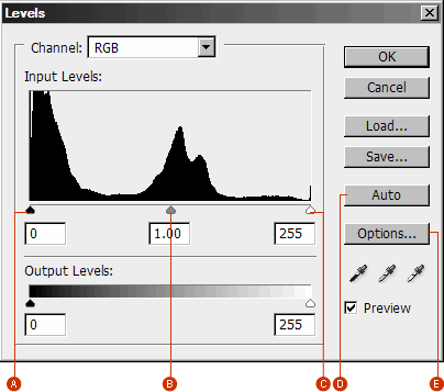
A. Darkest tones/shadows slider
B. Midtones slider
C. Brightest tones/highlights slider
D. Auto color correction
E. Auto color correction setting
With Levels, we can correct the color, contrast, and brightness of parts and the entire image. Here we want to adjust the white balance and exposure of this street scene photo.
Correcting underexposure
Move the midtones slider to the left to bright up the dark tones;
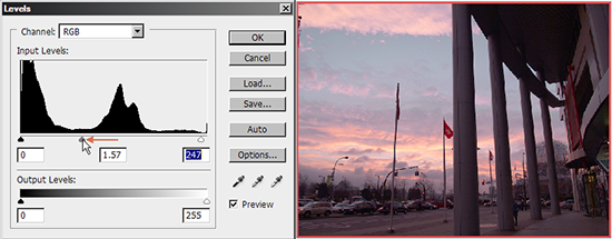
Correcting white balance
To neutralize the redness, select the red channel from the Channel dropdown menu; then move it to the right to reduce the intensity of redness in the image.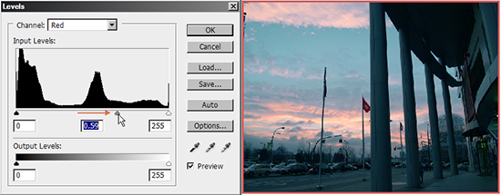
You can go to different channel to micro-adjust all the color value until you get the result you want.
Curve
Curve is another powerful tool for adjusting color and contrast. You can use it to create different color shifts and special effects such as solarization and color reversal. The main advantage of using curve is that it allows to re-map colors and tones in several different levels. So you can make precise changes.
Close and re-open week2_ColorAdjustment.psd. Next, go to Image>Adjustments> Curve to bring up the curve dialogue box,
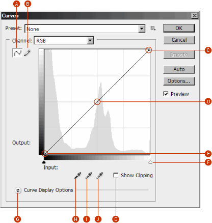
A. Adjust curve by adding points
B. Draw a curve with the pencil.
C. Brightest tones/Highlights
D. Midtones
E. Darkest tones/Shadows
F. Black and white point sliders
G. Curve display options
H. Set black point by sampling a point which representing the darkest tone in the image
I. Set gray point by sampling a point which representing the midtone in the image
J. Set white point by sampling a point which representing the brightest tone in the image
K. Show clipping while some tonal information are edited out through adjustment
Let's try to adjust the same photo with curve and experience the difference between levels and curve
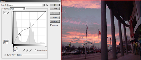
Brighten up the photo
First, click on the top-right curve segment (which representing the bright tones) to setup several anchor points which will fixate the bright tones. Next, click on the lower-left curve segment and move the anchor point a bit up to increase the brightness of the dark tones.
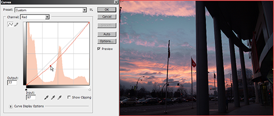
Correcting white balance
Similar to what we did in the levels dialogue box; select the red channel first; then drag the red curve lower to decrease the red value.
Also, you can hit Auto to let Photoshop do the adjustment for you but it could be inaccurate.
Hue, Saturation and Lightness (HLS)
Hue, saturation and lightness are commonly referred as the three main attributes of perceptual color. Hue is that aspect of a color identified with names such as "red", "yellow" and etc. Saturation is related to the intensity and colorfulness of one specific color. Lightness is a property of a color which is defined in a way to reflect the subjective brightness perception of a color for humans.
In this chapter, we are going to use week2_ColorAdjustment.psd for tutorial.
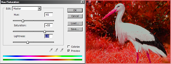
Change the overall color scheme of a photo
Select Image>Adjustments>Hue/Saturation, it brings up the Hue/Saturation dialogue box.
You can move the three sliders around to try to get different looks of the photo.
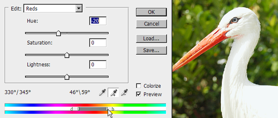
Change one specific color in a photo
In this exercise, we want to shift color of the beak to red only without affecting rest of the color.
1. Since the crane's beak is reddish yellow, let us try to select the red channel. Then move the hue slider to the right end; now you can see part of the bird's peak changed to blue while rest of image remains the same color.
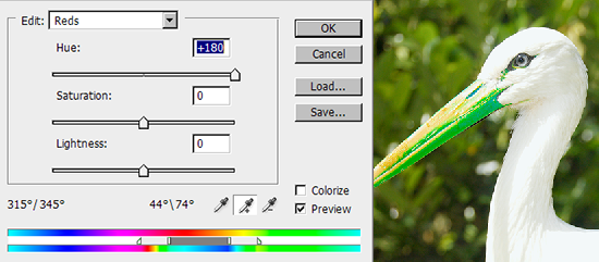
2. Part of the peak is still yellow; using Add to Sample (Shift + Click) on the yellow part to add that part into your selection.
Once you have done that you will find the background was affected as well which is not the result you want to have.
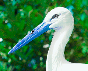
3. To restore the background color, we can accurately adjust the color range with the silder in the bottom of the dialogue box.
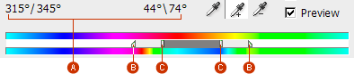
A. Hue slider values
B. Adjusts fall-off without affecting range
C. Adjusts range of color and fall-off
4. Move both sliders B and C to micro-adjust the color till the background looks normal, then move the hue slider to the left till the beak appears in vibrant scarlet.
Non-Destructive Editing: Adjustment Layer
The main advantage of using adjustment layer is it allows you to adjust the content with altering the original pixels so you can delete them or disable them anytime you want. You can treat an adjustment layer the same as a regular pixel layer; you can adjust the opacity and blending mode of an adjustment layer. As well, you can save your adjustment layer in your PSD file; you can always revisit any particular filter or effect you applied before and reset the attribute at anytime.
Whereas, the changes you made from the Image>Adjustment menu will permanently alter the pixel information, and if you ever want to redo one of the many steps you have done so far, you have to restart again. So it is highly recommended to use the adjustment layer all the time.
Hue/Saturation alteration with adjustment layer
1. Open week2_ColorAdjustment.psd.
Click on the black-white circle icon( as the screenshot showed) at the bottom of the layer penal to add an adjustment layer to the image and select Hue/Saturation
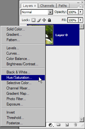
2. After you add the Hue/Saturation as an adjustment layer you can double click on the little chart icon (on the adjustment layer) to bring up the Hue/Saturation dialogue box; rest of steps are the same with what you have done before.
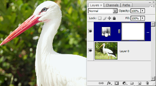
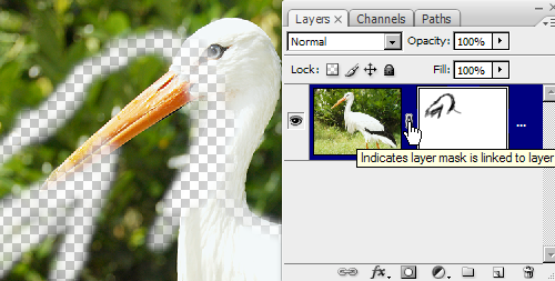
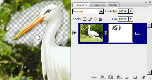
Non-Destructive Editing: Layer Mask
The advantage of using layer mask for erasing is similar to adjustment layer. You can simply eraser tool to paint away the pixel in a photo and make them invisible; however, this is a permanently pixel alteration, you will not be able to get it back unless you re-open the file without saving it. With layer mask, you can still do the same thing but leaving the original pixels unharmed and you can easily painted it back
Erasing with layer mask
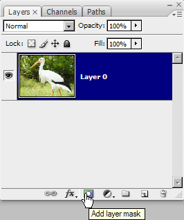
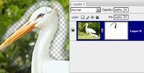
1. Select the layer mask icon at the bottom of layers panel
2. Pick the brush tool with color set to black and start to erase the pixel around the crane.
3. Alt + Click on the layer mask to view merely the layer mask.
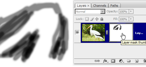
4. Anytime and anywhere you want to paint back the original pixels, you can brush the black color out with a white color in the layer mask, and the erased content will showed up again.
5. You can even unlink the layer mask with the layer and move the erased area around.