Organizing Lists by Columns
By default, with the exception of horizonal buttons, all list items are displayed vertically, one on top of another. To organize your list items into columns, the following CSS classes can be applied:
- col-2 : split the list items into 2 columns
- col-3 : split the list items into 3 columns
- col-4 : split the list items into 4 columns
All lists will stack on top of each other on small screen, you can force them to stack at different screen sizes by applying the following CSS classes:
- md-stack : force the list component to stack at 755px-979px
- mds-stack : force the list component to stack at 528px-754px
- sm-stack : force the list component to stack at 527px and below*
* sm-stack only needs to be used with horizonal buttons as this is the only list that does not automatically stack on small screens.
Samples of Using the Column Layout For Lists
Here are some screenshots of the configurable view and button linked lists using columns to change the layout.
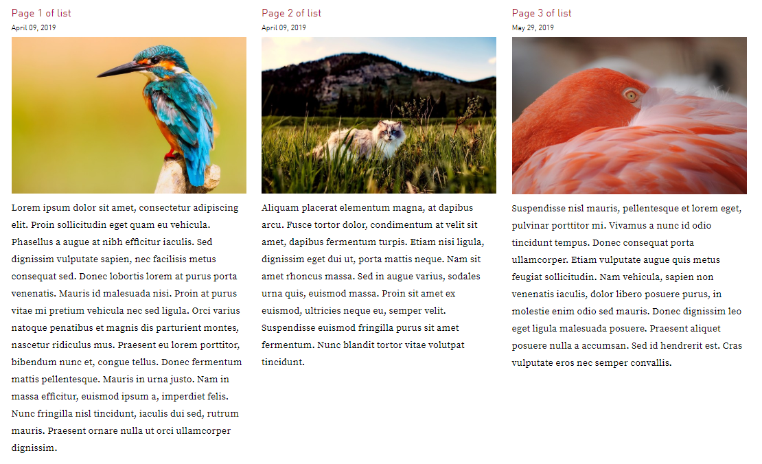
Configurable View across 3 columns
By adding a CSS class of col-3 to the configurable view, the list would be displayed as follows:
Button Links across 2 columns
By adding a CSS class of col-2 to the horizontal button links view, the list would be displayed as follows: