Styling Zebra Tables
CSS
What is a Zebra Table?
A zebra table is a table that has been styled to present its rows in automatically alternating colours, making the rows more readable.
How to style a Zebra Table
- Drag a Text component on to the page where you want the table to appear.
- Double-click the Text component and click on the Table button in the Rich Text Editor.
- Specify the number of rows and columns. Select the number and type of header rows you want to include. (Note that header rows have a white background to differentiate them from regular table rows; therefore, the zebra style will not apply to headers.)
- Specify the width of your table. Leave the height field blank.
- Locate the Border, Cellspacing and Cellpadding fields. Remove existing values and leave it empty. Click OK.
- In the CSS class field enter
alternateto apply the zebra-striping style. - Enter the data in your table. Press tab to jump to the next table cell.
- When the table has been filled out, click OK.
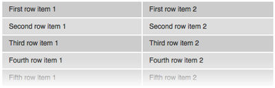
Example of a styled Zebra Table:
| First row item 1 | First row item 2 |
| Second row item 1 | Second row item 2 |
| Third row item 1 | Third row item 2 |
| Fourth row item 1 | Fourth row item 2 |
| Fifth row item 1 | Fifth row item 2 |
The HTML code used to create the table above:
<table width="500px">
    <tbody>
        <tr>
          <td>First row item 1</td>
          <td>First row item 2</td>
        </tr>
        <tr>
          <td>Second row item 1</td>
          <td>Second row item 2</td>
        </tr>
        <tr>
          <td>Third row item 1</td>
          <td>Third row item 2</td>
        </tr>
        <tr>
           <td>Fourth row item 1</td>
           <td>Fourth row item 2</td>
        </tr>
        <tr>
          <td>Fifth row item 1</td>
          <td>Fifth row item 2</td>
        </tr>
    </tbody>
</table>