
- Engage C&M
- Brand
- Campus Communications
- Media & News
- Social
- Web
- Events Calendar
Designing for Different Screen Sizes
Content is automatically adjusted for different screen sizes to make it accessible for tablets, mobile devices or desktop computers. You can also customize your page layout for these different screen sizes by:
Customizing layouts to stack earlier on smaller screen sizes (tablet or mobile screens)
Hiding components on certain screen sizes (desktop, tablet or mobile)
Add padding only on certain screen sizes (desktop, tablet or mobile)
Customizing stacking layouts for tablet and mobile screens
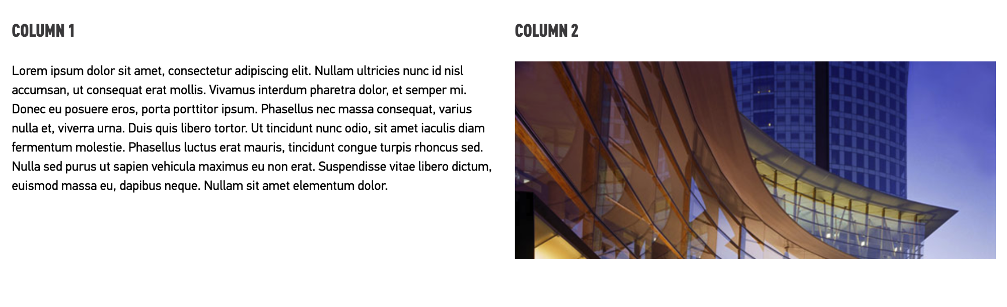
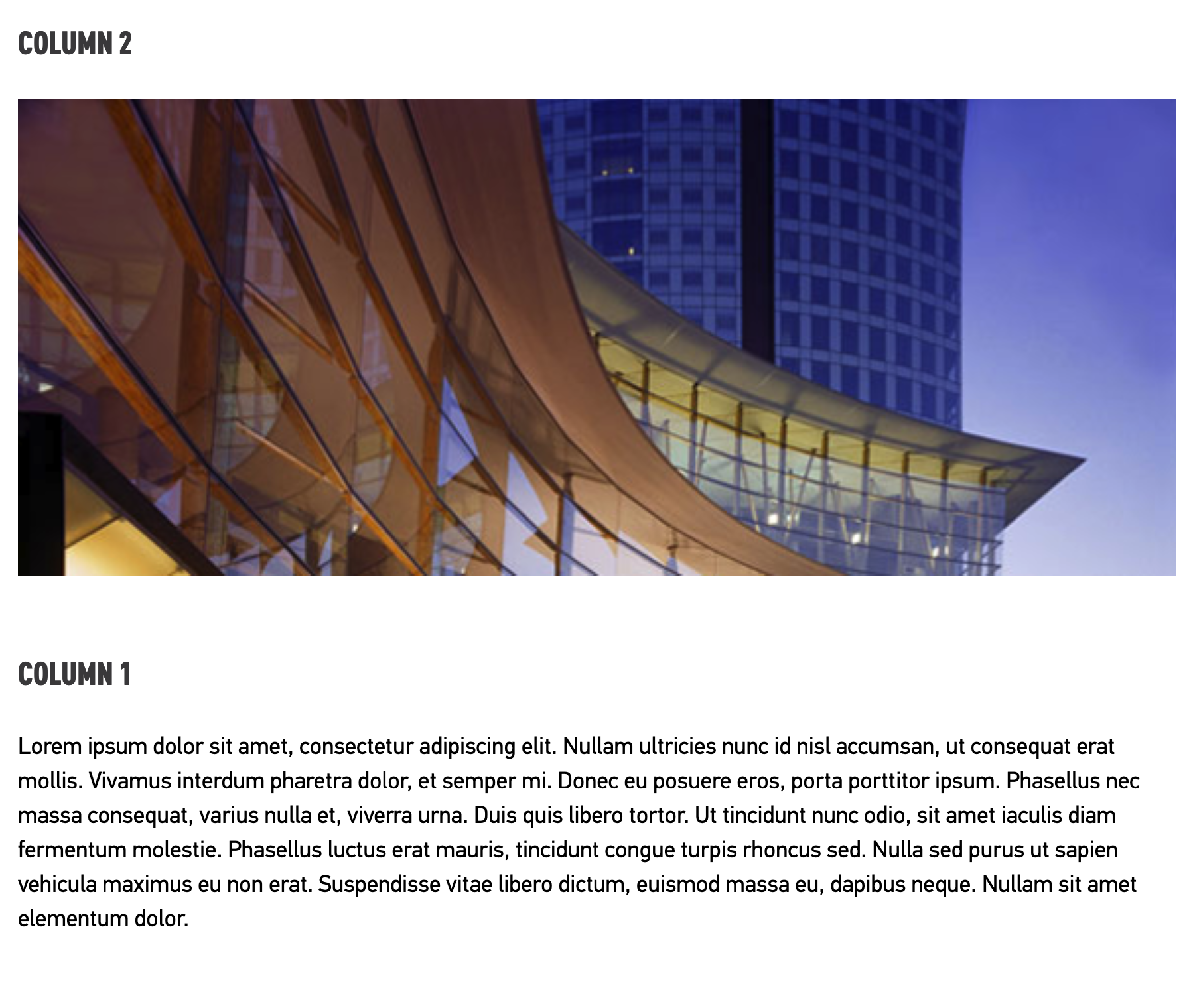
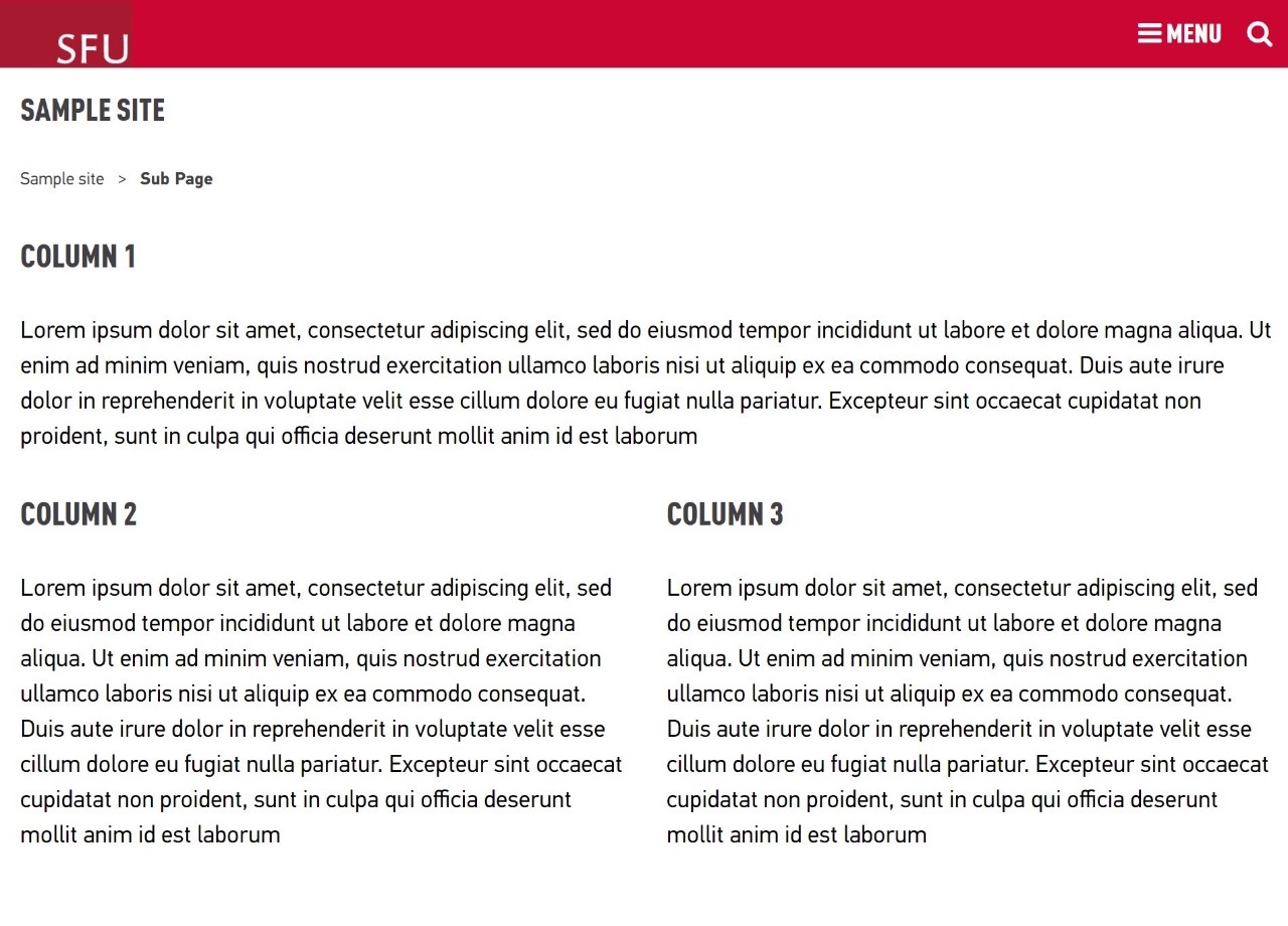
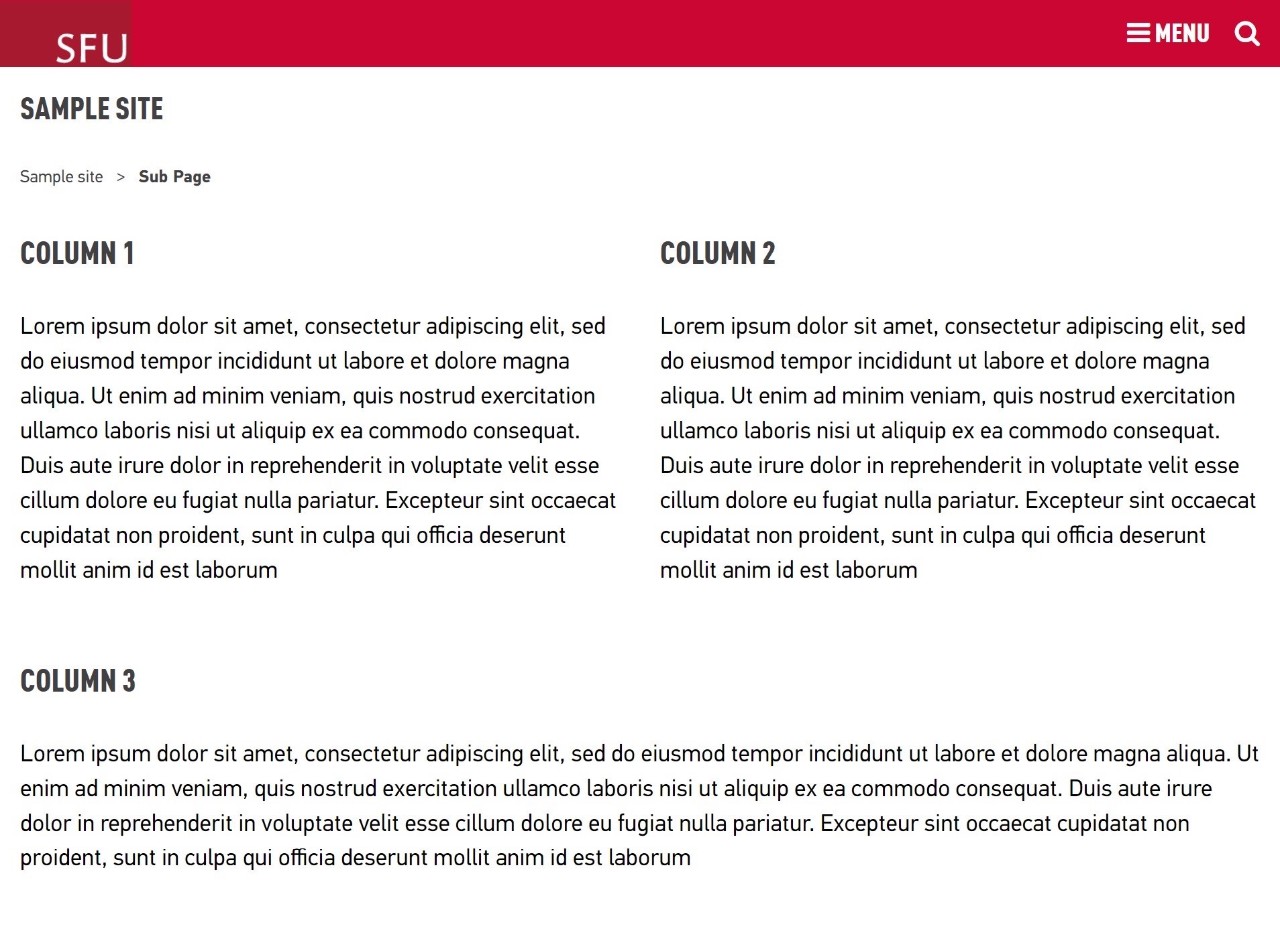
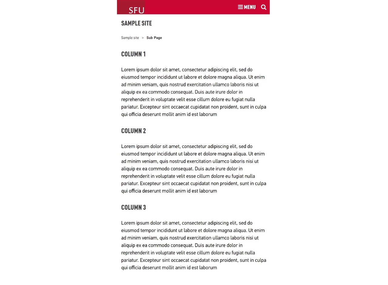
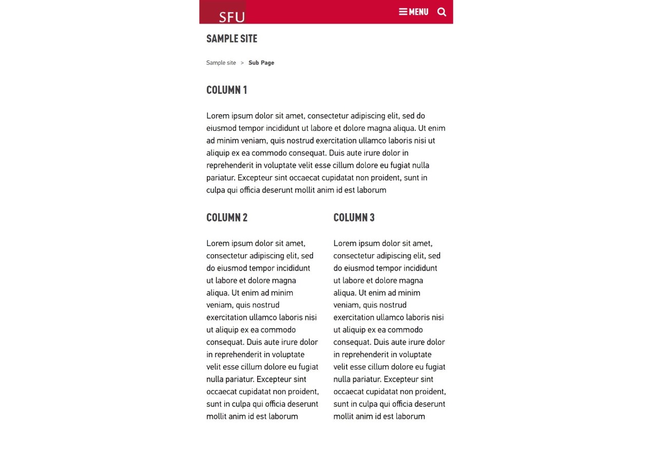
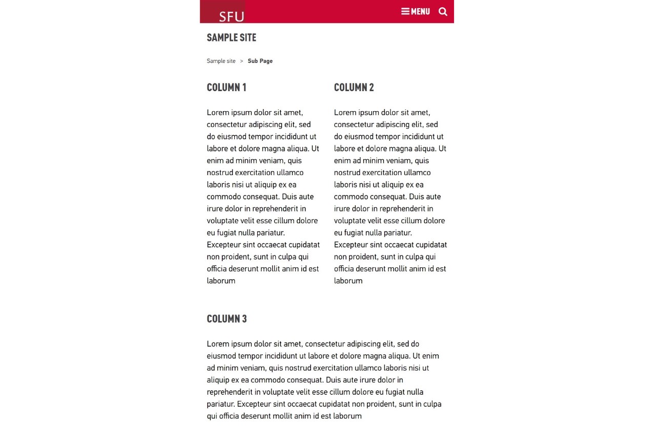
A specific class style can be used to create different layouts for mobile and desktop views. For example, if content in two columns becomes crowded when the browser size is small, you can set those two columns to stack in a smaller screen size. It’s always better to stack earlier so ensure the content doesn’t appear too crowded.
- Large size – 980px and up
- Medium size – 528px-979px
- Medium small size – 528px-754px
- Small – up to 527px
How to
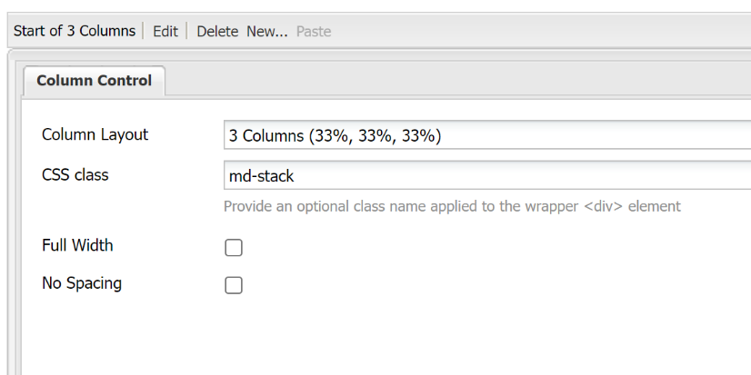
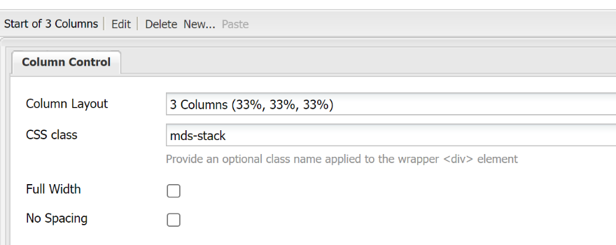
To stack columns in medium screen size (528px – 979px), add one class name to CSS Class field of the column control component
md-stack - Stacks all columns on top of each other at the medium screen size.
md-stack-first - Stretches the first column to 100% of the screen width with the other two columns stacked underneath at 50% and 50% (side-by-side) for medium screen size.
md-stack-last - Stretches the last column to 100% of the screen width with the other two columns stacked above at 50% and 50% (side-by-side) medium screen size.
md-stack-last-first - Stacks components from the last (second) column first, and components from the first column last when placed in a 2-column control component. These classes don’t work in a 1, 3 or 4 column layout.
To stack columns in a medium small screen size (528px - 754px), add one class name to CSS Class field of the column control component
mds-stack - Stacks all columns on top of each other at the medium-small screen size, respectively.
mds-stack-first - Stretches the first column to 100% of the screen width with the other two columns stacked underneath at 50% and 50% (side-by-side) for medium-small screen size.
mds-stack-last - Stretches the last column to 100% of the screen width with the other two columns stacked above at 50% and 50% (side-by-side) medium-small screen size.
mds-stack-last-first - Stacks components from the last (second) column first, and components from the first column last when placed in a 2-column control component. These classes don’t work in a 1, 3 or 4 column layout.