
- Engage C&M
- Brand
- Campus Communications
- Media & News
- Social
- Web
- Events Calendar
Page Layouts
The column control component can be used to create a variety of layouts to suit your content. Margins and padding styles can add more space and layouts for mobile and tablet screen sizes can be customized. For more information about creating different layouts in the AEM templates, refer to the design guidance.
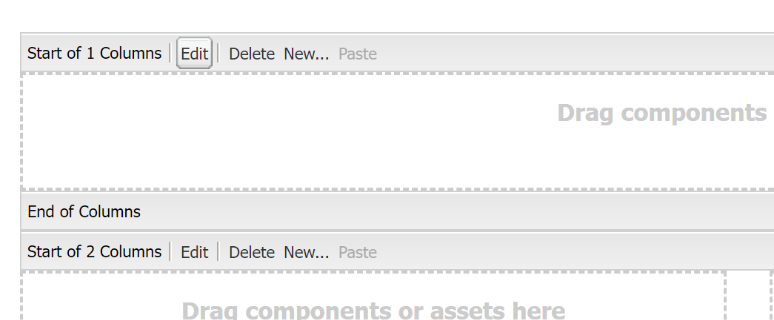
Columns
A column control component can apply different layout configurations on your page. This component allows you to display your content in side-by-side columns and apply style attributes (such as a grey background) to a single or multiple column(s).
Columns can also be customized to fill the entire width of the page or to remove padding between columns on a homepage layout.
Mobile / Tablet
On mobile, multiple columns collapse into a single column, placing the left column first, followed by the right columns. Consider the hierarchy of your information, and how this might display on mobile when designing for desktop.
Best Practices
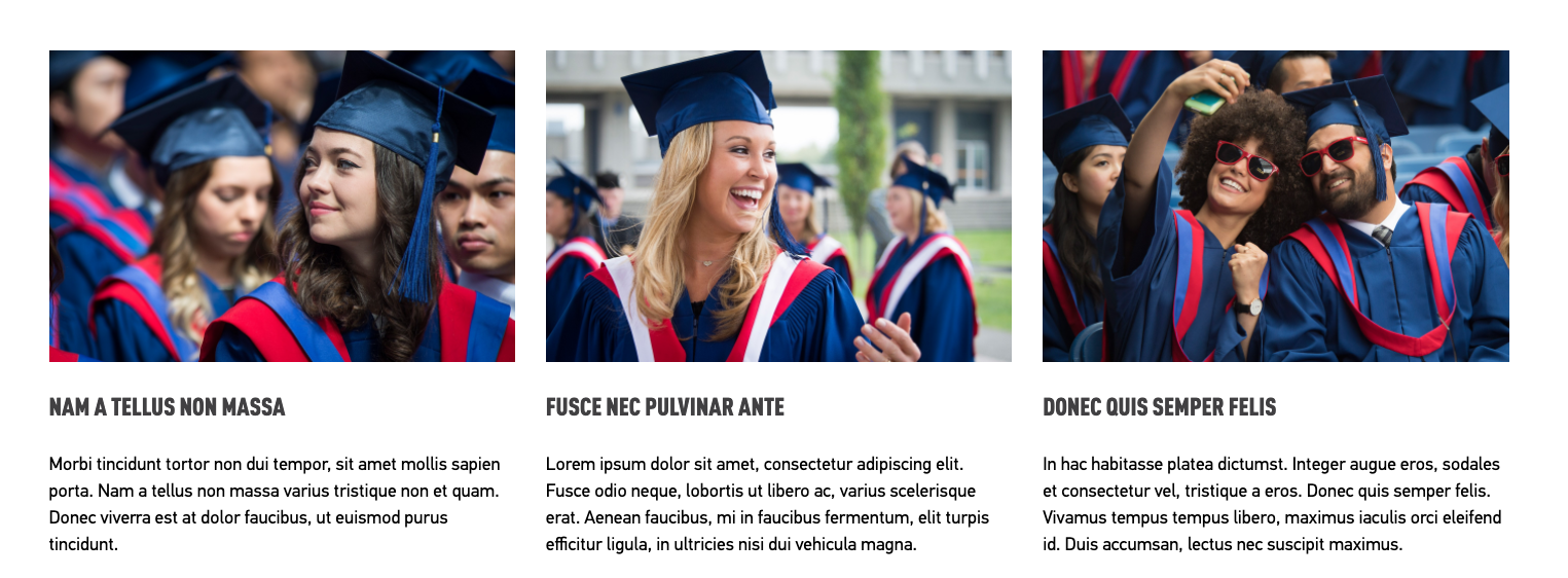
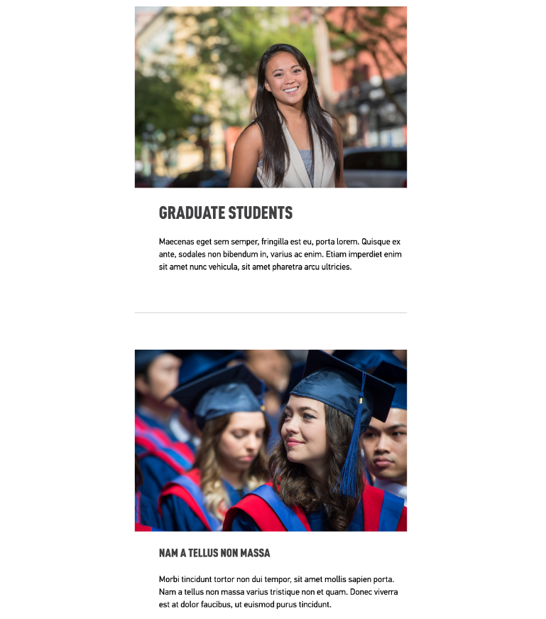
A four-column component is best used on the homepage or blank page template as these templates are wider and provide more space for content within multiple columns. Using a four- column on a smaller browser window may make the content difficult to view, unless it is stacked at a smaller screen size.
It is essential to test all layouts in different screen sizes by making your browser smaller for tablet and mobile devices.
How to
Add a column control component to your page:
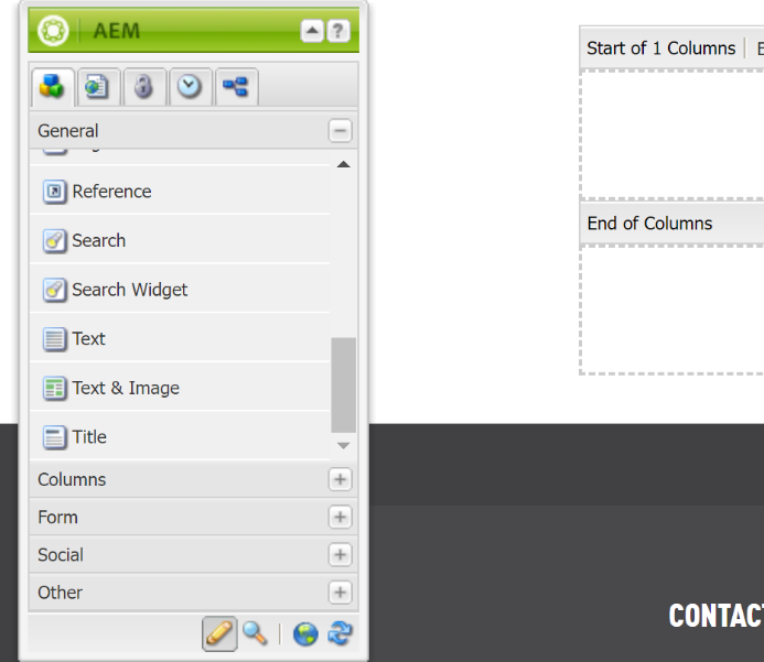
1. Add the Column Control Component from the sidekick to your page
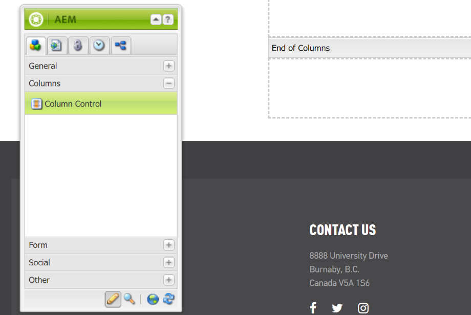
3. You can add other components from your sidekick menu (such as a text component) into your column control component to add content.
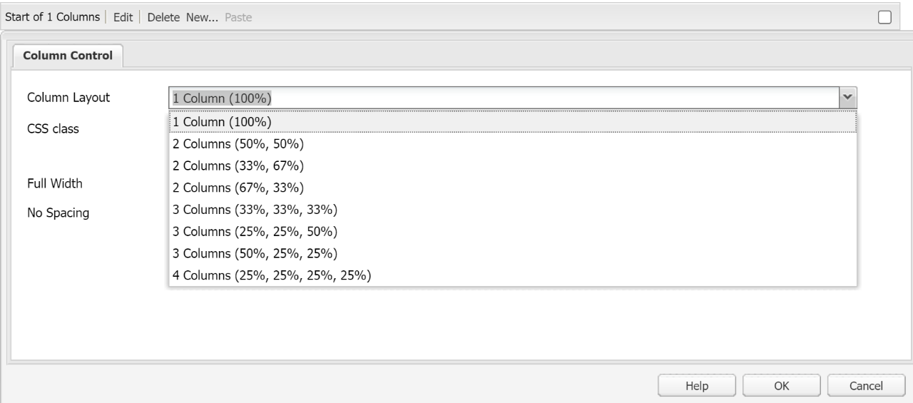
Customize your column control component:
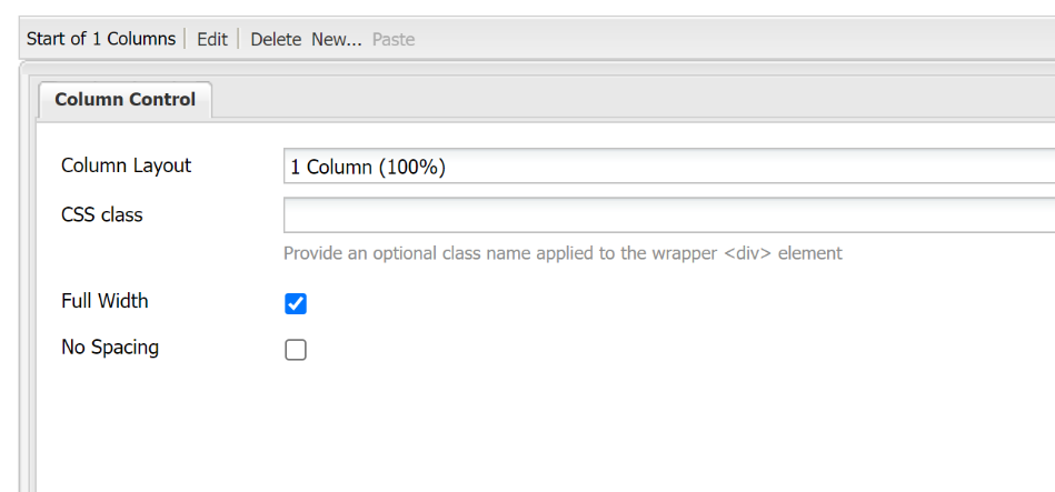
- Once your column control component is added to your page, select the edit tab.
Select between the following options:
Full Width – stretch your content to fill the full width of the user’s screen
- No Spacing – remove space between the columns