
- Engage C&M
- Brand
- Campus Communications
- Media & News
- Social
- Web
- Events Calendar
Text
Following web best practices, it's important to add text in a meaningful way that cleary communicates your message to your audience.
Below you'll learn how to use titles, heading styles, calls-to-action and more, to help audiences easily consume the content.
Infographics
Infographics are used for adding statistic or fast facts elements to your page. It can be helpful when you want to highlight important information to stand out on your page.
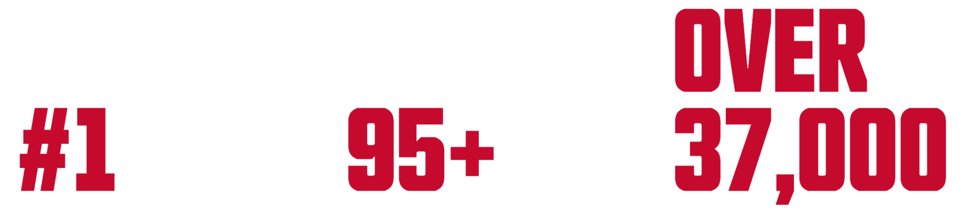
Infographics in 3 columns:
70%
increase in research
3,100+
in 128 Countries
#1
Canadian comprehensive university
Infographics in 1 side column:
SFU
Ranked
46
in the world
37,000 + students enrolled
Lorem ipsum dolor sit amet, consectetur adipiscing elit. Praesent ut nisl vitae nibh feugiat elementum non at ligula. Etiam feugiat porttitor dictum. Phasellus sit amet sem et ligula fermentum ultrices. Nam accumsan ipsum vitae orci vestibulum luctus.
Other Infographics layout samples:
SFU Ranked
46th
in the world
SFU
Ranked
46th
46th
in the
world
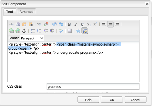
Infographics with icons:
group
undergraduate programs
diversity_3
collaboration
school
graduation
Best Practices
- Do not use infographics for page titles or long sentences.
- Do not overuse infographics, so it can stand out on your page
- Make sure to test infographics on smaller browser sizes, and fix any issues with stack classes or use on larger columns
Design Guidelines
- Looks clean if used in one row with 3 columns
- Can also be used on a side column to highlight information
- Can also be used with icons built in AEM (Google material symbols / icons)
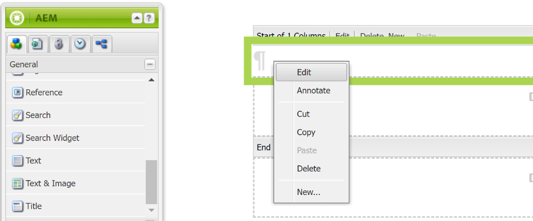
How to
1. Add text component to page and edit text.
- Add text you would like as infographic style
2. Add “graphics” or one of the following class names in the CSS class field of the text component.
- You can adjust the text alignment to left, center or right
- If you want your infographic text to go on 2-3 lines you can add break tags to your source code
Styles:
- graphics – standard infographic style.
- graphics-mid - infographic style with small text above and below
- graphics-left - infographic style with small text to the right of large text.
- graphics-right - infographic style with small text to the left of large text.
Add -red to any of the above styles to display in dark red colour.
- graphics-red
- graphics-mid-red
- graphics-left-red
- graphics-right-red
Add align-bottom to your Column Control component to align graphics styles to the bottom.
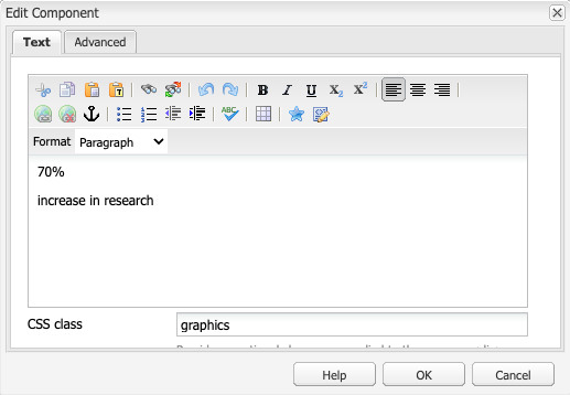
graphics – converts paragraph text to standard infographic style
- Can be used with 1, 2 or 3 paragraphs.
- First paragraph uses a large infographics font.
- Second paragraph uses the H3 style.
- Third paragraph uses the H3 style and is separated from the second paragraph by a line.
70%
increase in research
70%
increase in research
37,000+ students enrolled
graphics-red - is the same as above but in dark red colour
70%
increase in research
graphics-mid - converts paragraph text to infographic style with small text above and below
- Can be used with 2 or 3 paragraphs
- First paragraph uses the H3 style.
- Second paragraph uses a large infographics font.
- Third paragraph uses the H3 style.
SFU Ranked
46th
in the world
graphics-mid-red - is same as above but in dark red
SFU Ranked
46th
in the world
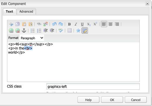
graphics-left - converts paragraph text to infographic style with small text to the right of large text.
- To be used with 2 paragraphs only
- First paragraph uses a large infographics font and displays on the left.
- Second paragraph uses the H3 style and displays to the right of the first paragraph.
- If the text can't fit side-by-side, it will stack.
46th
in the world
graphics-left-red - is the same layout as above but in dark red
46th
in the world
graphics-right - converts paragraph text to infographic style with small text to the left of large text.
- To be used with 2 paragraphs only
- First paragraph uses the H3 style and displays on the left.
- Second paragraph uses a large infographics font and displays to the right of the first paragraph.
- If the text can't fit side-by-side, it will stack.
SFU Ranked
46th
graphics-right-red - same layout but in dark red
SFU Ranked
46th
align-bottom - aligns all your infographics to the bottom of the Column Control component when using multiple columns
- add align-bottom CSS class to the Column Control component
- can be used with any of the graphics classes listed above
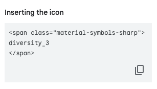
3. To add an icon to the infographic layout.
- Follow the first 2 steps.
- Go to the Google Material Symbols library
- Select an icon
- Copy the code from the "Inserting the icon" section in the panel on the right
- Go to your Text component and paste the code into the source edit tab