
- Engage C&M
- Brand
- Campus Communications
- Media & News
- Social
- Web
- Events Calendar
Page Layouts
The column control component can be used to create a variety of layouts to suit your content. Margins and padding styles can add more space and layouts for mobile and tablet screen sizes can be customized. For more information about creating different layouts in the AEM templates, refer to the design guidance.
Backgrounds & Outlines
Coloured backgrounds or outlined boxes can be applied to your content. Coloured backgrounds can be applied to components (i.e., text component), column control component or to individual columns. Outline boxes can be added to the column control component or individual components such as the text component.
Here is a light-red block class applied to a text box
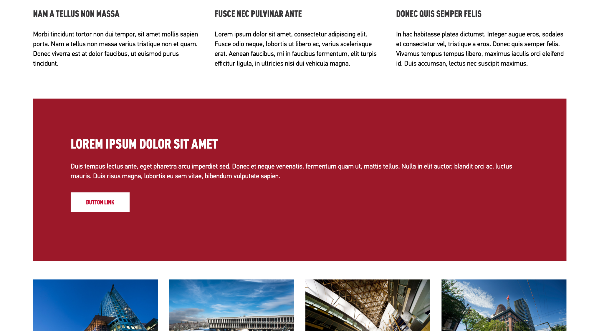
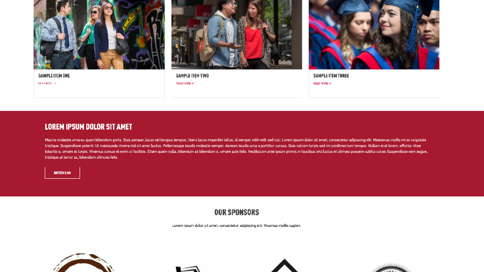
Here is a red block class applied to a text box
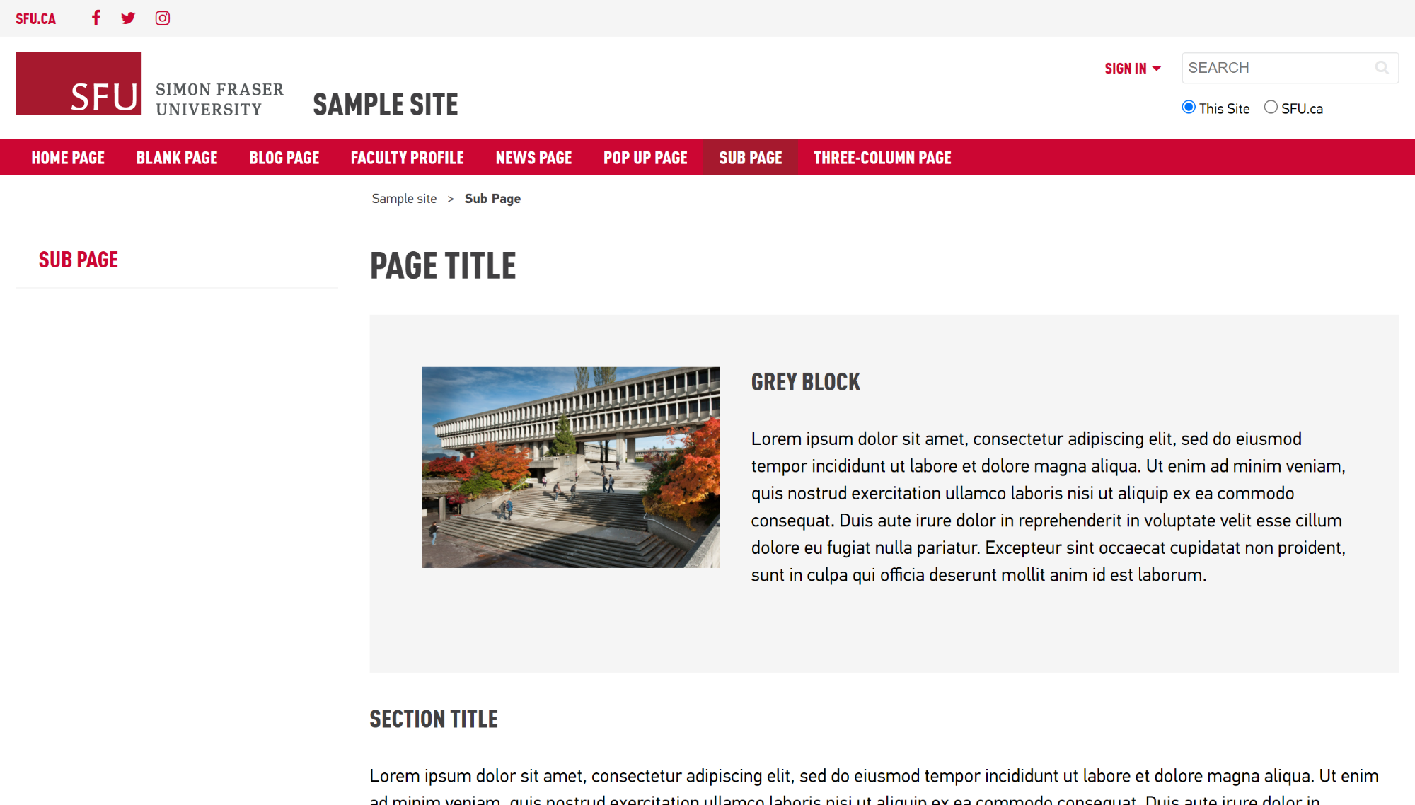
Here is a grey block class applied to a text box
A col-1-red class makes the first column red
A col-2-grey class makes the second column grey
A col-3-light-red class makes the third column light-red
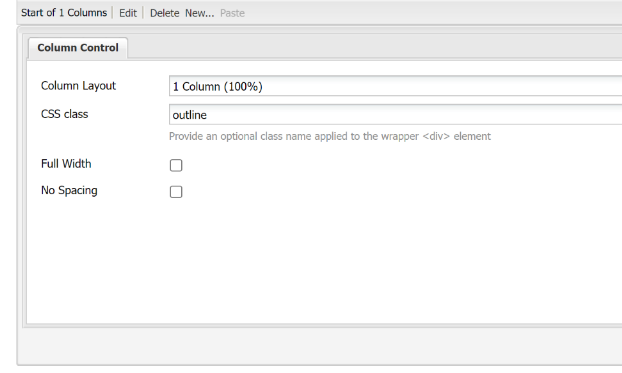
Here is a outline class applied to a text box
Design Guidelines
Single column design on subpages:
Add a coloured block class or outline class to a column control component, then add content as needed
Homepages options:
background colours and outlines can be added to a column control component
- background colours can be added to a column control component, and set to full width to extend to the edges of the window
- background colours can be added to a column control component, and set to full width with the class style content-narrow to extend to the edges of the window, but keep the content within the frame and prevented from expanding on larger screens.

Two or more column design options:
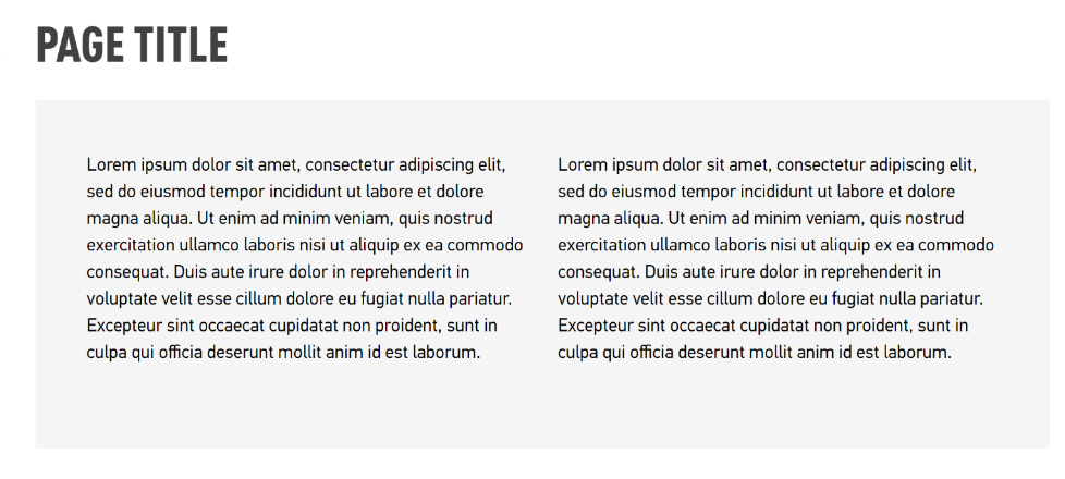
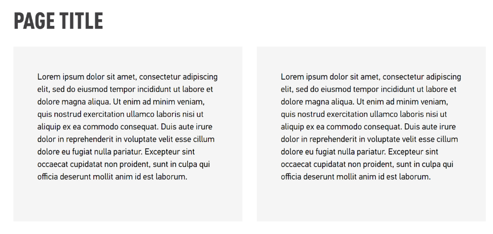
For two or more columns of content within the same coloured box, add CSS classes to the column control component and everything within the columns will contain the background colour
- To create two or more columns of coloured boxes side by side with a white divider between each column, you can specify each column as a colour.
Example:
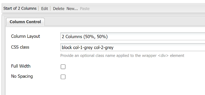
If you wanted a two-column layout to have grey backgrounds with a space between them, add “block col-1-grey col-2-grey" to the CSS Class field
Important
- Red block boxes should be reserved for important or highlighted information
Grey block boxes or outline boxes can be used for additional information that should be highlighted, but is not as important
How to
Add a coloured background to components
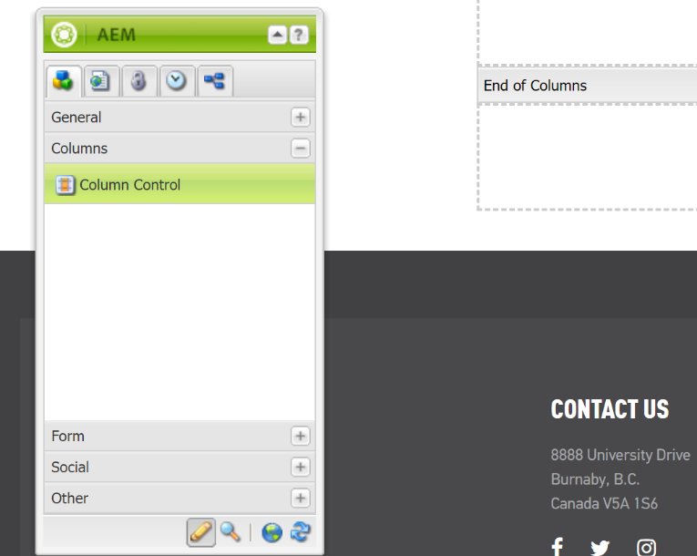
1. Add column control component to the page
Note:
A coloured background is generally added to a column control component, but it can be added to most components
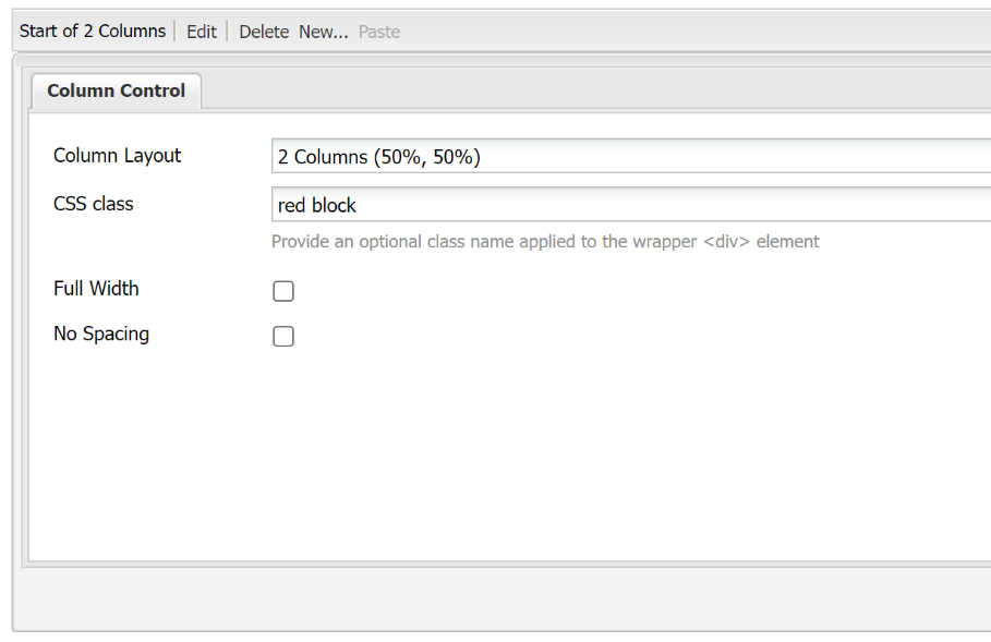
2. Edit the component and add the class name red block or grey block into the CSS Class field
Styles:
- red block – sets the background of the component to red
- light-red block – sets the background of the component to light red
- grey block – sets the background of the component to grey
Note: the class block sets the area up for a box, and adding the colour red, light-red or grey applies the colour to that box. There should be a space between the block and the colour (ex. grey block)
Add coloured backgrounds to individual columns of a column control component
1. Add the style block, and then any combination of the class styles below to the CSS Class field of your component.
- Each number represents the order of the column from left to right (1 being the furthest on the left, and 4 being the furthest on the right)
- Separate each style name with a space
(ex. block col-1-grey col-2-grey)
Note:
Columns have a white background by default, you do not need to define a white colour.
Styles:
1. Add first
block – sets the columns to have a background colour
2. Then add 1 (or more, depending on number of columns)
- col-1-red – sets the first column background as red
- col-2-red – sets the second column background as red
- col-3-red – sets the third column background as red
- col-4-red – sets the fourth column background as red
- col-1-light-red – sets the first column background as light red
- col-2-light-red – sets the second column background as light red
- col-3-light-red – sets the third column background as light red
- col-4-light-red – sets the fourth column background as light red
- col-1-grey – sets the first column background as grey
- col-2-grey – sets the second column background as grey
- col-3-grey – sets the third column background as grey
- col-4-grey – sets the fourth column background as grey
3. Add padding style "pad-all" to the individual components within the coloured columns
Add an outline box to a component:
- Add your text component to your page
Edit the component and add "outline" to the CSS Class field of your component.
Styles:
- outline - sets an outline box around the content