
- Engage C&M
- Brand
- Campus Communications
- Media & News
- Social
- Web
- Events Calendar
Page Layouts
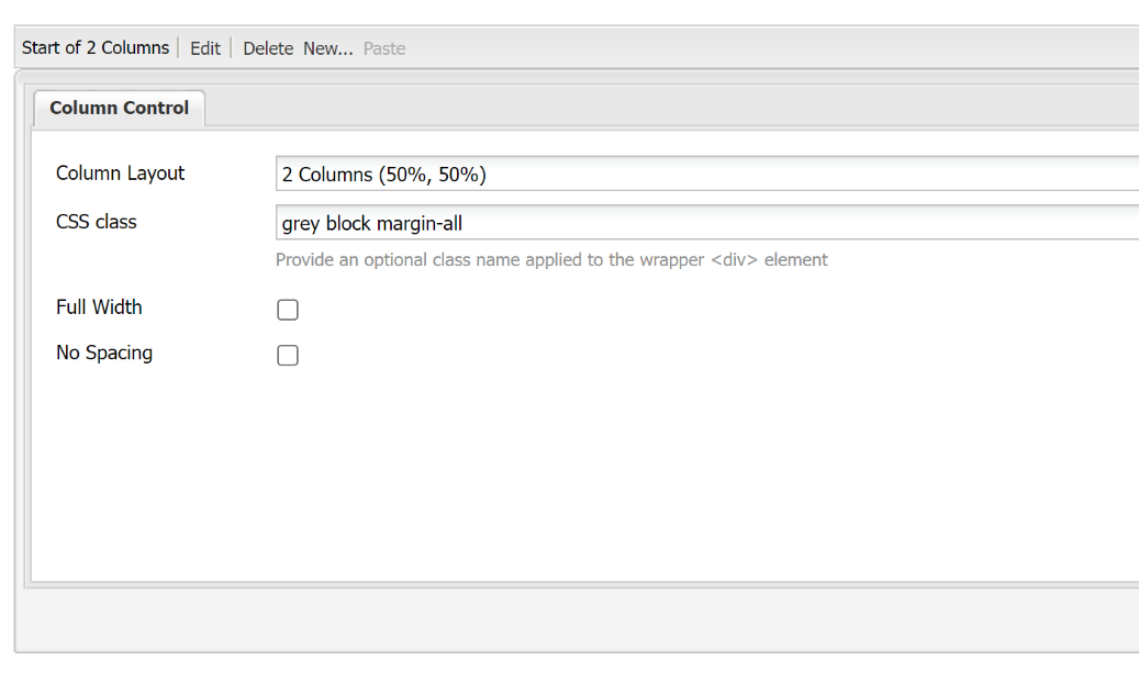
The column control component can be used to create a variety of layouts to suit your content. Margins and padding styles can add more space and layouts for mobile and tablet screen sizes can be customized. For more information about creating different layouts in the AEM templates, refer to the design guidance.
Margins & Padding
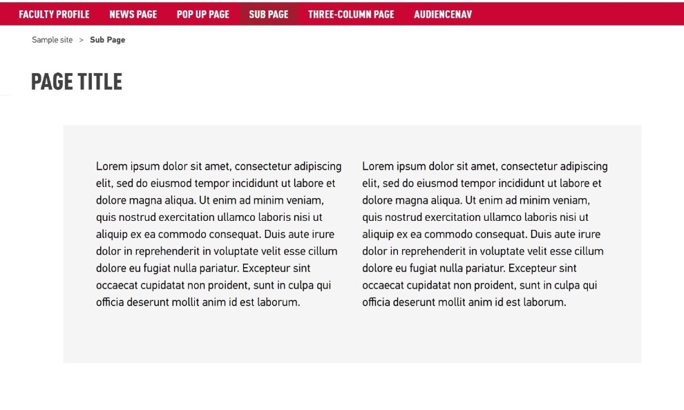
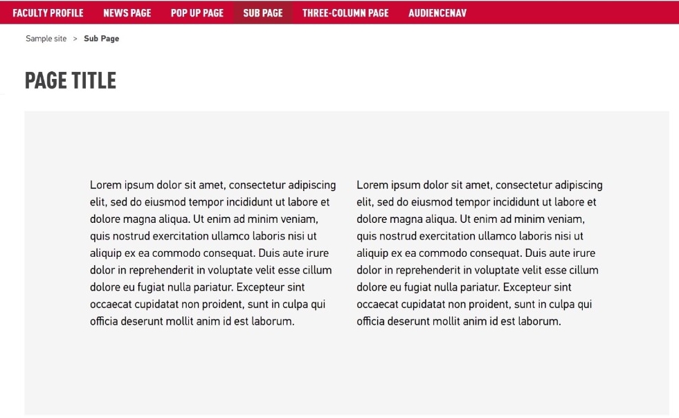
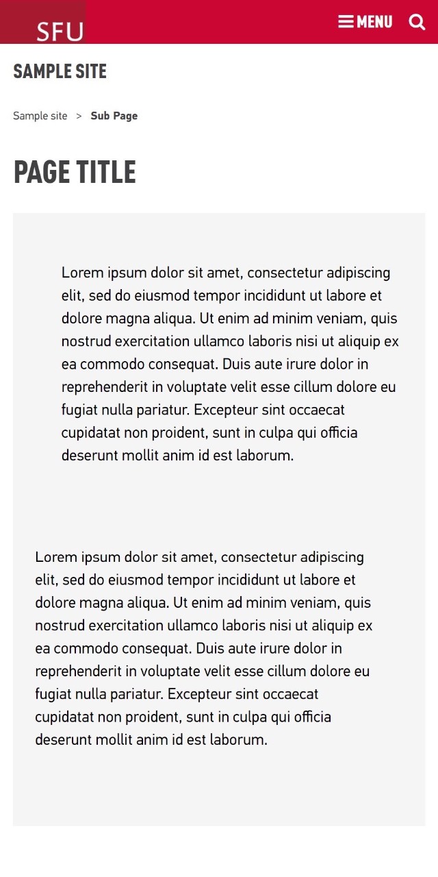
Margin and padding classes can increase the space around a component by 50px. Typically, this is applied to a column control component to add more white space around the columns. However, it can be added to other components as well.
The difference between margins and padding is most noticeable when using coloured backgrounds on columns. See the design guidelines for best cases and ways to use padding or margins around your components.
Margins create space outside the component, appearing to ‘push’ it away from other components.
Padding creates space inside the border of the component, ‘shrinking’ the space inside the component
Mobile
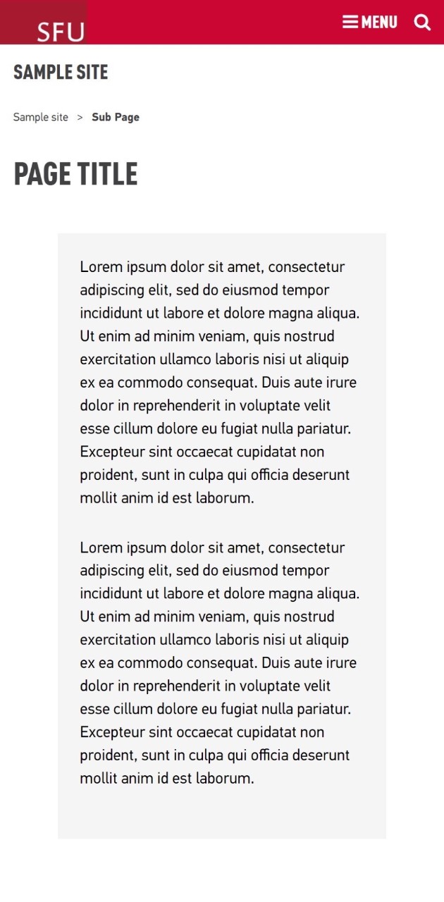
Padding impact is slightly reduced on mobile displays. However, you can add more padding for mobile displays or for desktop displays only with a class style.
Best Practices
- Avoid applying margins or padding on components in narrow columns. This can lead to thin columns of texts which are difficult to read on smaller screen sizes.
Design Guidelines
Subpage template
- columns have padding added to it for mobile, so no extra padding is necessary
How to
Margins
To increase margin on your components, add the style name into the CSS Class field of your component
Styles:
- margin-all - Adds a 50px margin to all four sides of the component.
- margin-top - Adds a 50px margin above the component.
- margin-bottom - Adds a 50px margin below the component.
- margin-top-bottom - Adds a 50px margin above and below the component.
- margin-left - Adds a 50px margin to the left of the component.
- margin-right - Adds a 50px margin to the right of the component.
- margin-left-right - Adds a 50px margin to the left and right of the component.
Padding
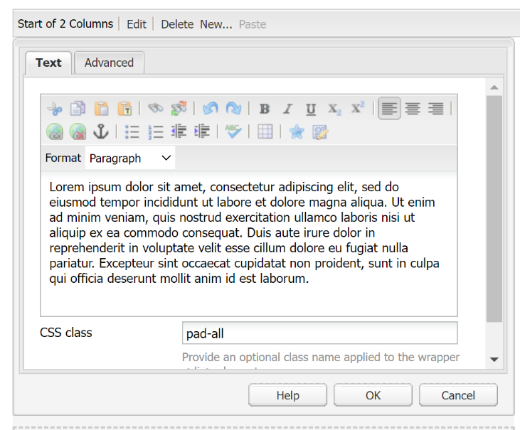
To increase padding on your components, add the style name into the CSS Class field of your component.
Styles:
- pad-all - Adds a 50px padding to all four sides of the component.
- pad-top - Adds a 50px padding above the component.
- pad-bottom - Adds a 50px padding below the component.
- pad-top-bottom - Adds a 50px padding above and below the component.
- pad-left - Adds a 50px padding to the left of the component.
- pad-right - Adds a 50px padding to the right of the component.
- pad-left-right - Adds a 50px padding to the left and right of the component.
To add padding to mobile / tablet view only, see padding styles for mobile / tablet screen sizes.