
- Engage C&M
- Brand
- Campus Communications
- Media & News
- Social
- Web
- Events Calendar
Page Layouts
The column control component can be used to create a variety of layouts to suit your content. Margins and padding styles can add more space and layouts for mobile and tablet screen sizes can be customized. For more information about creating different layouts in the AEM templates, refer to the design guidance.
Ruled Lines
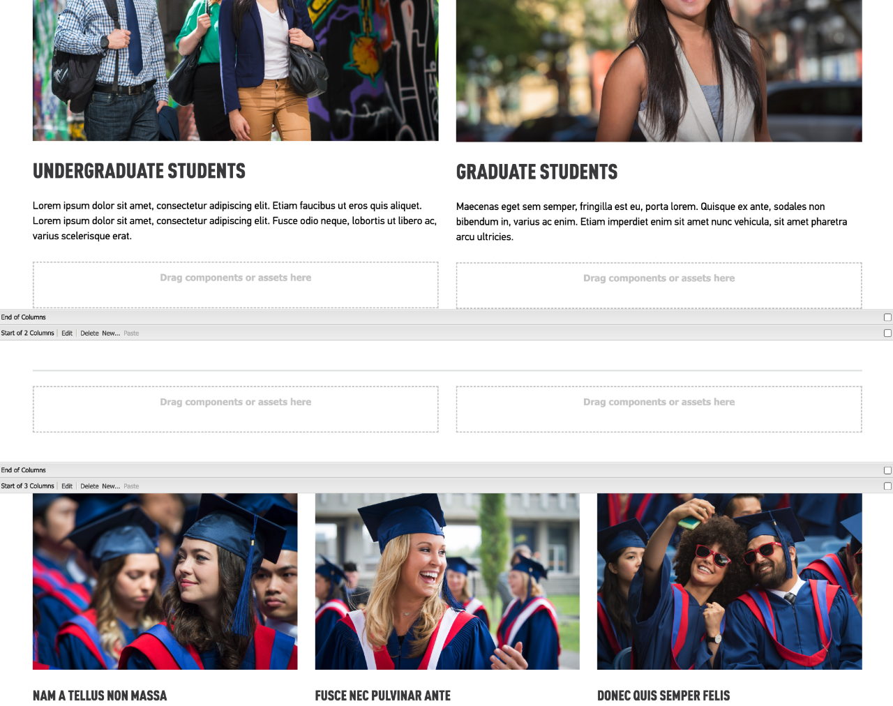
Ruled lines are generally used as part of the design to create a division between components or to break up sections of content in multiple columns.
A ruled line
A thin ruled line
A ruled-below line
A ruled-below thin line
A ruled-below line on red
A ruled-below thin line on red
Design Guidelines
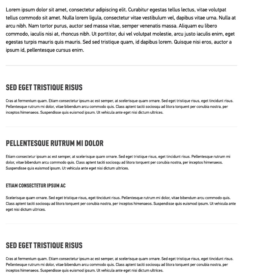
Use ruled lines to divide content into sections to make your page more visually appealing, and to break up types of information.
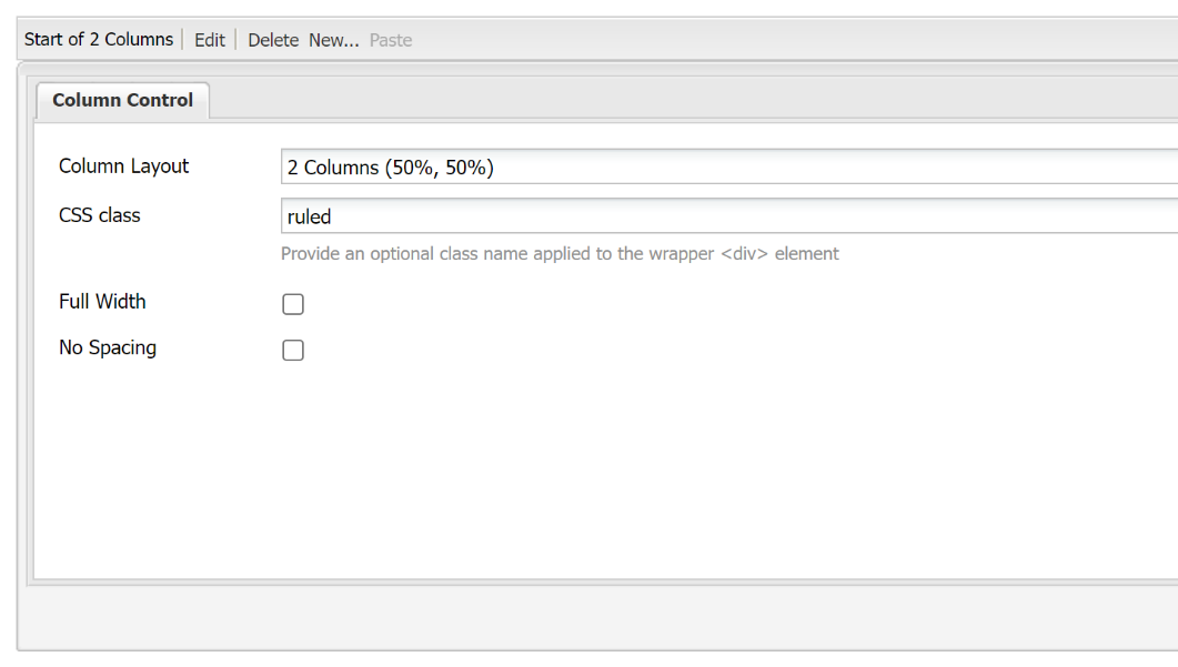
- Always apply a ruled line between column control sections instead of below individual text boxes to line up sections.
- To apply a ruled line, add a new column control component where you would like it to appear and add the class "ruled" or "ruled-thin" and then add margin above and below the line.
- For thick line - "Ruled margin-bottom margin-top"
- For thin lines - "Ruled-thin margin-bottom margin-top"
Consider how a ruled line will behave on mobile. When applied between column control components, it will divide sections of content on mobile.
Important
We recommend the following to maintain consistency across SFU websites:
- The thicker (ruled, ruled-below) line is to be placed between an intro section and sub content section, or to divide different topics on the same page
The thinner (ruled-thin, ruled-below-thin) line is to be placed between content of the same kind or sub content below the intro section
How to
1. Open to edit the column control component or other component
2. Add style name to the CSS style field
3. For specific layouts using ruled lines, refer to the design guidelines.
Styles:
- ruled - Places a grey border above the component
- ruled-below - Places a grey border below the element
- ruled-thin - Places a thin grey border above the element
- ruled-below-thin - Places a thin grey border below the element