
- Engage C&M
- Brand
- Campus Communications
- Media & News
- Social
- Web
- Events Calendar
Organizing Text Content
Further organization and optimization of page content can make the user experience more enjoyable and helps the audience consume the content the way you intended.
Below you'll learn about creating tables and toggles, adding file downloads, list components for news feeds, and tags and filtering options.
List Component
Content can be dynamically pulled from a list of pages and displayed into a list of content, in order to display content such as News items, list of links, or set of images. For basic bullet and numbered lists use list options in the text component.
In the List component items can be displayed in:
- A dynamic list of links and styled as plain, bullets, lined, horizontal buttons, or a drop-down list
- A set of images
- A set of cards, which is a new design in CLF4
- A list of news items, blog items or something similar, which are configurable by selecting which items from the list to display. This can be customized to display or hide the date, image, or description.
- A list of full content (i.e., All the content put into the item will be displayed in the list)
Plain links
Lined links
Dropdown list
Bullet links
Indented Lined links
Horizontal list

Design Guidelines
Since the default layout is stacked add the column class (col-2, col-3, col-4) to place the cards in multiple columns for larger screens.
It is best to crop all images placed on the cards to be the same height, so that the cards line up.
Mobile version:
On mobile, the cards list stack items in a single column. If you require the cards to stack sooner for tablet view, see Customizing stacking layouts for tablet and mobile screens.
-

Morbi blandit, diam eget pretium accumsan, libero lectus suscipit erat, eget interdum felis nisl id enim.
-

Pellentesque habitant morbi tristique senectus et netus et malesuada fames ac turpis egestas.
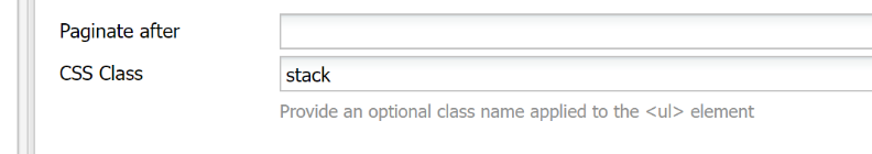
- Configurable view can be stacked by applying "stack" class
-
Morbi blandit, diam eget pretium accumsan, libero lectus suscipit erat, eget interdum felis nisl id enim.
-
Pellentesque habitant morbi tristique senectus et netus et malesuada fames ac turpis egestas.
How to
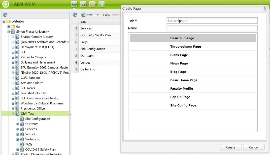
1. Set up Pages
Prior to setting up your list component, you will need to set up child pages in a directory or select from a set of pages which will be used to compile your list
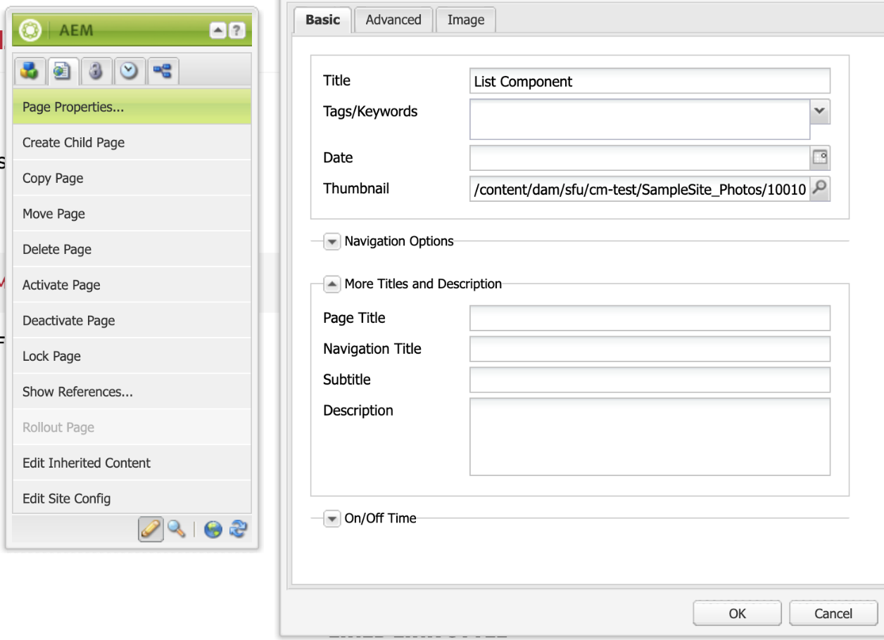
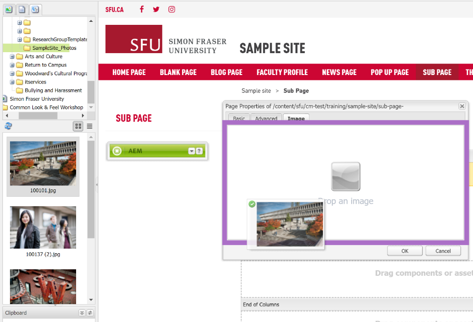
2. Set Page properties for each page - Content for each page will need to be set under each page’s properties:
- Page titles - are used for the titles in a list
- Images - are selected from the DAM and set in the Thumbnail field or the Image tab
- Dates - for each page is set under the date field
- Description - is pulled from the description field
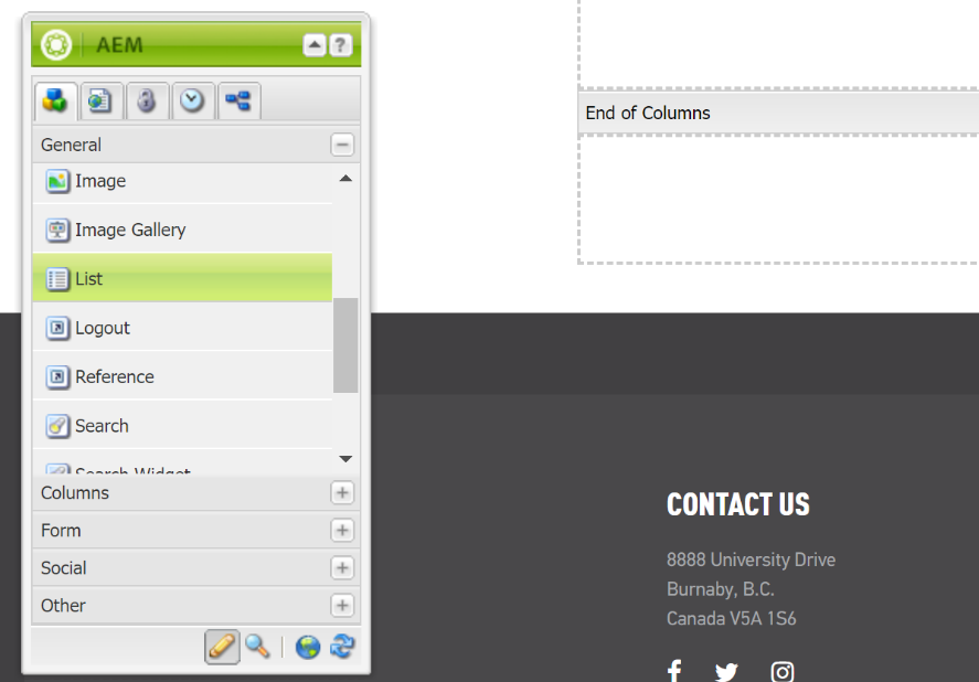
3. Add List component - To create your list, add a List component to your page and edit the component
4. Build list using - Configure which pages to display in the list component by selecting one of the options under “build list using”
- Child pages - Allows you to display child pages within a certain section as a list
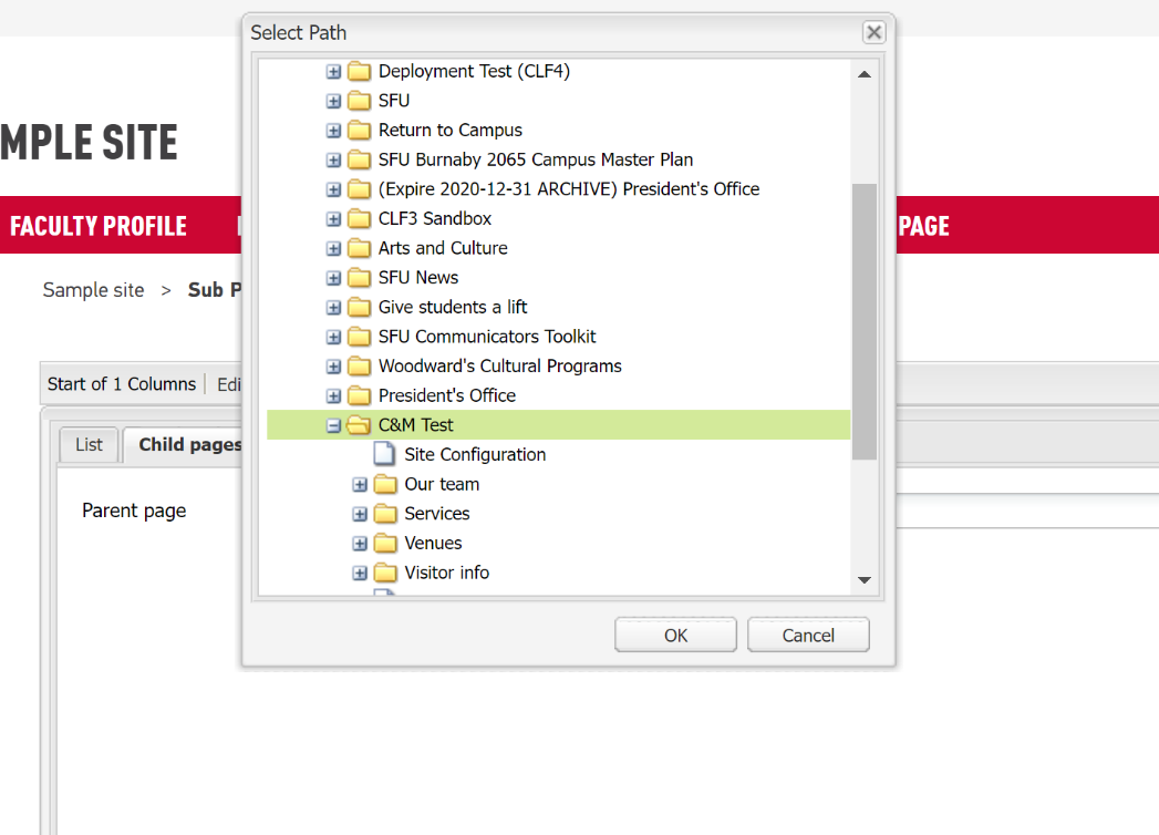
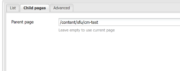
- Select Child pages, and within the child pages tab, select which page from your directory is the parent page. All the child pages within this section will be displayed as your list.
Note: This is limited to the first level of child pages
Fixed list - Allows you to select specific AEM pages to build a custom list of pages
- Select Fixed list, and within the fixed list tab, you can add pages from your directory to build your custom list
- You can reorder the list by using the arrows on the right
- You can remove an item by clicking on the red circle
- Advanced search - Allows you to specify a search query to build a list.
- Refer to Advanced Queries for examples and recommended usage.
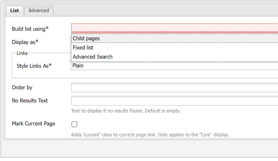
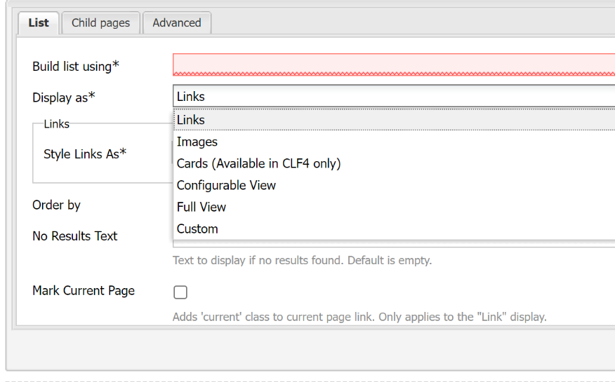
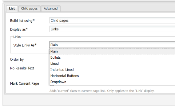
5. Display As - You can specify how to display your list under “Display as”. Each option has different settings that can be customized. See below for detailed descriptions of each. See (details for each section below)
- Links
- Images
- Cards
- Configurable View
- Full View
- Custom
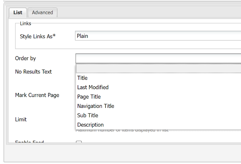
6. Order by - Leave blank to use the default page order or choose to order the pages by title, date created, date modified, or page template
- set to Last Modified to display the most recent items first
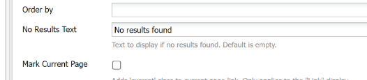
7. No Results Text - If your List component returns no results, you can use this field to display a message
8. Limit - Allows you to specify the maximum number of items displayed on the list. Items surpassing the limit will not be displayed. Homepages are generally limited to three to six items, whereas news feed pages can be more.
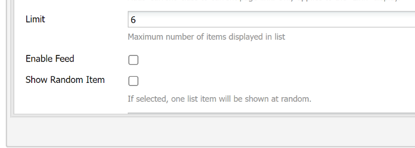
9. Enable Feed - Enables an RSS feed
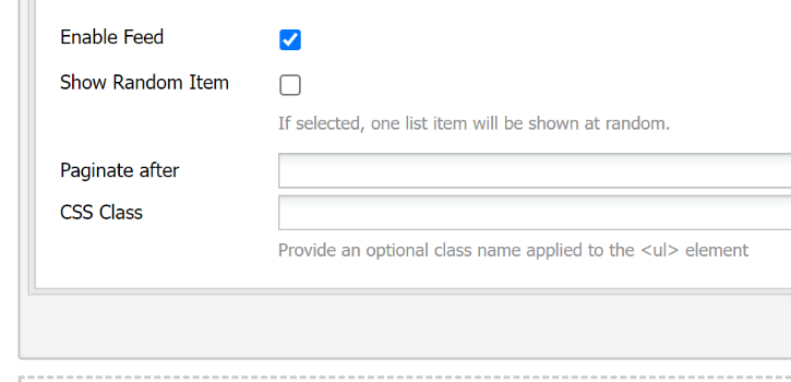
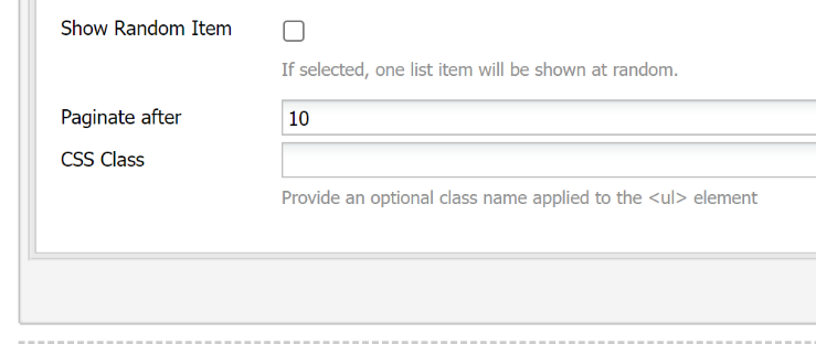
10. Paginate after - Allows you to specify the maximum number of items to display before pagination occurs
11. Set into Columns
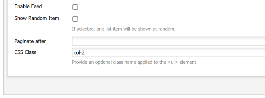
By default, with the exception of horizonal buttons, all list items are displayed vertically, one on top of another. To organize your list of items into columns, one of the CSS classes below can be applied. Add the style class name in the CSS Class text field:
Styles:
- col-2 - Splits the list into two columns on large screens
- col-3 - Splits the list into three columns on large screens
- col-4 - Splits the list into four columns on large screens
Note: All list component items, including items with a column class added to it, will be stacked in mobile view.
List Component - Display As
Will display only page titles of the selected pages and will display the list as a set of links.
Page titles can be set in the page properties of each page in the list.
The list of links can be styled in one of the following ways:
- Plain
- Bullets
- Lined
- Indented lined
- Horizontal buttons
- Dropdown
- See buttons section for style guidelines of horizontal buttons
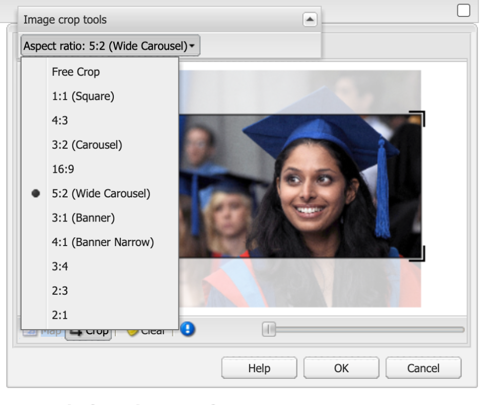
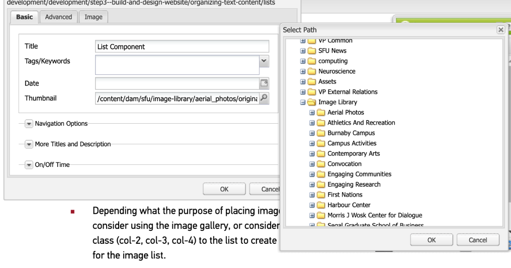
The List displays only the images of the specified pages using either the Thumbnail Field or the Image tab in Page Properties.
To add an image, open the page properties, and add an image from the DAM to either the Thumbnail Field or the Image tab of each page in the list
Design Guidelines
Depending what the purpose of placing images on the page, consider using the image gallery, or consider adding a column class (col-2, col-3, col-4) to the list to create multiple columns for the image list.
Resources:
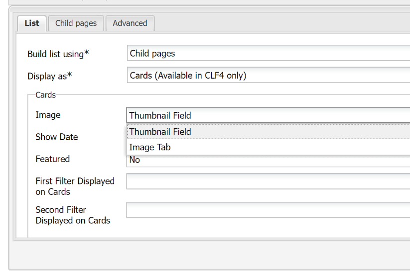
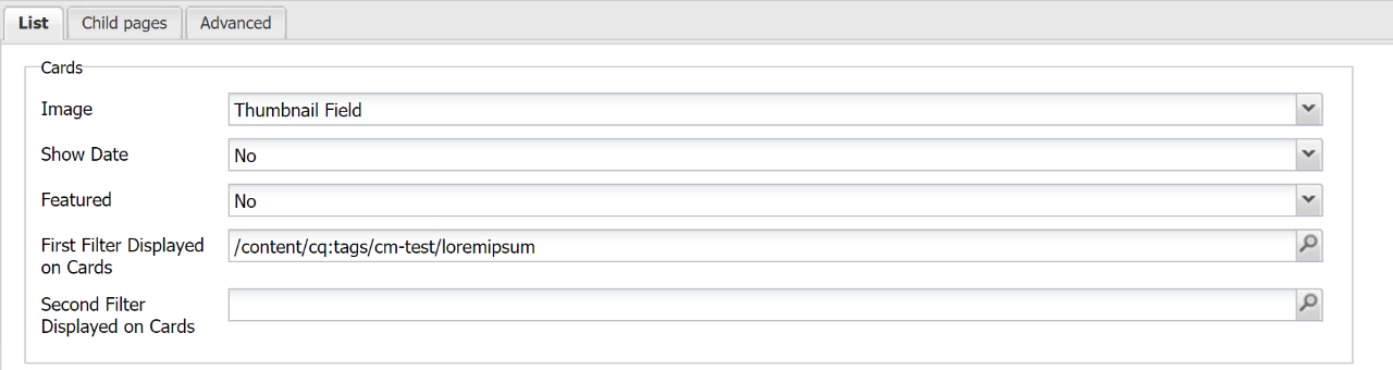
The list is displayed as a stylized card (only available in CLF4). The card style includes an image, page title, date (optional), tags and a call-to-action link.
- Image - Select where the image is pulled from (image tab, or thumbnail field
- To add an image, open the page properties and add an image from the DAM to either the Thumbnail Field or the Image tab for each page set in your list
- Date – Date can be hidden or displayed. Select to show date (Yes, no). Dates are set in the page properties
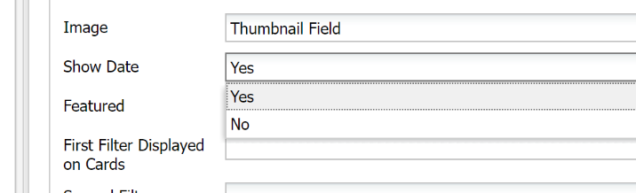
Featured - The Featured option will increase the font size of the title and is only recommended for a single card. Adds a bigger headline (image)
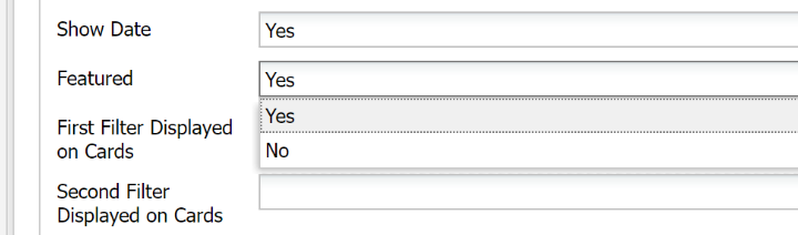
Filter Displayed on Cards – You can set two tags listed on your cards, and you can select from 2 lists of tags. For more information on setting up Tags. see Tags section.
Design Guidelines
Consider adding a column class (col-2, col-3) to place cards in multiple columns.
Resources:
Displays the titles, dates, and teaser text of the pages, with various layout options. Can be used to display a list of news items by setting up pages in the News Template.
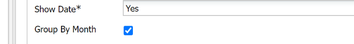
- Show Date - Select "Yes/No" to show the date
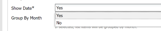
- Group By Month - Items in the list can be sorted and displayed by month.
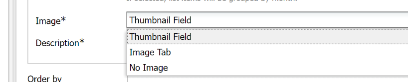
- Image - Select where the image should be pulled from, the Thumbnail Field, Image Tab or choose not to show an image at all
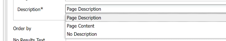
Description - Select where the description should be pulled from, the Page Description in Page Properties, the page content (first 100 characters) or choose not to show a description at all
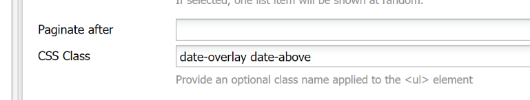
Date Display - to set how the date displays add class names to the CSS Class field
Styles:
- date-above - add CSS Class “date-above” to displays the date above the title
- date-overlay - add CSS Class “date-overlay” to overlays the date on top of the image aligned to the bottom
- date-overlay date-above - add CSS Class “date-overlay date-above" to overlays the date on top of the image aligned to the top
- Stack items - option to stack items
Styles:
- Stack - add CSS Class “stacks” Stacks all fields on top of each other instead of showing the image and content side by side. The title and date are displayed above the image
Resources