
- People
- Administration & Staff
- Research faculty
- Gabriela Aceves-Sepúlveda
- Alissa N. Antle
- Sheelagh Carpendale
- Parmit Chilana
- Jon Corbett
- Steve DiPaola
- Halil Erhan
- Brian Fisher
- Diane Gromala
- Marek Hatala
- Kate Hennessy
- Alireza Karduni
- Sylvain Moreno
- Carman Neustaedter
- Will Odom
- Philippe Pasquier
- Niranjan Rajah
- Bernhard Riecke
- Gillian Russell
- Thecla Schiphorst
- Chris Shaw
- Wolfgang Stuerzlinger
- Ron Wakkary
- Ö. Nilay Yalçin
- Teaching faculty
- Emeritus
- Adjunct Faculty
- Alumni
- Work at SIAT
- Research
- Programs
- News & Events
- Spaces & Equipment
- Media
- Showcase
- Contact
- Staff & faculty resources
Research
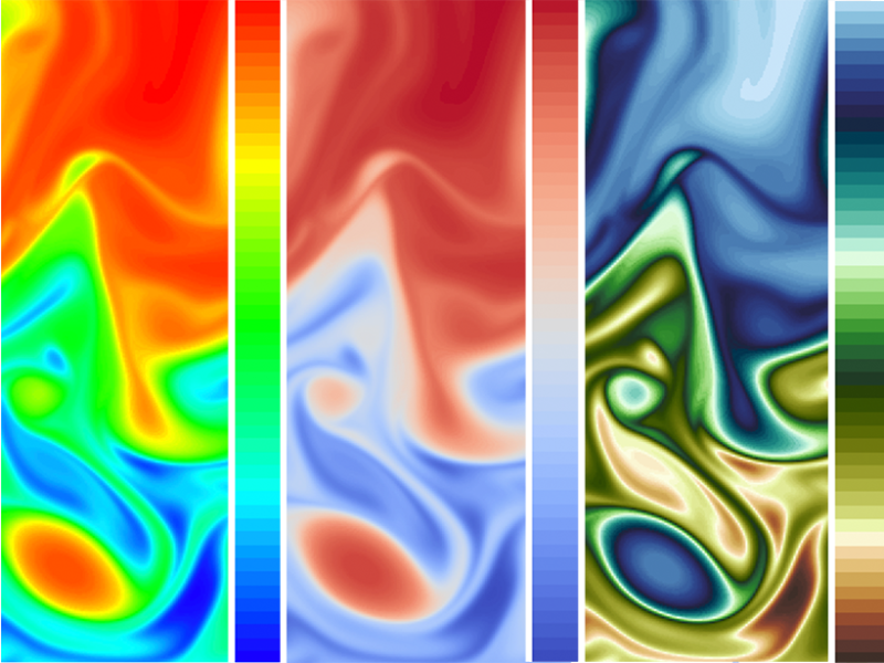
Visualizing science: how colour determines what we see
Article originally appeared in the Eos: Science News by AGU (date: May 21, 2020).
Color plays a major role in the analysis and communication of scientific information. New tools are helping to improve how color can be applied more accurately and effectively to data.
Scientific visualizations play multiple roles of helping people quantify, interpret, evaluate, and communicate information. Their importance in the exploration and discovery of data is immense and is growing with advances in computational power, yet visualization’s single most effective encoder—color—remains vastly understudied. Although the macroscale effects of such neglect on public perception of issues like climate change are yet unknown, many groups are beginning to devote greater resources to designing their visualizations with the public in mind.
“Data visualization is a language, and, foundationally, you’re trying to tell a story. Color is a huge part of this.”Ed Hawkins, a lead author of the upcoming sixth Intergovernmental Panel on Climate Change (IPCC) report and creator of the now-viral “Warming Stripes” graphic, said the IPCC pays multiple graphic designers to transform complex visualizations into simplified graphics. “We have to be able to reach a very broad audience,” Hawkins added. “Not just for general communication, but also to inform policy decisions and to help people respond to risks that threaten their way of life.” Hawkins and his team spend “a lot of time” focusing on color blindness issues in addition to readability and semantic understanding of color.
Keeping in mind the difference in perception between those publishing reports and those reading them is imperative, according to Lyn Bartram, a professor in the School of Interactive Art and Technology at Simon Fraser University and director of the Vancouver Institute for Visual Analytics. “Rather than engaging people in the experience of understanding big data, we just sort of throw the facts out there and wash our hands of the affair,” she said. “Data visualization is a language, and, foundationally, you’re trying to tell a story. Color is a huge part of this.”
If researchers do not behave as if they are in conversation with their audience, Bartram said, their work will have little impact. “The democratization of data visualization means that it has become media; it is no longer just a means to an end for scientists,” she said. “Visualization has become so much more than just a tool. It is now a part of our conversations and decision-making as a society at large.”
Read the full article featuring comments from Dr. Lyn Bartram via Eos: Science News by AGU.