- People
- Administration & Staff
- Research faculty
- Gabriela Aceves-Sepúlveda
- Alissa N. Antle
- Sheelagh Carpendale
- Parmit Chilana
- Jon Corbett
- Steve DiPaola
- Halil Erhan
- Brian Fisher
- Diane Gromala
- Marek Hatala
- Kate Hennessy
- Alireza Karduni
- Sylvain Moreno
- Carman Neustaedter
- Will Odom
- Philippe Pasquier
- Niranjan Rajah
- Bernhard Riecke
- Gillian Russell
- Thecla Schiphorst
- Chris Shaw
- Wolfgang Stuerzlinger
- Ron Wakkary
- Ö. Nilay Yalçin
- Teaching faculty
- Emeritus
- Adjunct Faculty
- Alumni
- Work at SIAT
- Research
- Programs
- News & Events
- Spaces & Equipment
- Media
- Showcase
- Contact
- Staff & faculty resources
Research
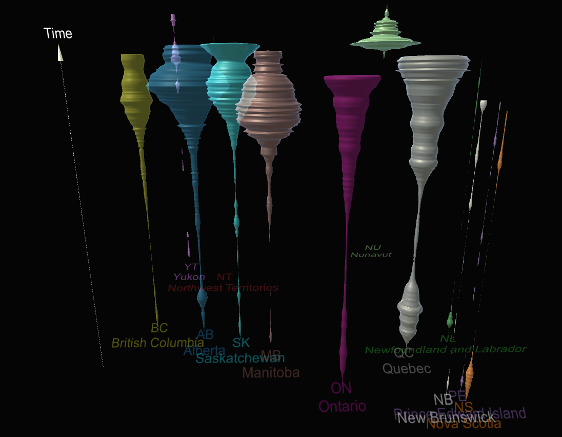
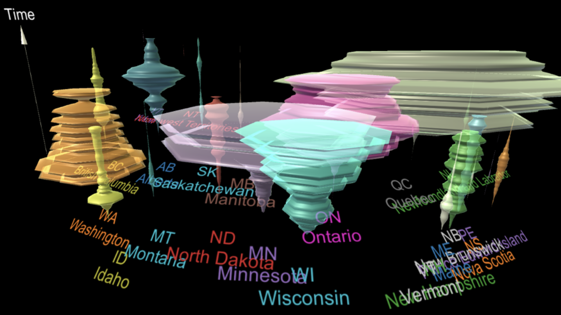
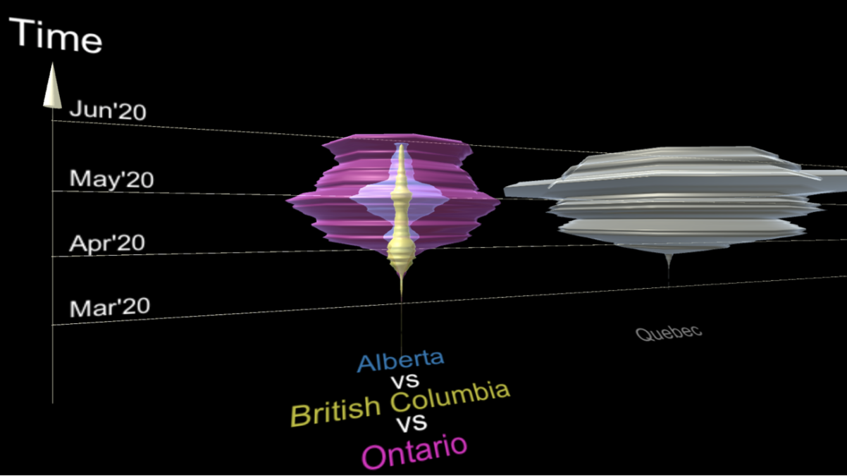
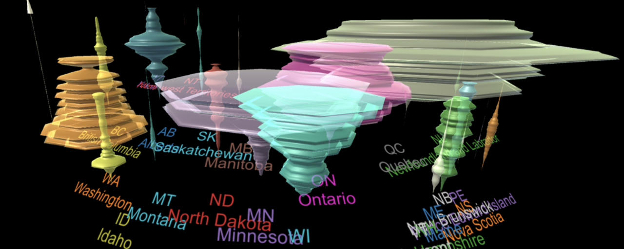
SIAT researchers aim to improve communication of COVID-19 trends through 3D visualizations
SIAT’s Dr. Wolfgang Stuerzlinger and his colleagues have recently been named the recipients of an NSERC grant to research and develop better communication about COVID-19 trends through 3D visualization.
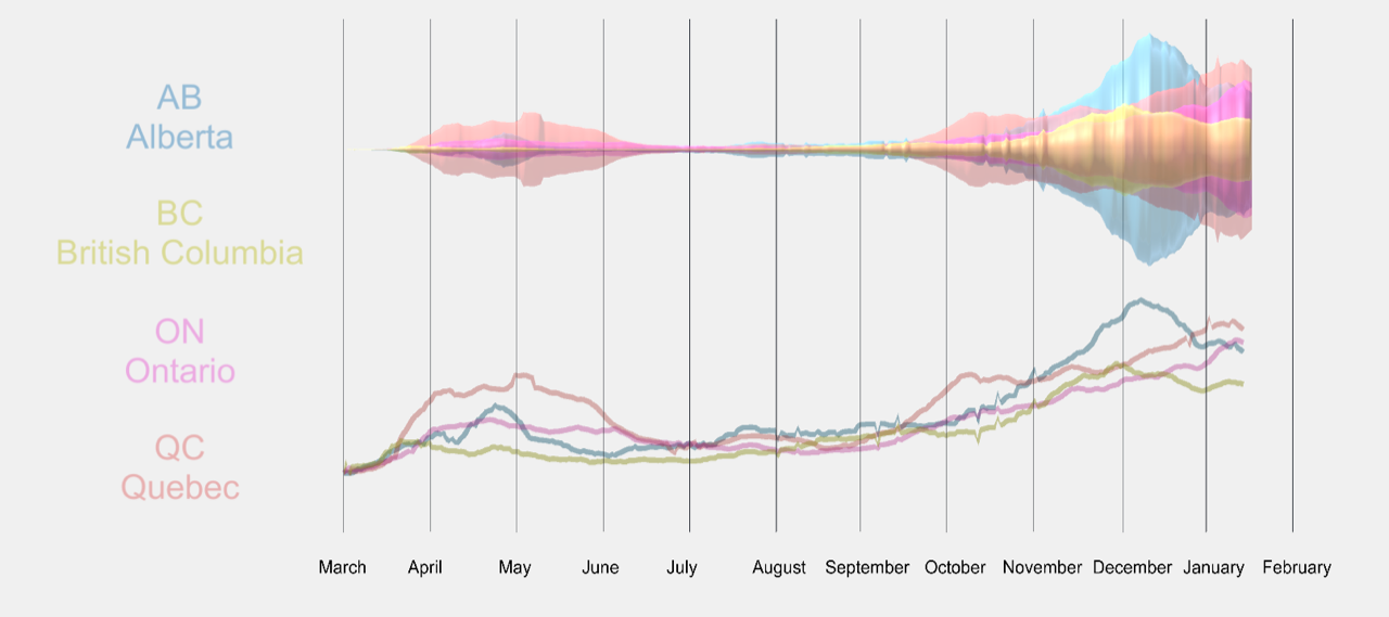
To develop strategies to continue managing the ongoing COVID-19 pandemic, health officials are increasingly needing to analyze large amounts of data on the trends of virus transmission and to use this data to make decisions about the best methods of combating the spread of the virus.
Along with policy changes, British Columbia’s response to containing the COVID-19 pandemic has largely been to provide citizens with information regarding the spread of the virus and then to rely on them to change their behaviour to limit transmission.
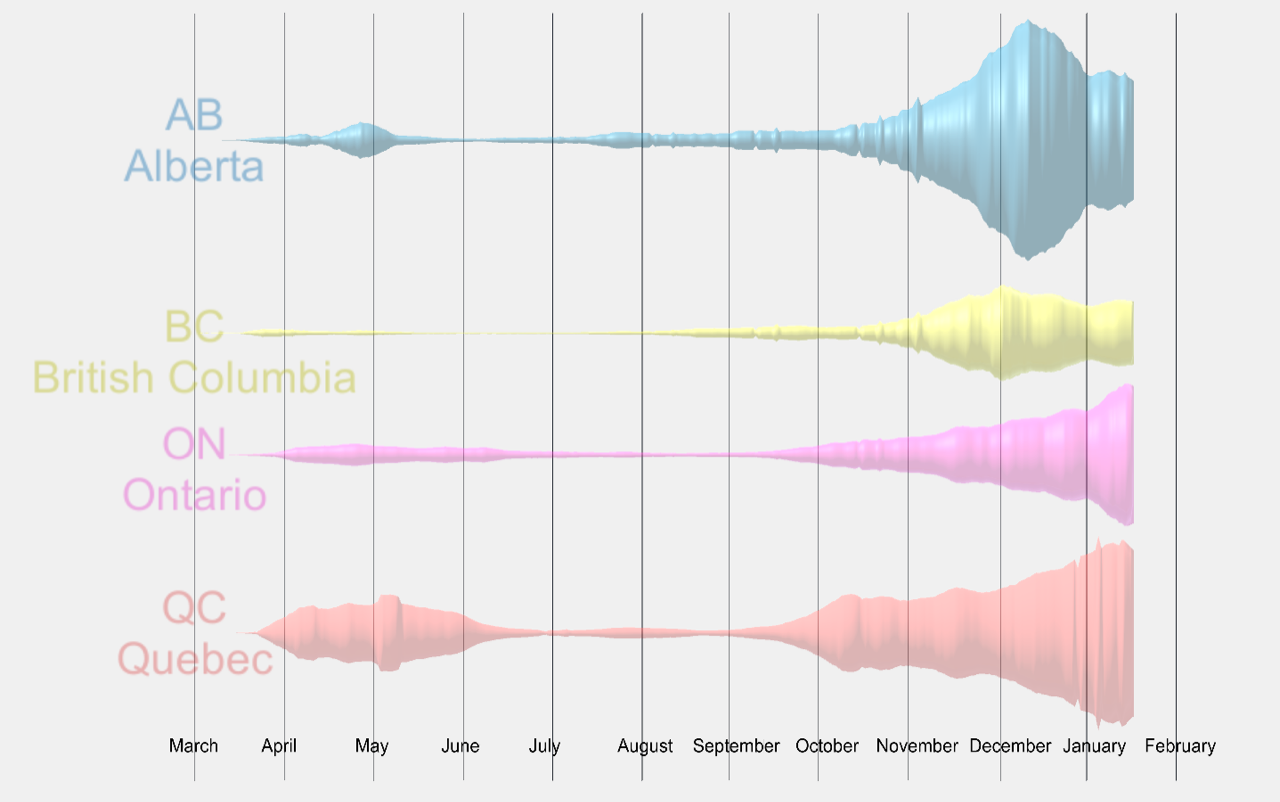
For this pandemic response to be effective, it is important that the general public understand the virus’s exponential growth, its rate of spread, and its increase over time. Only that way can individuals make informed behavioural changes. Currently data on the spread of COVID-19 is mostly through daily updates or shown through 2D graphs and plots, and for the average Canadian, these can be overwhelming and difficult to comprehend.
“Typically, non-linear graphs, such as logarithmic ones, are used in engineering, medicine, and science to make phenomena in these areas easier to comprehend,” says Dr. Wolfgang Stuerzlinger, “but most people not immersed in these fields do not understand such plots.” Yet, Stuerzlinger explains, these kinds of communication strategies show the exponential growth of unchecked COVID-19 spread more clearly than any other option. At the same time, traditional 2D graphs do not represent the third dimension that can be used to represent time or comparisons to other countries or to previous pandemics, which can be very useful in helping people understand the growth rate and comparative risk of COVID-19.
Stuerzlinger saw this challenge as an opportunity to help the general public comprehend exponential trends of the spread of COVID-19 using simple, effective, and easy-to-understand 3D data visualizations.
“The fact that an exponential trend is harder to show and to understand is a serious concern for everyone who needs to communicate how quickly COVID-19 spreads, including governments around the world, who need their citizens to fundamentally change their behaviour to combat COVID-19 successfully,” says Stuerzlinger. “The research in this project looks at alternatives to visualize COVID-19 data in more easy-to-understand ways.”
Stuerzlinger, postdoctoral fellow Anil Ufuk Batmaz, and Stambol Studios plan to build on successful 3D visualizations such as space-time cubes, or create new 2D and 3D visualizations that represent the COVID-19 data better. They will also take the research one step further and investigate how people respond to existing data visualization methods and how their reactions change with different methods.
Stuerzlinger and his colleagues hope that by helping people to understand the severity of COVID-19, its damaging effects on our society, and its growth trends, individuals will be able to make better informed decisions that will help to reduce the virus’s spread and minimize its effect on our communities.